 Paint Visualizer AI
Off-white paint color
Oatmeal
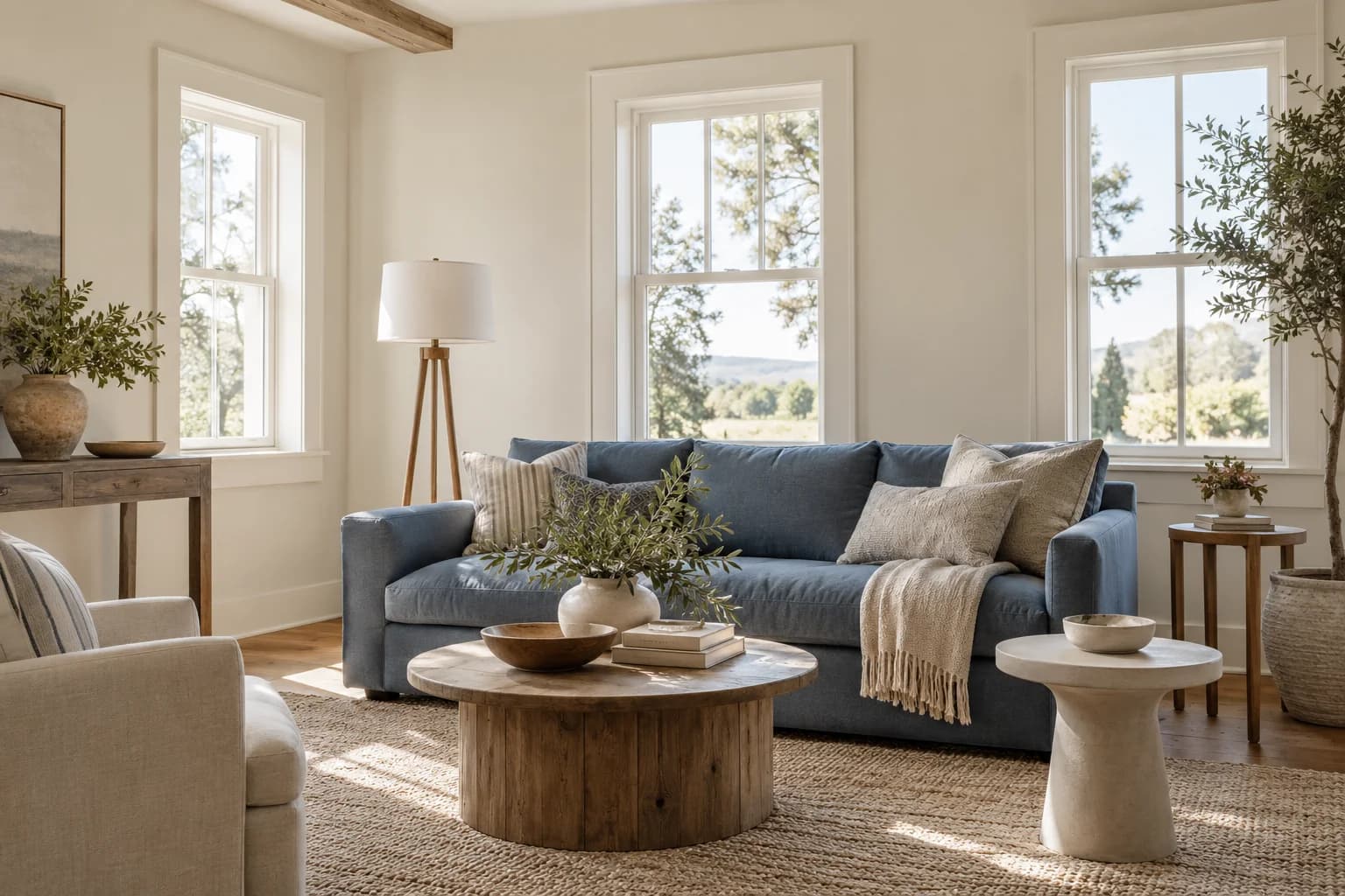
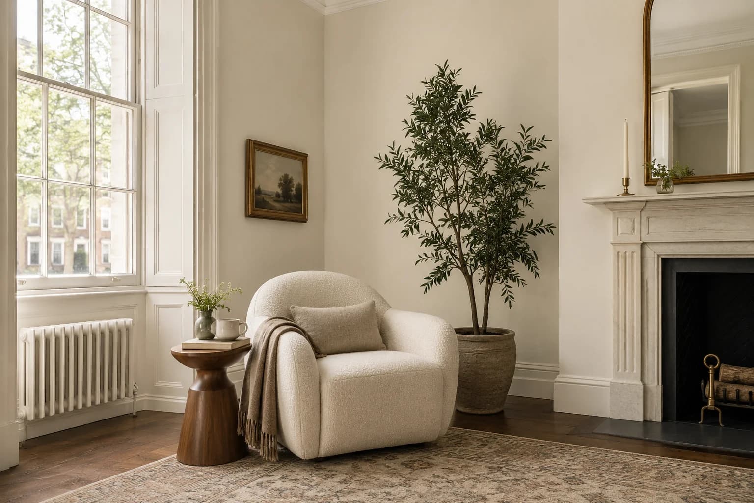
A soft, warm off-white
Oatmeal is a pale off-white with yellow and a subtle green undertone. It pairs well with greige walls and natural materials.
- Color family
- Off-white
- Undertone
- Green
- Light reflectance
- 76 LRV / 100
- Use
- Interior & exterior
- Brand
- PPG Paints
Color & light
Color and lighting
Its warmth is more noticeable beside a clean white.
Lightness
76 LRVIt has a light appearance that keeps walls close to an off-white.
Temperature
warmIntensity
MutedRGB
- Red
- 231
- Green
- 227
- Blue
- 214
HSL
- Hue
- 46°
- Saturation
- 26%
- Lightness
- 87%
How light can change it
Bright daylight
Bright daylight gives it a pale, warm look.
Cool or indirect light
Cool shade can reveal a little more gray-green.
Warm evening light
Warm lamps make the yellow tone more visible.
Inspiration
Interior and exterior ideas
Interior
See Oatmeal in living rooms, kitchens, bedrooms, and more.
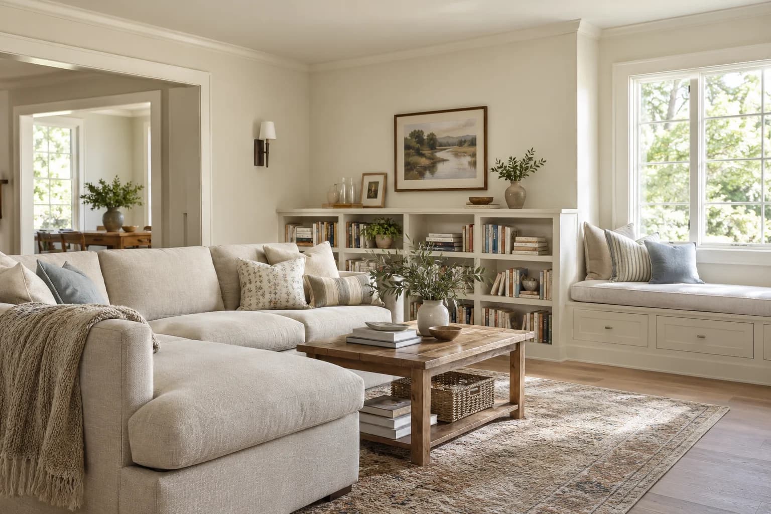
Living room
Warm off-white walls surround the cream sectional and built-in window seat.
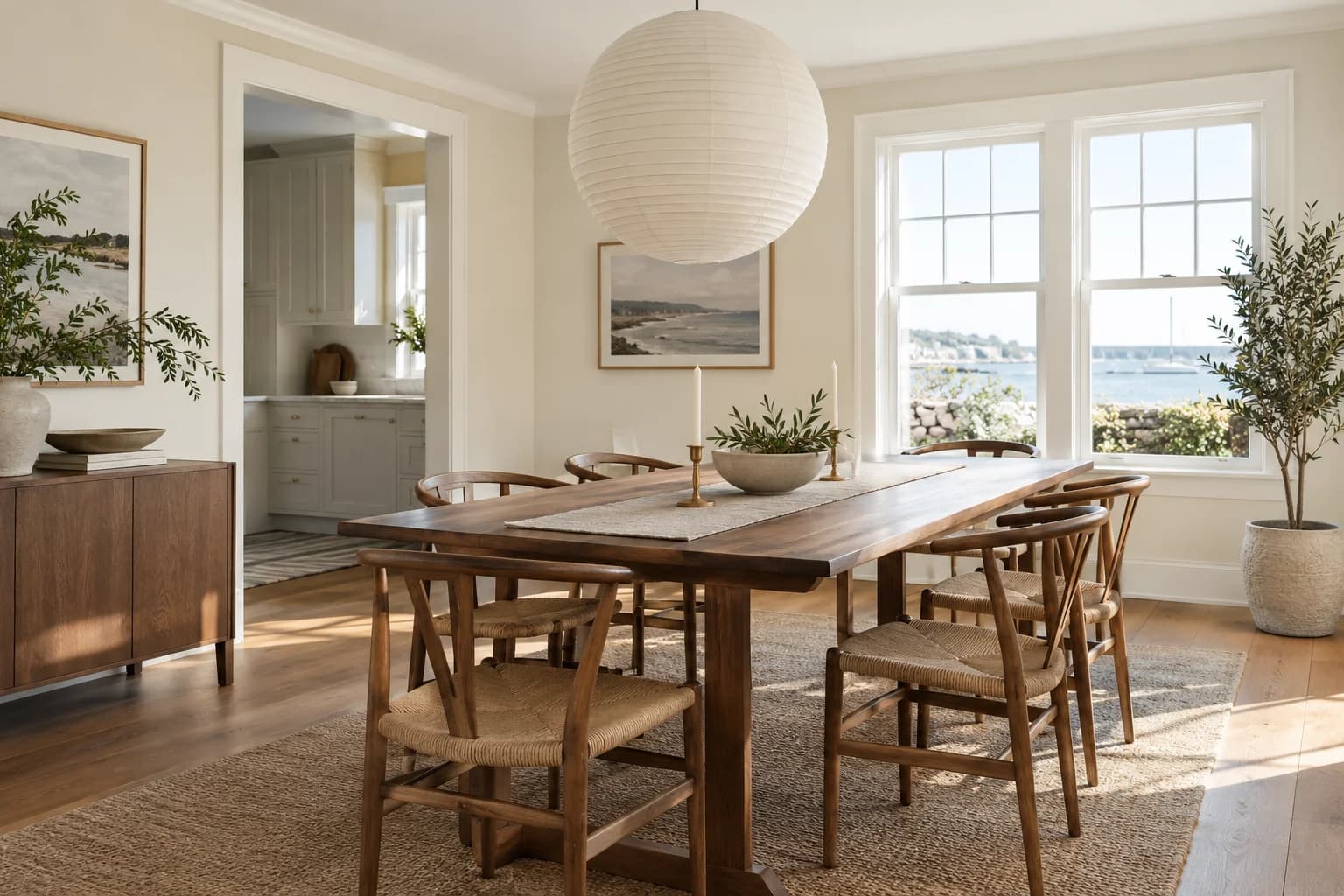
Dining room
Off-white walls keep the dining room light around the long wood table.
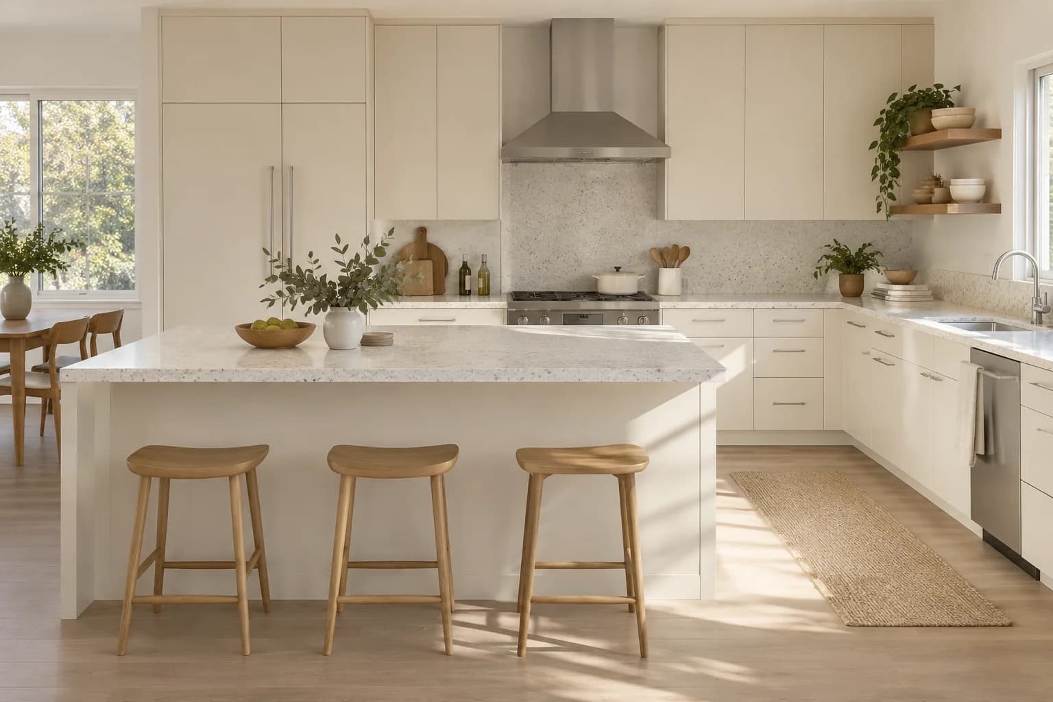
Kitchen cabinets
Creamy cabinets pair with white counters and simple wood stools.
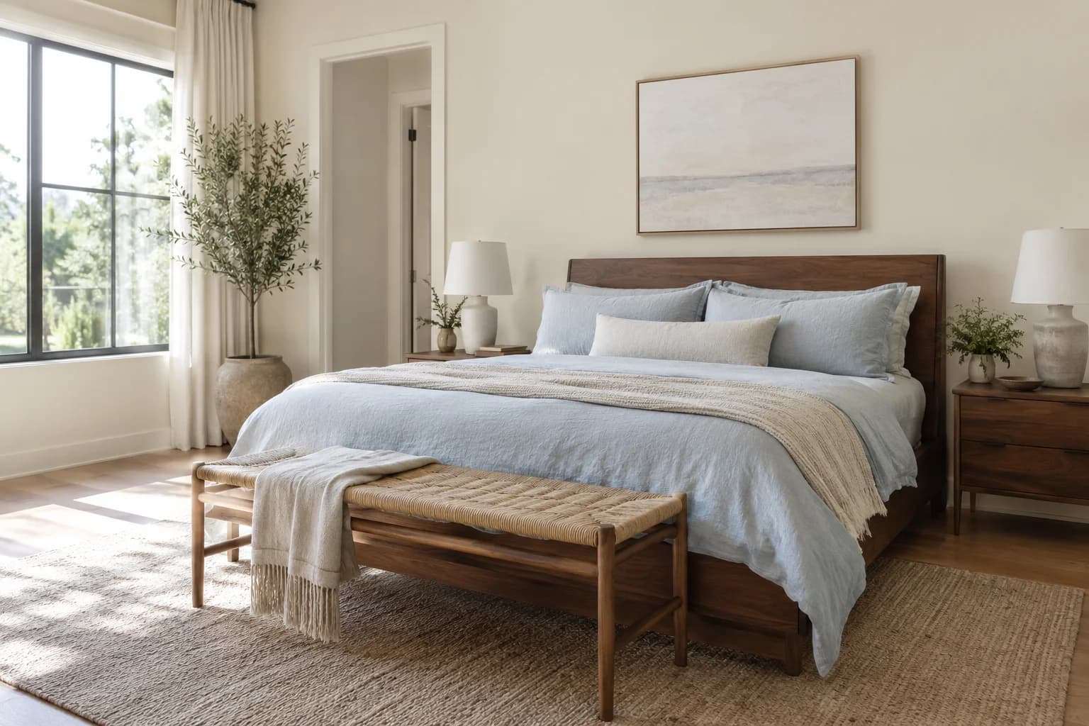
Bedroom
Warm off-white walls balance the pale blue bedding and wood headboard.
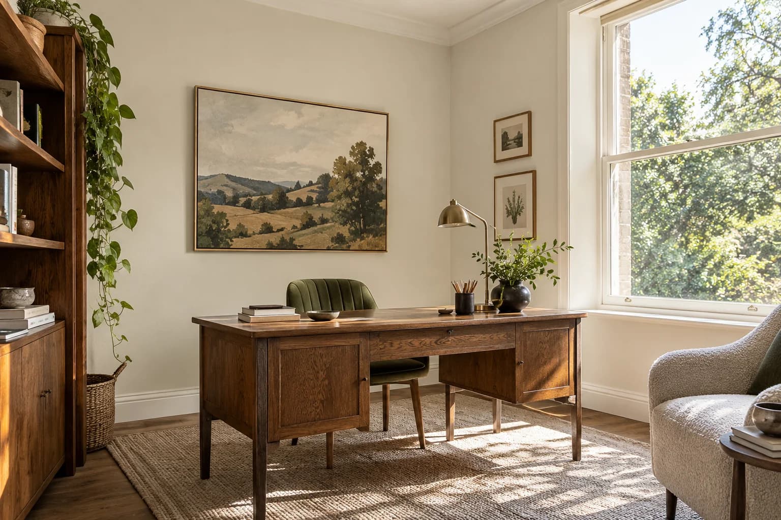
Home office
Cream walls provide a light backdrop for the dark wood desk and landscape artwork.
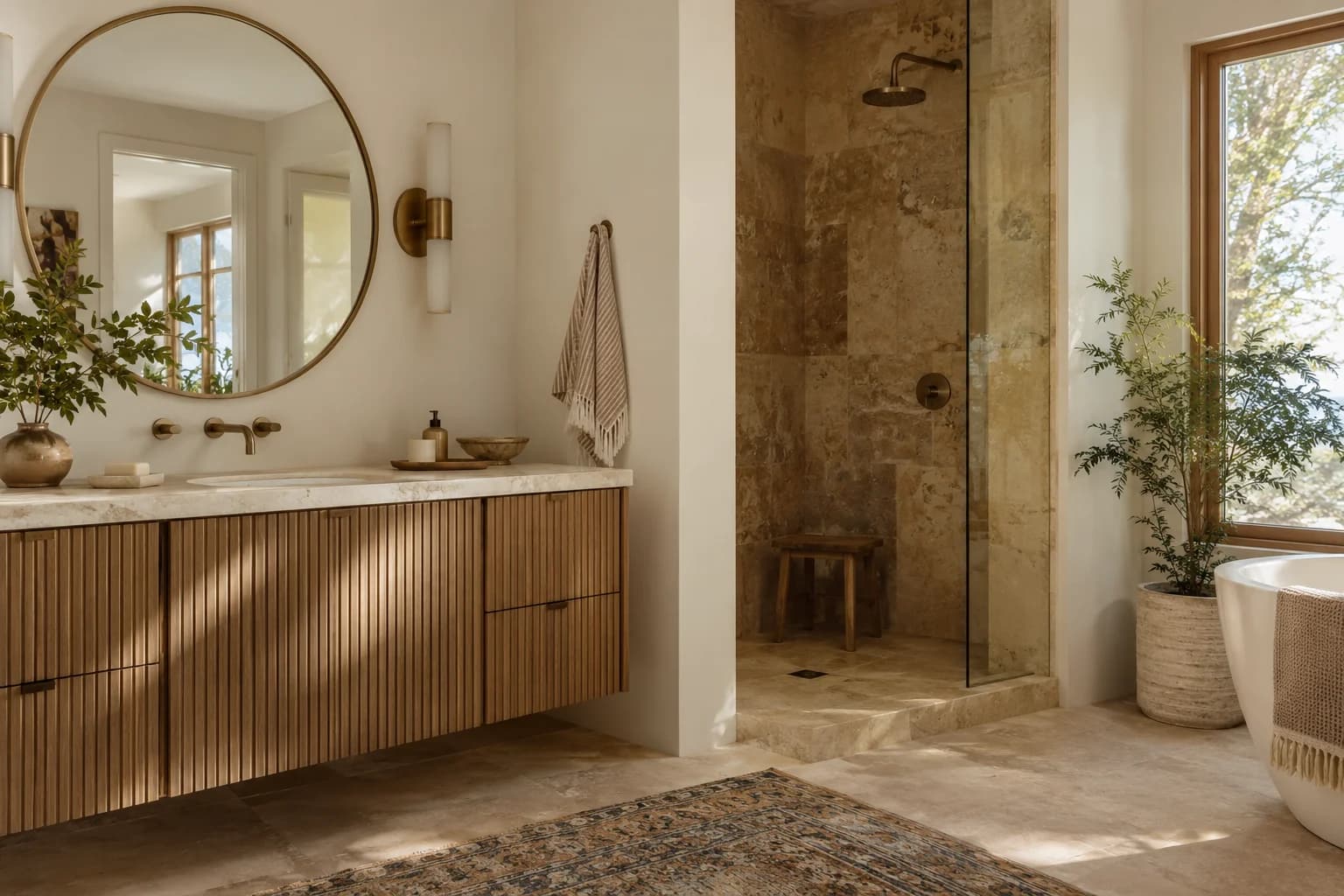
Bathroom
Warm off-white paint complements the ribbed wood vanity and sandy shower tile.
Exterior
See Oatmeal on siding, front doors, trim, and more.
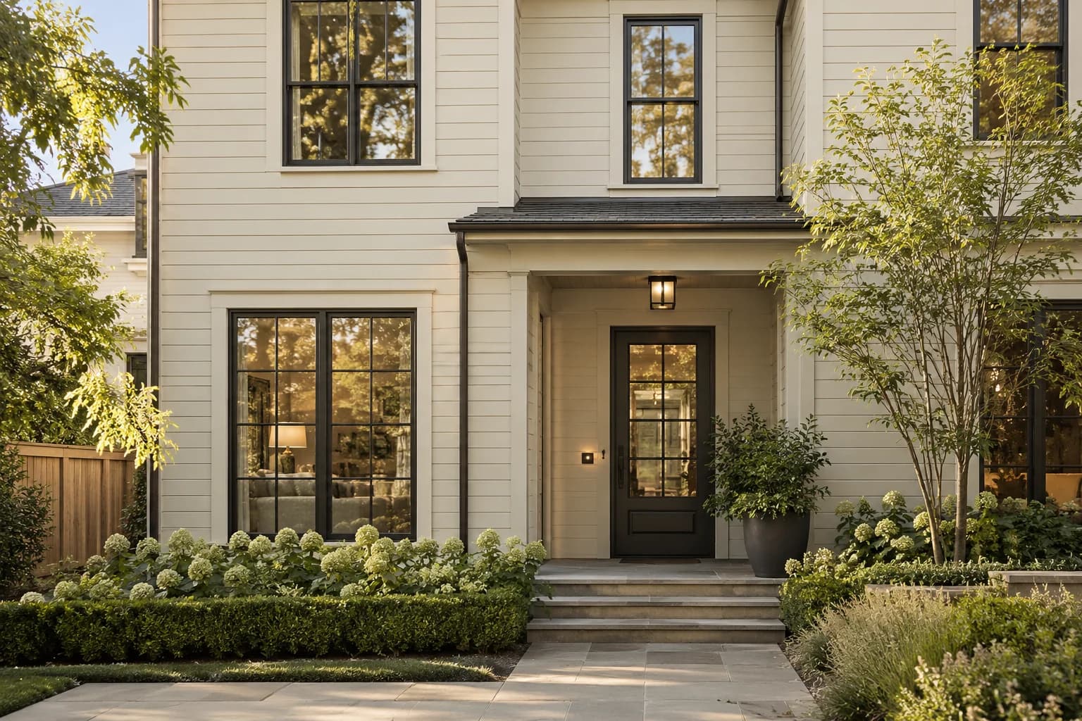
Siding
Off-white clapboards contrast with the dark door and window frames.
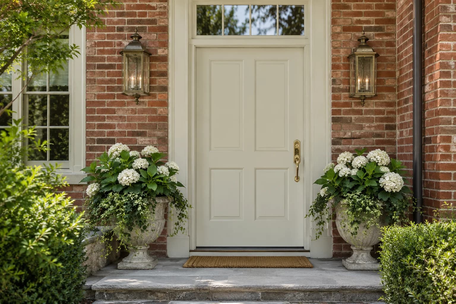
Front door
The creamy paneled door brightens the red brick entrance.
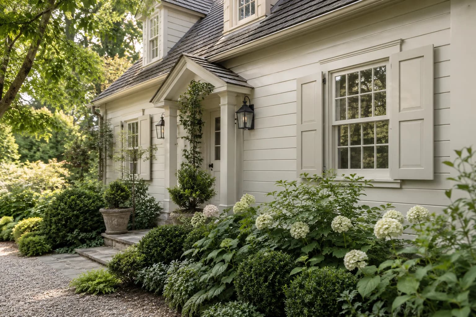
Shutters & trim
Off-white shutters blend with the siding beside the hydrangea beds.
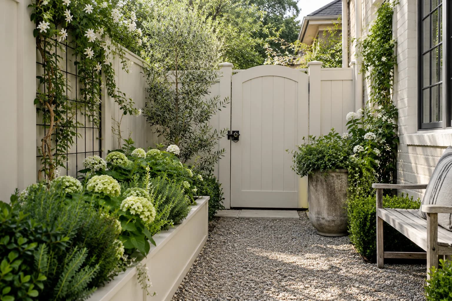
Fences & garden structures
A cream garden gate sits between gravel paving and raised planting beds.
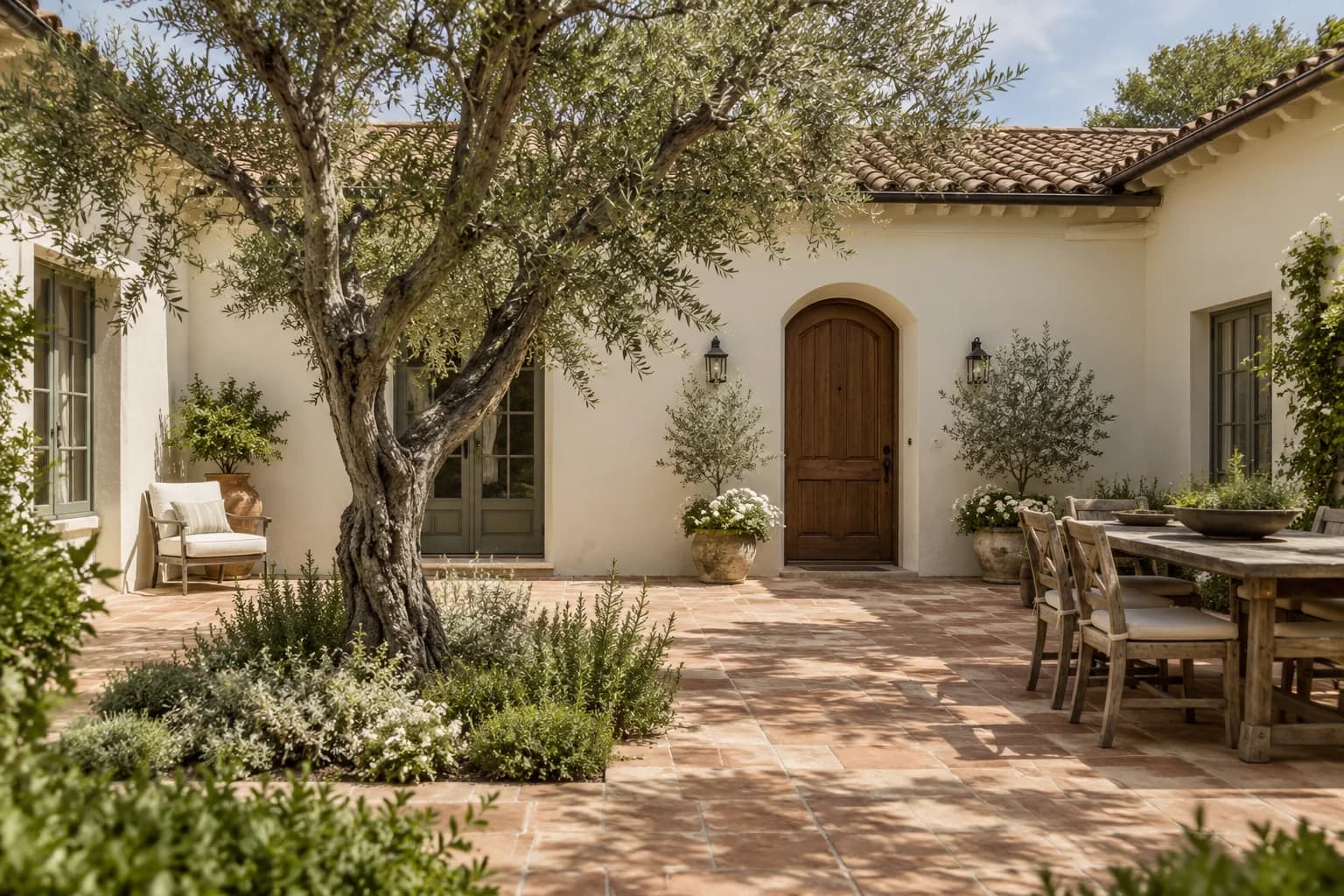
Stucco
Off-white stucco lightens the courtyard around its tree and terracotta paving.
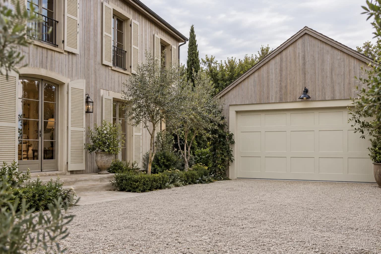
Garage door
The cream garage door sits beneath a pale wood gable beside the gravel drive.
Color pairings
Colors that go with Oatmeal
White and charcoal
Bright trim and a dark accent add definition.
- Oatmeal1023-1 · Main color
- Delicate White1001-1 · Second color
- Black Magic1001-7 · Accent color
Soft white and green
Warm white and olive green soften the contrast.
- Oatmeal1023-1 · Main color
- Gypsum1006-1 · Second color
- Olive Sprig1125-4 · Accent color
Blue and beige
Pale walls with warm beige and deeper blue accents.
- Oatmeal1023-1 · Main color
- Cocoa Cream1079-3 · Second color
- Blue Fjord1163-6 · Accent color
Lighter and darker shades
Warm neutrals, from off-white to brown.
Compare brands
Similar colors from other brands
Frequently Asked Questions