 Paint Visualizer AI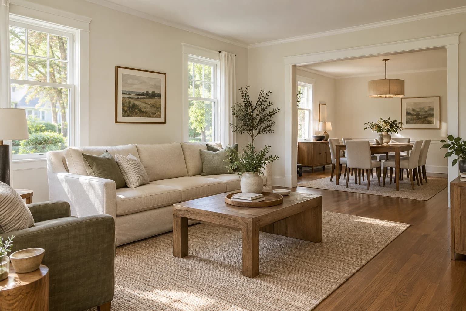
If you're getting your house ready to sell, repainting worn or heavily marked walls is a great idea to make the rooms look cleaner and better cared for.
In a Zillow survey of more than 4,400 recent and prospective buyers, participants viewing images of homes said they would offer an estimated $2,277 more for a home with a chocolate-brown bedroom than one with a white bedroom.
While a new paint color alone doesn't guarantee an increase in your home's value, giving your walls, floors, cabinets, and trim a consistent look can make your property more attractive to buyers.
If your existing paint is in good condition and suits the home, you may only need to freshen up a few areas.
Below, we'll look at nine interior paint colors to consider before selling, explain where each works well, and cover the colors we'd be more careful about choosing.
1. White
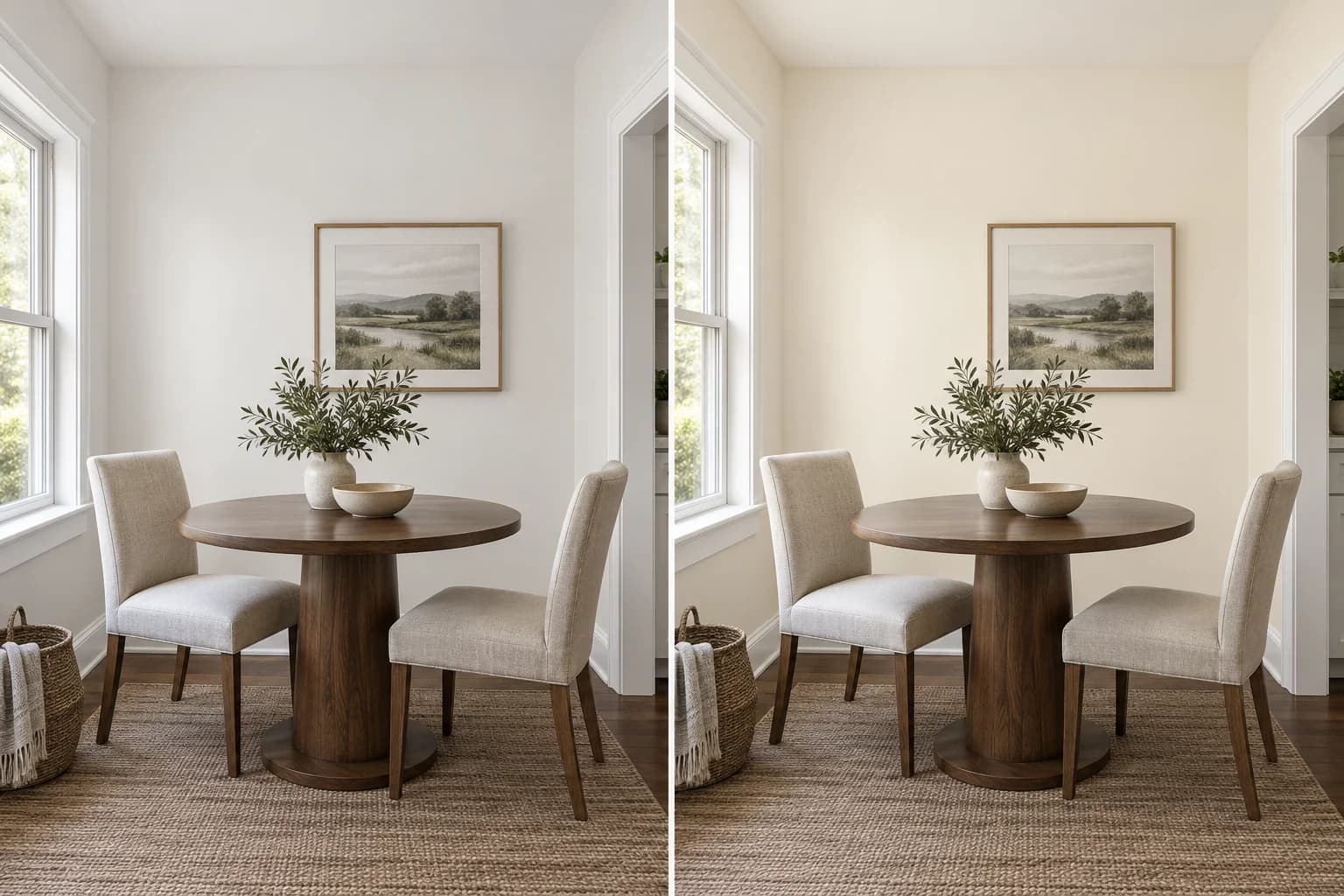
White keeps the walls light and gives you plenty of choice when arranging furniture and decor for listing photos. It's a good option for living rooms, hallways, and open layouts where several rooms are visible together.
You can choose a soft white for a subtle off-white look, a warm white with a little yellow in it, or a creamier white with a more noticeable cream tone.
If your home has beige tile, brown furniture, or warm wood finishes, warmer and creamier shades can give your home a more consistent look.
You can use white in a living room and dining area with dark wood floors. The lighter walls create contrast with the floor, while using the same color helps the two spaces look connected.
Whites can look quite different beside one another, so check your sample against the trim and cabinets before painting all the walls.
Look at it with your lamps on too, since yellow tones can become more noticeable under warm lighting.
| Swatch | Color | Code | Brand |
|---|---|---|---|
White Dove Soft white OC-17 | OC-17 | Benjamin Moore | |
Paramount White Soft white 7006-22 | 7006-22 | Valspar | |
Gypsum Soft white 1006-1 | 1006-1 | PPG | |
Harmonious White Soft white DC-013 | DC-013 | Behr | |
Alabaster Warm white SW 7008 | SW 7008 | Sherwin-Williams | |
Swiss Coffee Creamy white 12 | 12 | Behr |
2. Greige
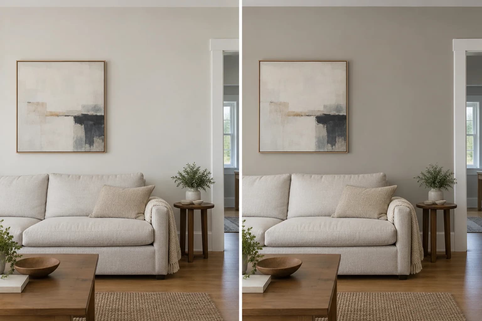
Greige combines gray and beige, which gives you a neutral wall color with a little more color than white. It's a good option for living rooms, dining rooms, bedrooms, and hallways.
Choose a light greige for a subtle change from white or a deeper shade for more contrast with white trim.
You can use greige through a living room and connecting hallway, with white baseboards and doors throughout to make the spaces look consistent.
A pale greige can look almost white near a window and show more color in a shaded corner, so check your sample in both places.
| Swatch | Color | Code | Brand |
|---|---|---|---|
Pale Oak OC-20 | OC-20 | Benjamin Moore | |
Agreeable Gray SW 7029 | SW 7029 | Sherwin-Williams | |
Silver Drop 790C-2 | 790C-2 | Behr | |
Whiskers 1025-3 | 1025-3 | PPG |
3. Warm Beige
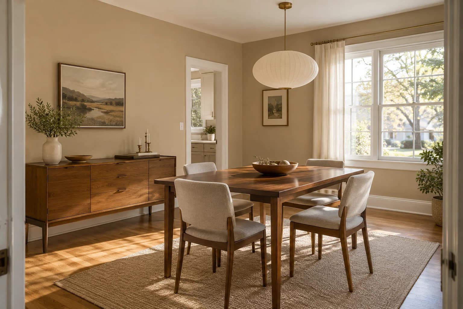
Warm beige gives the walls a warmer, more noticeable color than white.
It's a good option for living and dining rooms with wood floors, cream cabinetry, or brown stone.
You can pair warm beige walls with white trim and a light ceiling. This keeps the room's palette warm while giving the walls some contrast with the woodwork.
If you already have beige carpet or upholstery, check how much contrast you'll get. You may prefer a lighter wall shade so the walls, floor, and furniture don't all look the same.
| Swatch | Color | Code | Brand |
|---|---|---|---|
Accessible Beige SW 7036 | SW 7036 | Sherwin-Williams | |
Litchfield Gray HC-78 | HC-78 | Benjamin Moore | |
Synchronicity 1021-2 | 1021-2 | PPG | |
Even Better Beige DC-010 | DC-010 | Behr |
4. Taupe
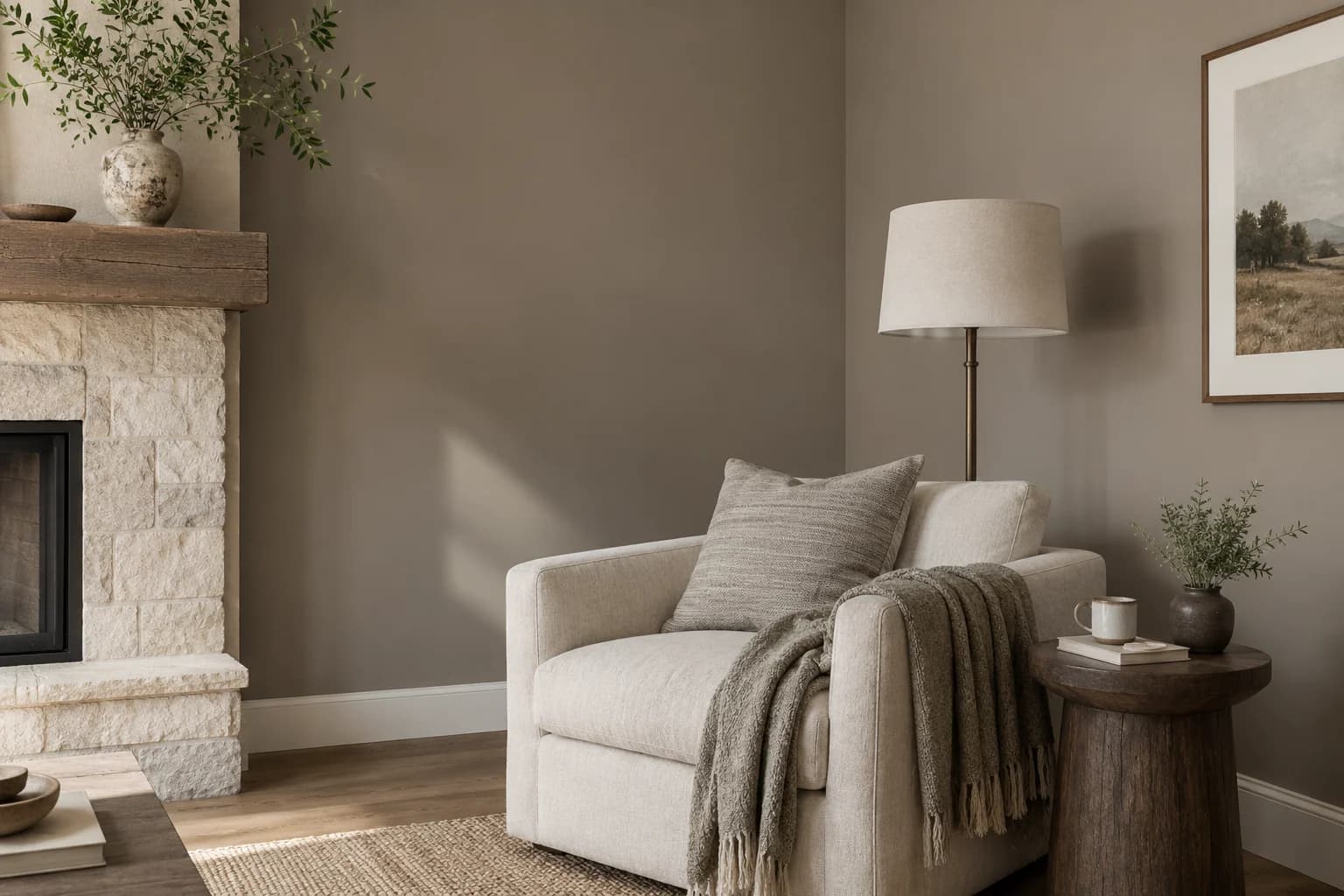
Taupe combines brown and gray, which gives the walls an earthier look than a pale greige.
It's a good option for living rooms, dining rooms, and bedrooms with cream fabrics, wood furniture, or stone finishes.
You can pair taupe walls with a cream sofa, a wood coffee table, and white trim. The lighter furniture and trim give you some contrast with the walls.
Some taupes show pink or purple tones beside other finishes. Check your sample against the floor and any large pieces of furniture that will stay in the room for viewings.
| Swatch | Color | Code | Brand |
|---|---|---|---|
Pashmina AF-100 | AF-100 | Benjamin Moore | |
Poised Taupe SW 6039 | SW 6039 | Sherwin-Williams | |
Perfect Taupe PPU18-13 | PPU18-13 | Behr |
5. Green
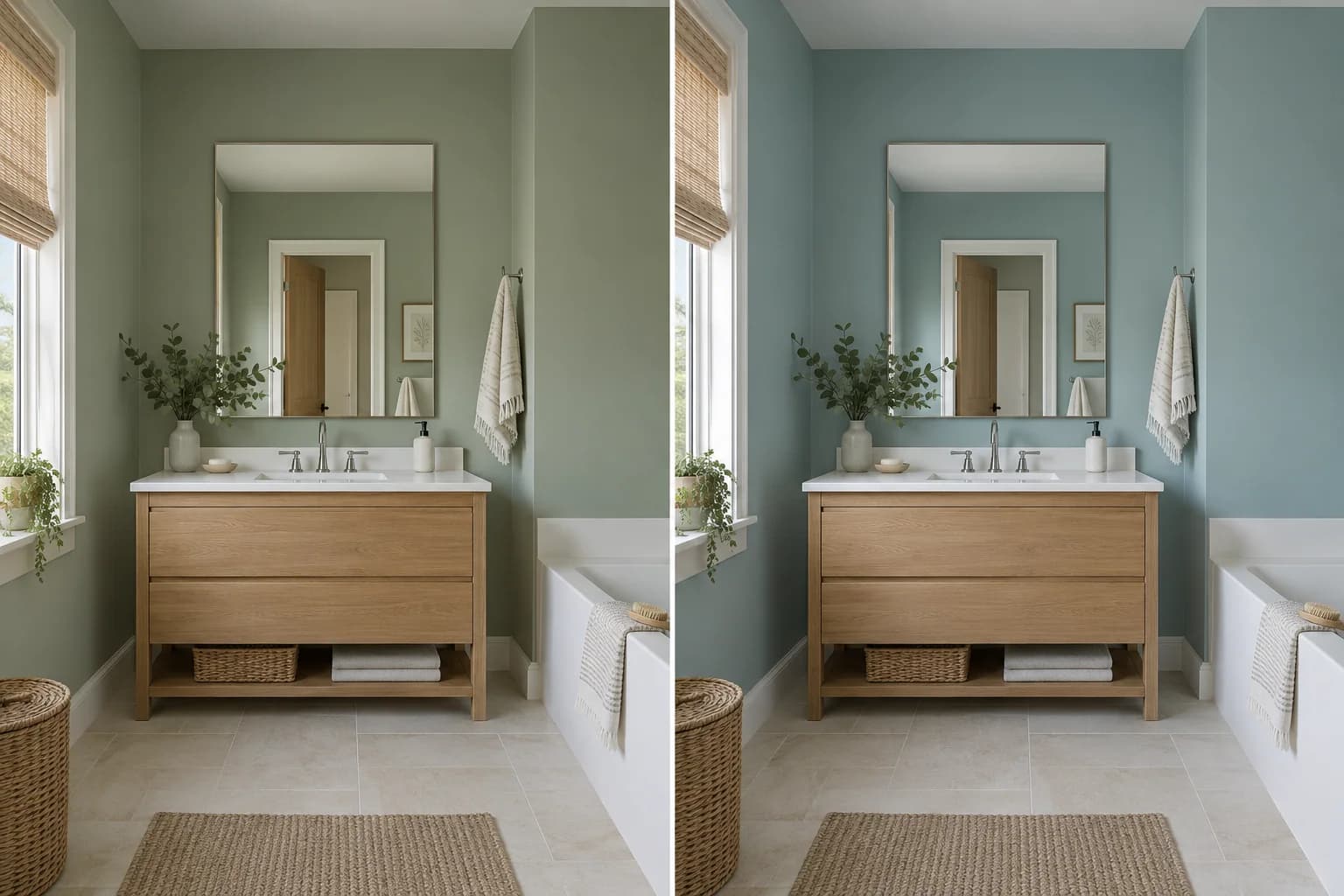
Green adds color to the walls, and softer shades are easy to pair with white, cream, or natural wood furnishings.
It's a good option for bedrooms, bathrooms, and living rooms. You can try a muted sage for a warmer look or a blue-green if you prefer a cooler shade.
You can use soft green in a bedroom with an oak bed and light bedding. In a bathroom, a muted blue-green can sit alongside a wood vanity and white countertop.
A blue-green sample may look more blue, green, or gray depending on the light and surrounding colors, so compare it at different times of day.
| Swatch | Color | Code | Brand |
|---|---|---|---|
Liveable Green SW 6176 | SW 6176 | Sherwin-Williams | |
Spring Thaw 1508 | 1508 | Benjamin Moore | |
Sea Salt SW 6204 | SW 6204 | Sherwin-Williams | |
Gray Cashmere 2138-60 | 2138-60 | Benjamin Moore |
6. Pale Blue
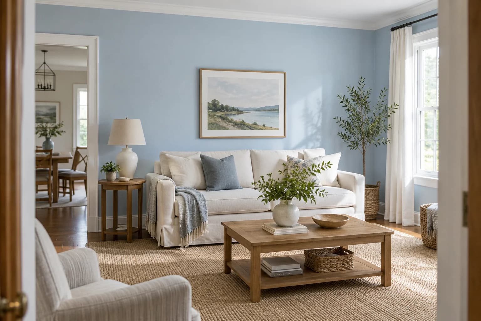
Pale blue adds color to the walls while keeping the room light.
It's a good option for living rooms and bedrooms where you want a softer color than a bright blue.
You can pair pale blue living-room walls with white trim, a cream sofa, and a wood coffee table.
If the room already has gray flooring and gray upholstery, check whether the blue makes the whole space feel too cool.
Look at it from adjoining rooms too, especially where you can see the kitchen cabinets or hallway walls.
| Swatch | Color | Code | Brand |
|---|---|---|---|
Tradewind SW 6218 | SW 6218 | Sherwin-Williams | |
Brittany Blue 1633 | 1633 | Benjamin Moore | |
Sky Splash 1037-2 | 1037-2 | PPG | |
Urban Raincoat N440-2 | N440-2 | Behr |
7. Charcoal
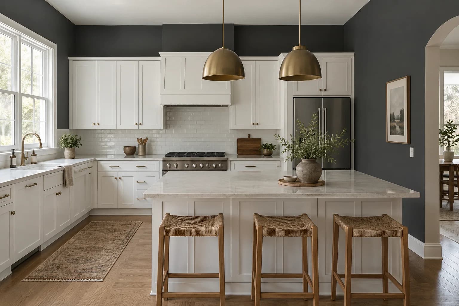
Charcoal creates a strong contrast with white cabinets, pale counters, and light trim.
It's a good paint option for kitchens with limited exposed wall space or living rooms where a darker color suits the existing finishes.
You can use charcoal on the walls around white kitchen cabinets to make the cabinetry more noticeable. A narrow strip above a backsplash will give you a different result from covering four full walls.
Check how much dark color the room already has. If the floors, cabinets, and counters are dark too, compare charcoal with a lighter neutral before deciding.
| Swatch | Color | Code | Brand |
|---|---|---|---|
Peppercorn SW 7674 | SW 7674 | Sherwin-Williams | |
Gray 2121-10 | 2121-10 | Benjamin Moore | |
Shadow Mountain PPU24-22 | PPU24-22 | Behr | |
Jet DE6378 | DE6378 | Dunn-Edwards |
8. Chocolate Brown
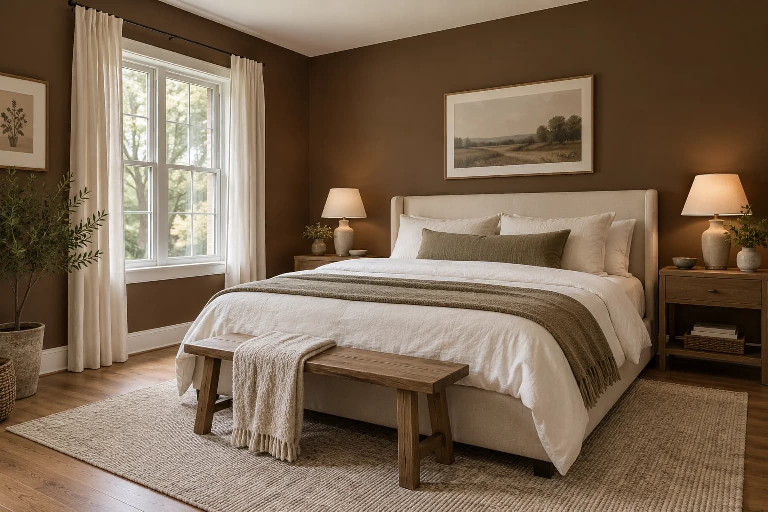
Chocolate brown gives the walls a deeper, warmer color and creates a noticeable contrast with white bedding and a light ceiling.
It's a good option for a bedroom where you want a warmer, more enclosed feel.
You can pair chocolate-brown walls with light bedding and cream curtains.
If the room already has dark carpet and a large dark wood bed, compare brown with a lighter beige so the shade works with the room you're selling.
| Swatch | Color | Code | Brand |
|---|---|---|---|
Turkish Coffee SW 6076 | SW 6076 | Sherwin-Williams | |
Tudor Brown HC-185 | HC-185 | Benjamin Moore | |
Spiced Hot Chocolate DET691 | DET691 | Dunn-Edwards | |
Cola No. 9918 | No. 9918 | Farrow & Ball |
9. Muted Plum
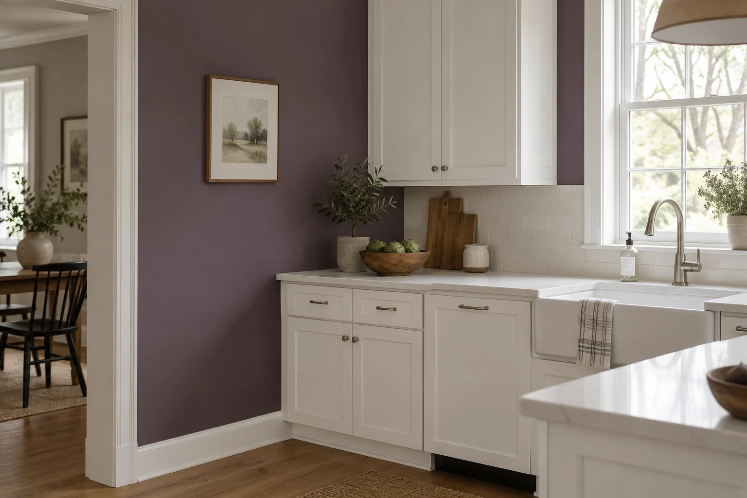
Muted plum gives the walls a deeper purple color with a softer look than a bright violet.
It's a good option for kitchens with light cabinets and counters, especially when only a small amount of wall is visible.
You can use plum on the walls around white kitchen cabinets, with a pale countertop and a simple backsplash.
| Swatch | Color | Code | Brand |
|---|---|---|---|
Expressive Plum SW 6271 | SW 6271 | Sherwin-Williams | |
Plum Brown SW 6272 | SW 6272 | Sherwin-Williams |
What Paint Colors Work for Different Rooms in the House?
You can use the same color through the main living areas and choose something different for bedrooms or bathrooms.
The important thing is to check how the colors look together, especially where one room opens into another.
Living Rooms and Dining Rooms
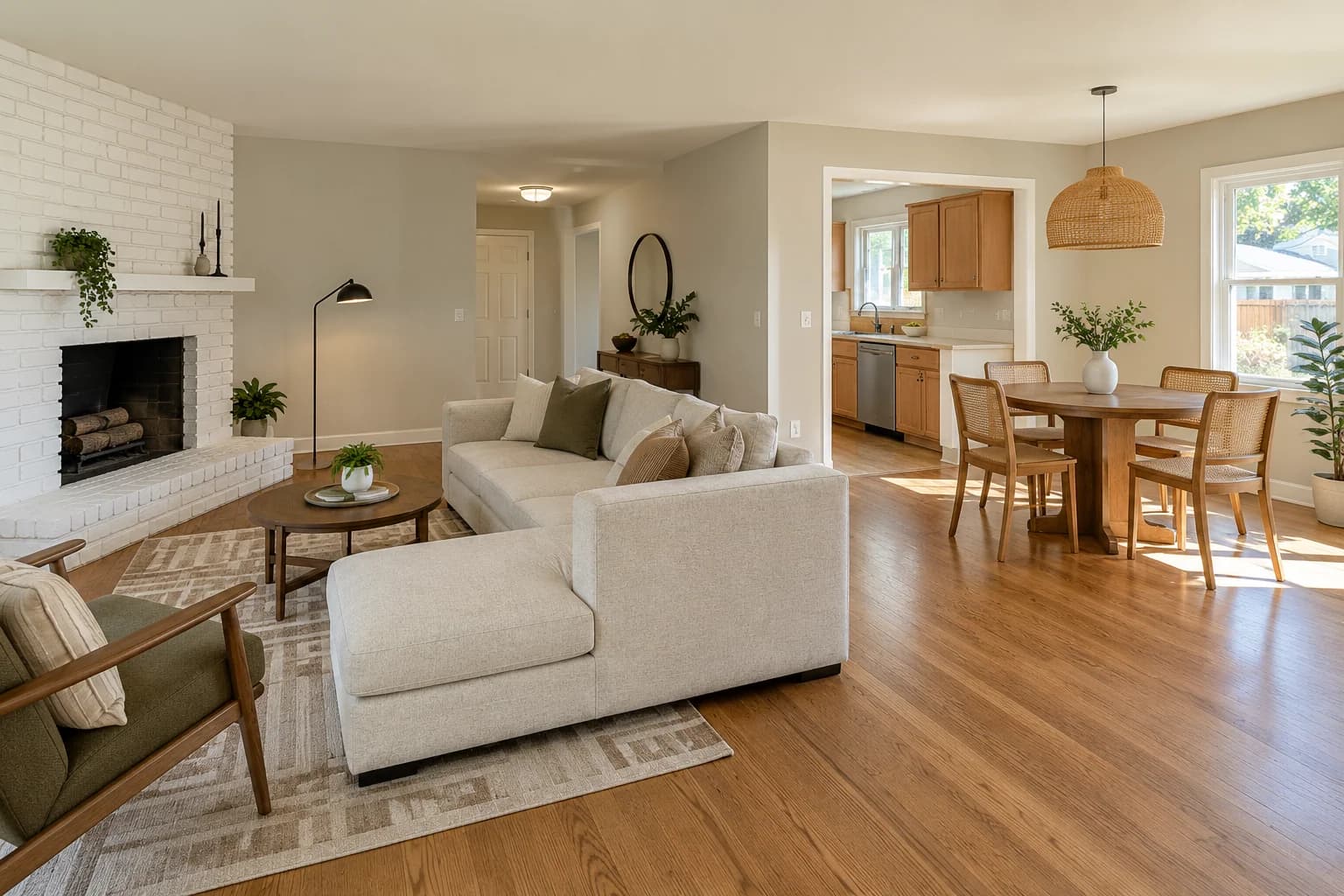
Soft white, greige, beige, and taupe work well for connected living and dining spaces.
Compare samples with the floor, sofa, fireplace, and built-in cabinets, since these take up much of the view.
Pale blue is another option if you want some color.
For an open layout, stand where you can see the living room and kitchen together.
Choose the wall color from that view as well as from inside each room, especially if the kitchen cabinets are staying.
Kitchens
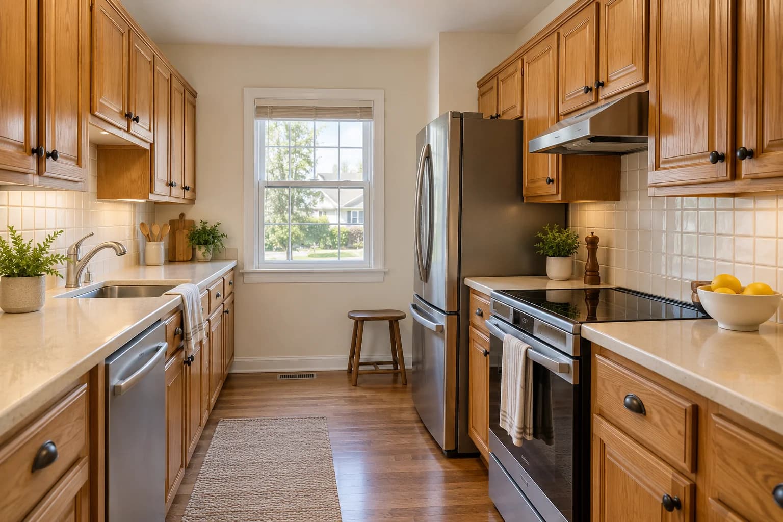
Choose the kitchen wall color around your cabinets, countertop, and backsplash.
Try soft white or beige with warm wood or cream cabinets. With white cabinets and lighter counters, charcoal and muted plum are other options.
If the cabinets are in good condition, changing the walls may be enough to freshen up the room.
Check your sample against the backsplash in daylight and with the kitchen lights on.
Bedrooms
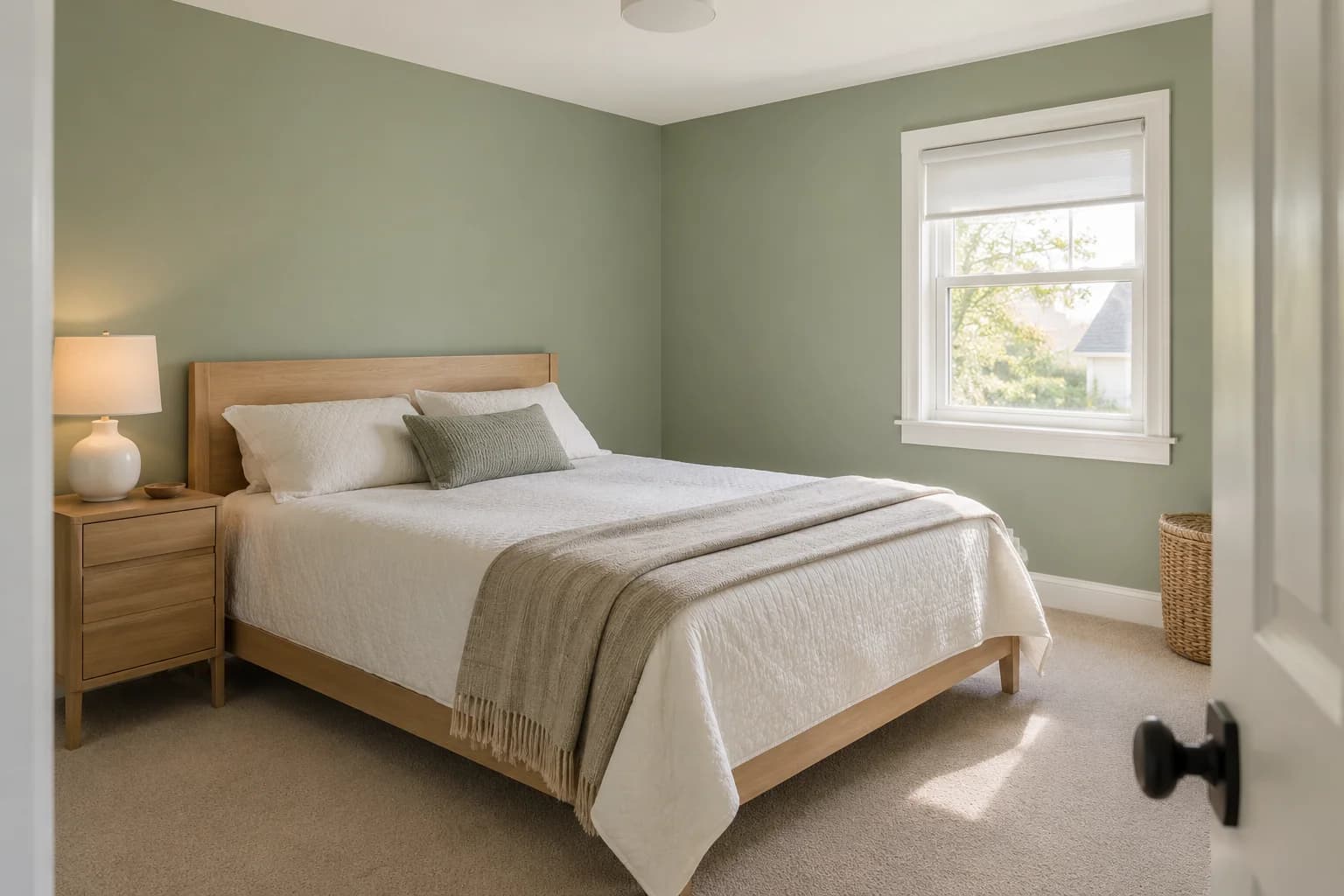
Sage green, pale blue, soft white, and light greige work well in bedrooms. Start with the carpet or flooring, then look at the furniture and bedding you'll use in listing photos.
Chocolate brown is worth testing if you prefer a deeper color for the main bedroom. Keep the rest of the palette simple so you can judge how the walls work with the bed, curtains, and ceiling.
If you plan to cover bright colors in the children's bedrooms, you can use the same neutral as the hallway.
Bathrooms
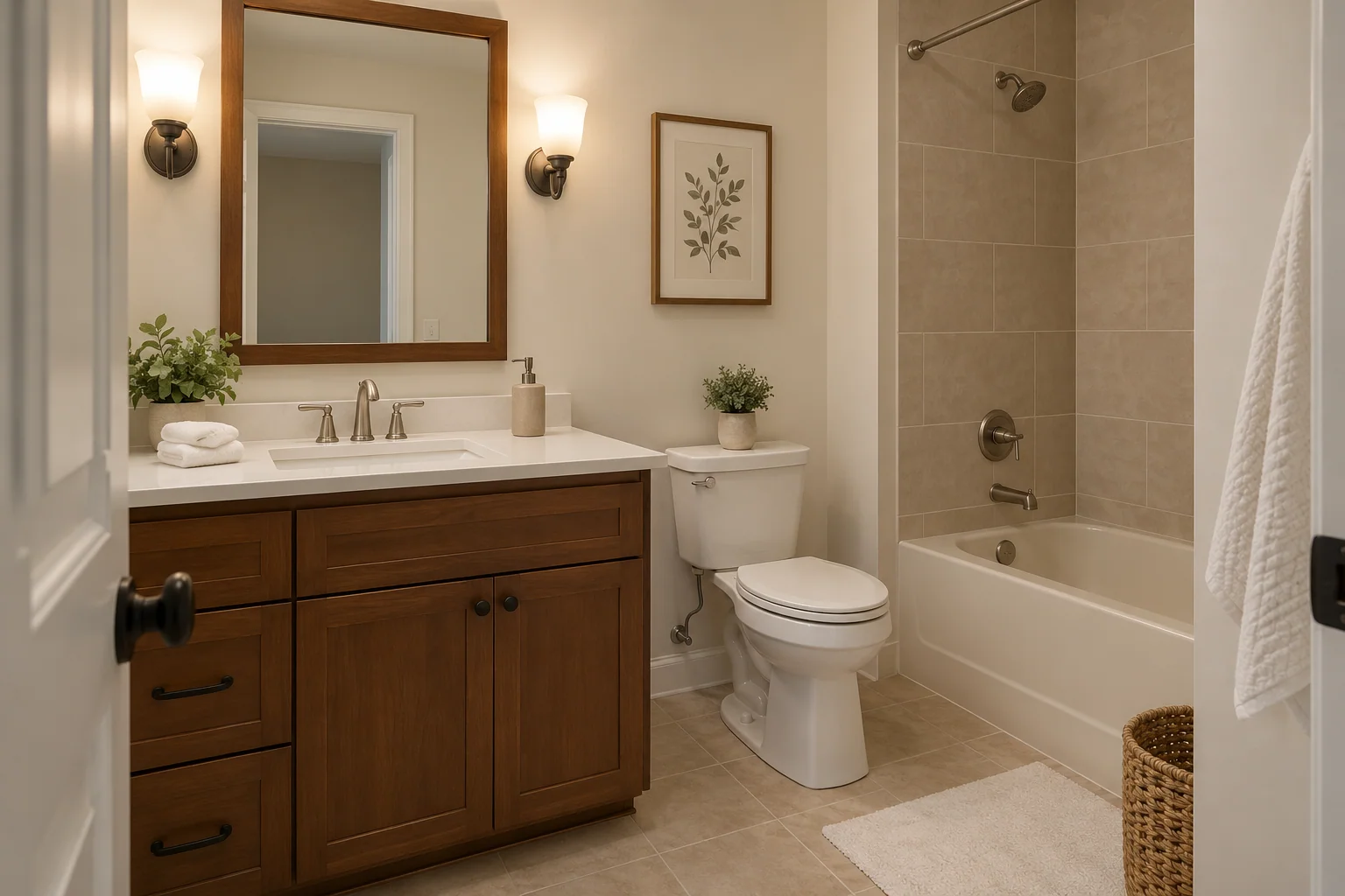
Soft white and muted sage are good colors to compare with your bathroom tile and vanity.
In a bathroom without a window, judge your samples under the lights buyers will actually use.
Also choose a paint product suitable for the room's moisture conditions; the color alone doesn't determine how well the finish will hold up.
Entryways and Hallways
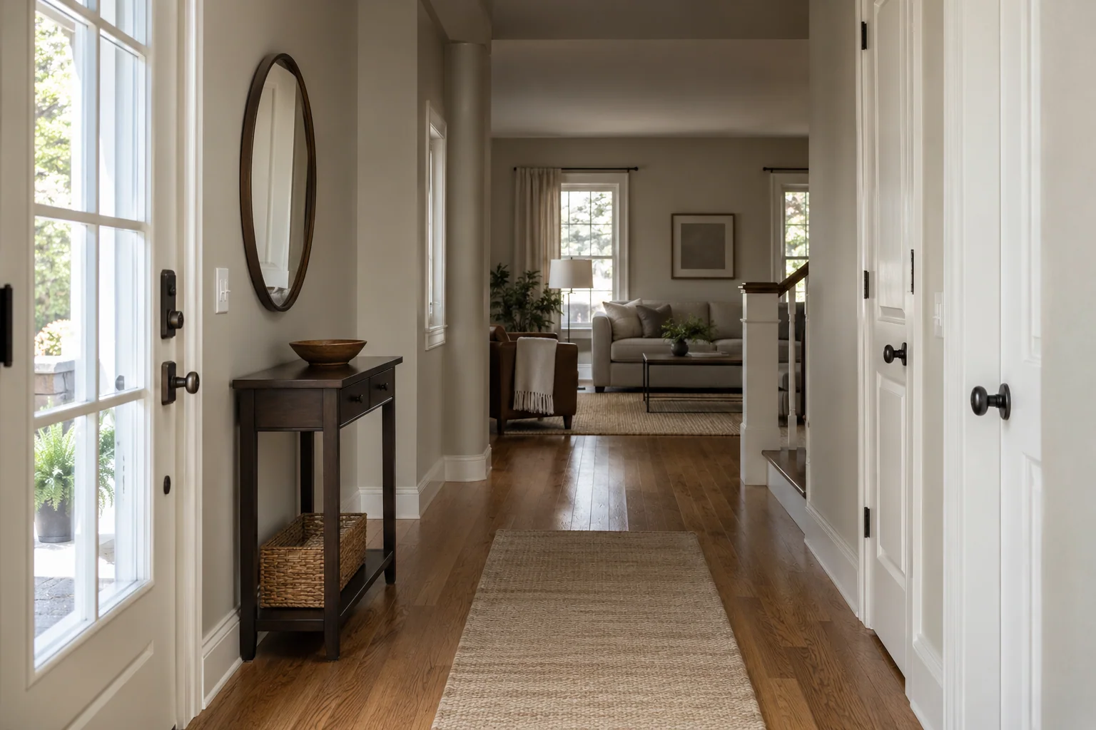
Using the living-room white or greige through your entryway and hallway helps the spaces look connected.
It also means you have fewer colors to choose before getting the house ready to list.
Check the sample at the darkest end of the hall, not only near the front door. Keep the trim color consistent where possible, and look closely at door frames and baseboards for marks that may need attention.
For the walls, compare the finished appearance and the color.
Flat or matte finishes can make minor surface imperfections less noticeable, while eggshell and satin offer other options depending on the product and cleaning needs.
Paint Colors to Avoid Before Selling
Before selling, we'd avoid adding colors that clash with your floors or cabinets, or make each room look disconnected from the next. Here are some choices to be careful with.
Bold red, ochre yellow, and blush pink
Bold red can make the walls the main focus in listing photos, drawing attention away from features such as the fireplace or woodwork. Ochre yellow can add too much warmth to a room that already has orange-toned wood floors or golden oak cabinets.
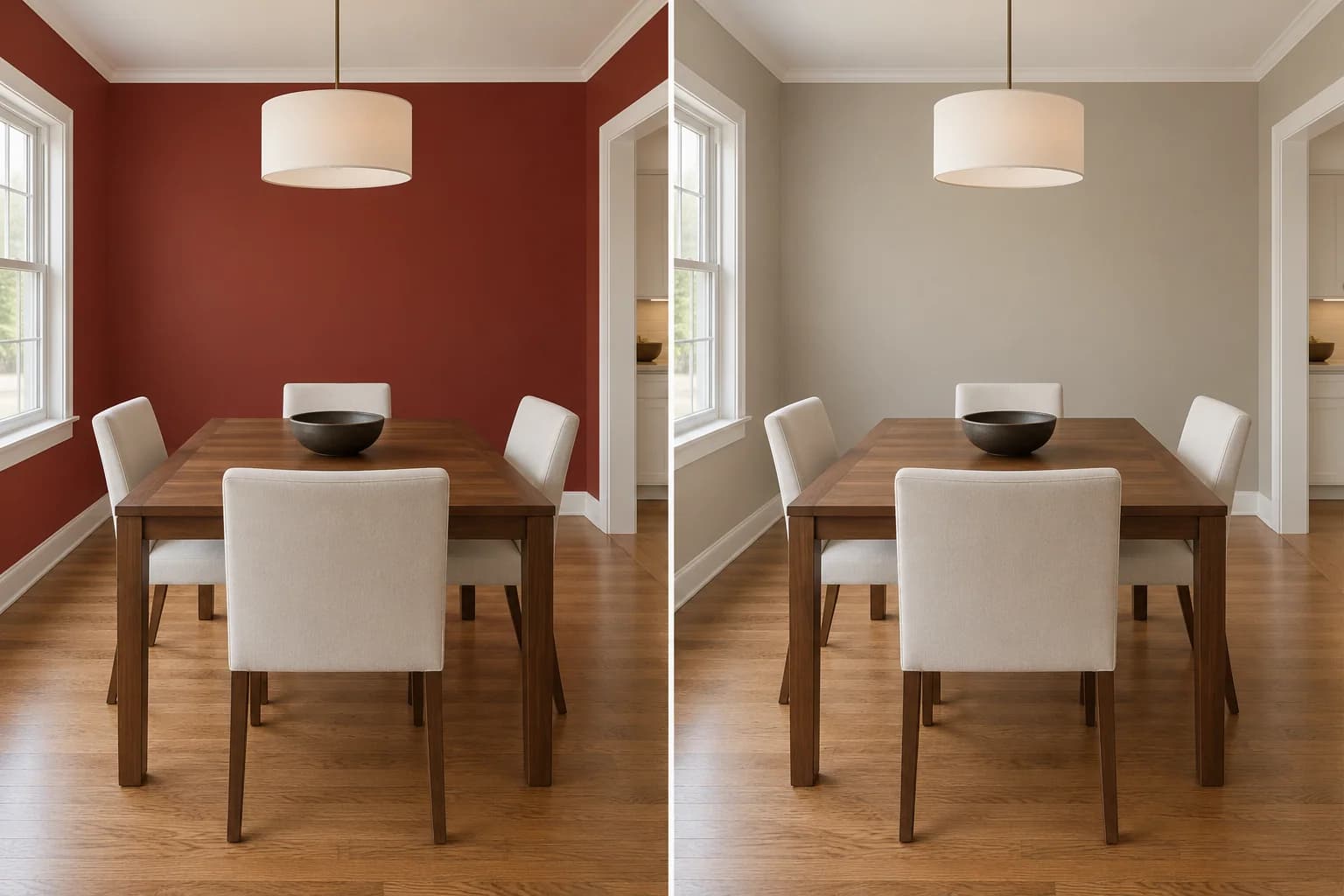
Blush pink is softer, but its rosy tone can be difficult to coordinate with some beige carpets or cream finishes. If you're already repainting a red dining room or pink bedroom, consider a soft white, greige, or beige that works with the surfaces you're keeping.
Be careful with bright white beside cream finishes
If you're painting the walls a much brighter white, it can make older cream cabinets, trim, or fixtures look more yellow by comparison. The difference is especially noticeable where the two meet, such as along a cabinet edge or door frame, even when both surfaces are clean and in good condition.
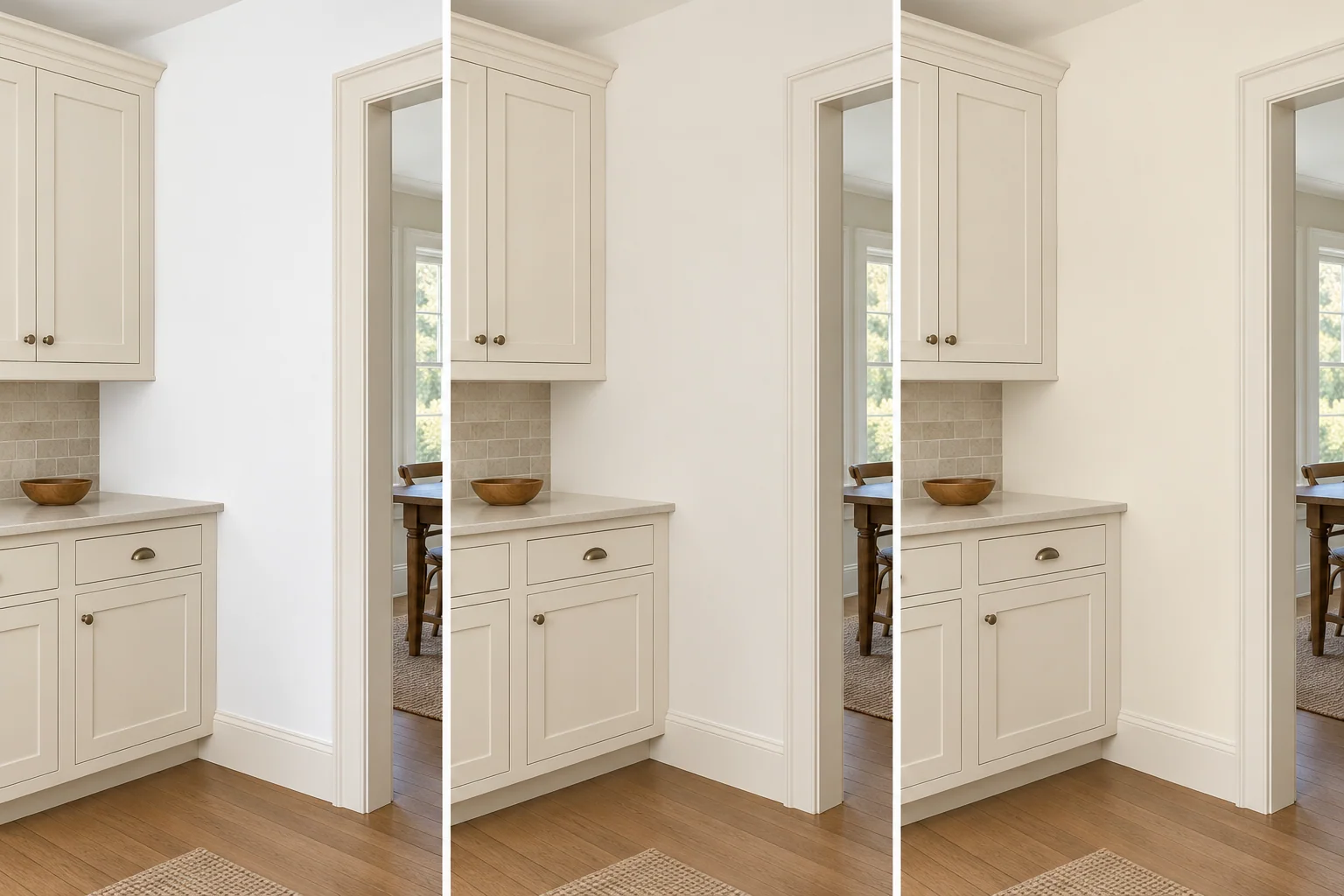
If your cabinets, bathtub, and trim are staying, choose the wall color around them. A softer or creamier white may give you a better combination without needing to repaint several other surfaces to match the new walls.
Check cool gray against warm wood
Some grays look more blue or purple beside orange-toned flooring than they do on a paint card. That contrast can make the orange in the wood more noticeable, which may be the opposite of what you want if you're trying to soften the look of older oak floors or cabinets.
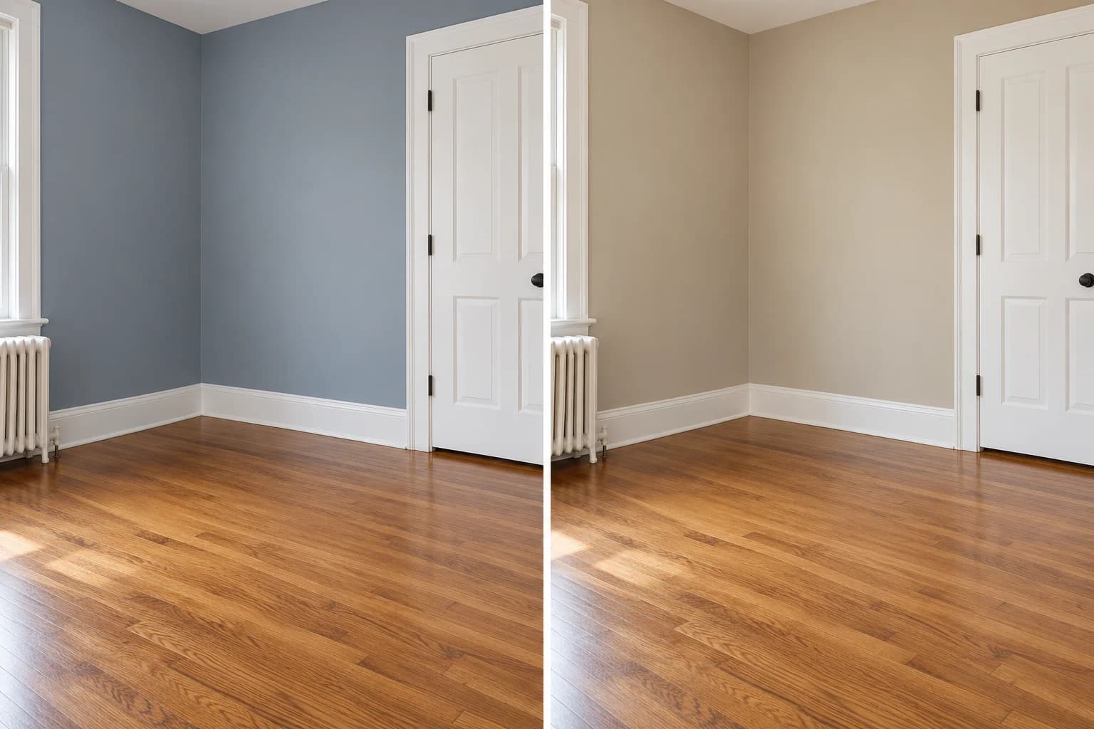
Compare a warmer greige or beige beside the wood itself. You don't need to match the floor, but look for a wall shade that lets the two surfaces sit comfortably together. If the wood runs through several rooms, check the combination in those rooms before choosing one paint color for all of them.
Avoid using a dark color everywhere without checking each room
Charcoal may suit a kitchen with white cabinetry but create a very different result in a narrow hallway. In the kitchen, cabinets and a backsplash can break up the darker paint. In a hall, the same color may cover nearly every surface at eye level.
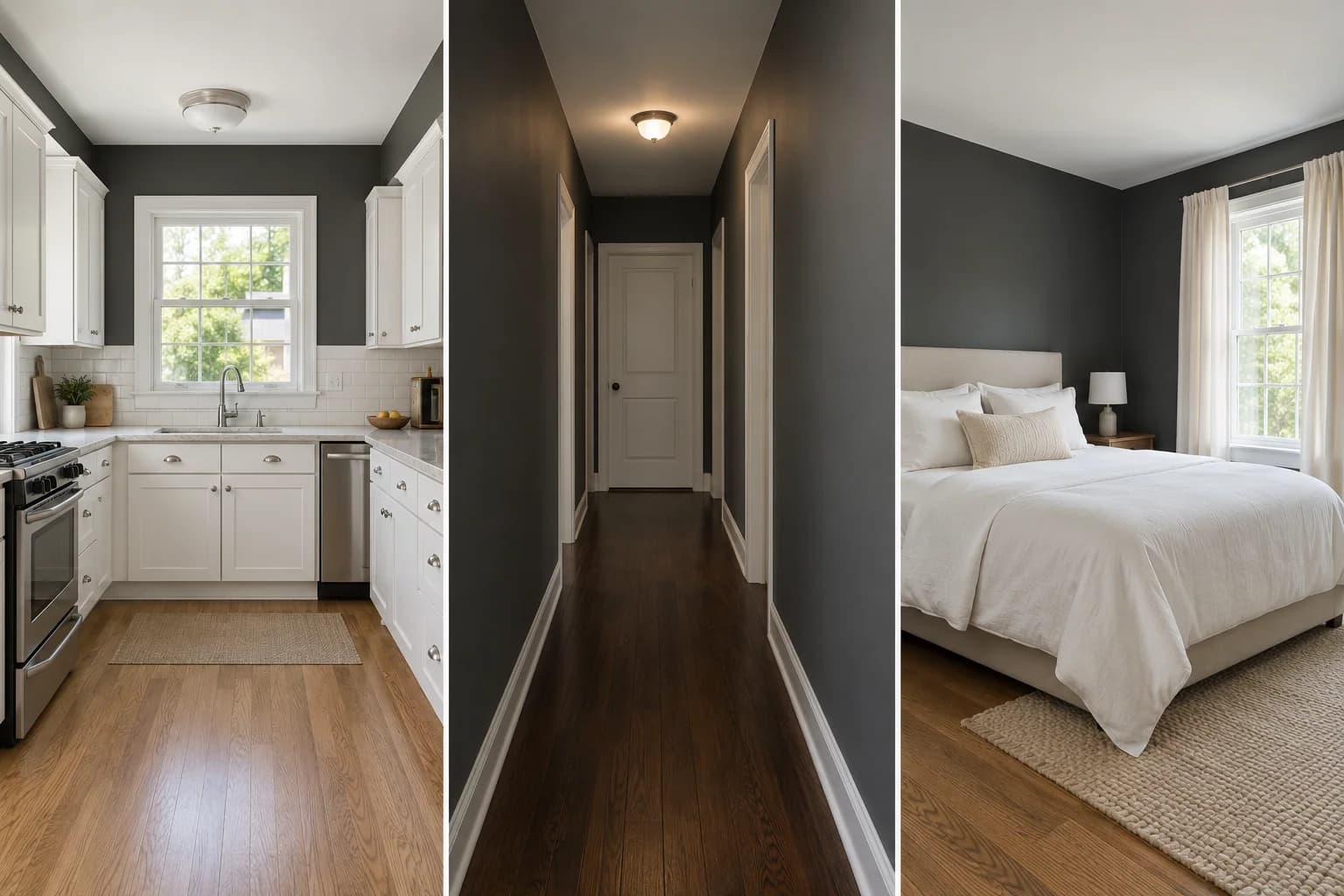
Dark walls also reflect less light, so a room with small windows, dark flooring, or limited lighting can feel dimmer after repainting. You can keep a deeper color in a bedroom or kitchen where it suits the space and use a lighter neutral in connecting halls. Check each room rather than choosing a dark shade for the whole house from one sample.
Find the Right Paint Colors Before Listing Your Home
Choosing a paint color that works with your flooring, cabinets, and trim can help your home look better cared for before it goes on the market.
Upload a photo of your room to see how soft white, greige, or sage would look with your existing finishes.
You can preview real paint colors from Sherwin-Williams, Benjamin Moore, Behr, Farrow & Ball, PPG, and Valspar, plus custom colors.
Once you've narrowed down your favorites, check them with physical paint samples in daylight and under your evening lighting before buying paint for the whole space.
Virtually paint your interior with Paint Visualizer AI today!