 Paint Visualizer AI
A small bathroom with no windows can easily feel dark, closed in, or flatter than you expected, especially when all of the light comes from ceiling fixtures and vanity lights.
When there’s no natural light entering the room, shadows also tend to be more noticeable, and the walls, floor, vanity, tile, and other finishes all compete for the same limited light.
The right paint can make small, windowless bathrooms feel brighter, softer, warmer, more open, or intentionally cozy.
In this article, we’ll look at seven paint options for a small bathroom with no windows, including lighter and deeper choices, along with practical advice for choosing the right one for your space.
1. White
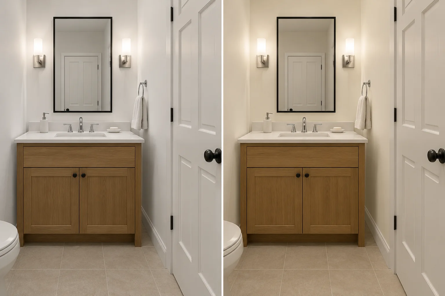
White is one of the easiest places to start in a small bathroom with no windows, especially if the room already has white tile, a white sink, or other light finishes.
A softer white can help the walls reflect more of the available artificial light without making the bathroom feel overly stark. It also gives you a neutral backdrop if the vanity, flooring, shower tile, or countertop already brings stronger color or pattern into the space.
Benjamin Moore White Dove is a softer option, while Sherwin-Williams Alabaster, Behr Blank Canvas, and Behr Swiss Coffee lean warmer and can work well with beige tile, cream countertops, or wood vanities.
If your sink, tub, shower tile, or trim is a crisp white, a creamier wall color can look more yellow beside it, especially under warm bathroom lighting.
You can also use the same soft white across the walls and ceiling if you want a more consistent look throughout a very small bathroom.
If that feels too neutral, bring in contrast through the vanity, towels, hardware, or shower curtain instead.
| Swatch | Color | Code | Brand |
|---|---|---|---|
White Dove Soft white OC-17 | OC-17 | Benjamin Moore | |
Alabaster Warm white SW 7008 | SW 7008 | Sherwin-Williams | |
Blank Canvas Warm white DC-003 | DC-003 | Behr | |
Swiss Coffee Creamy white 12 | 12 | Behr |
2. Beige and Greige
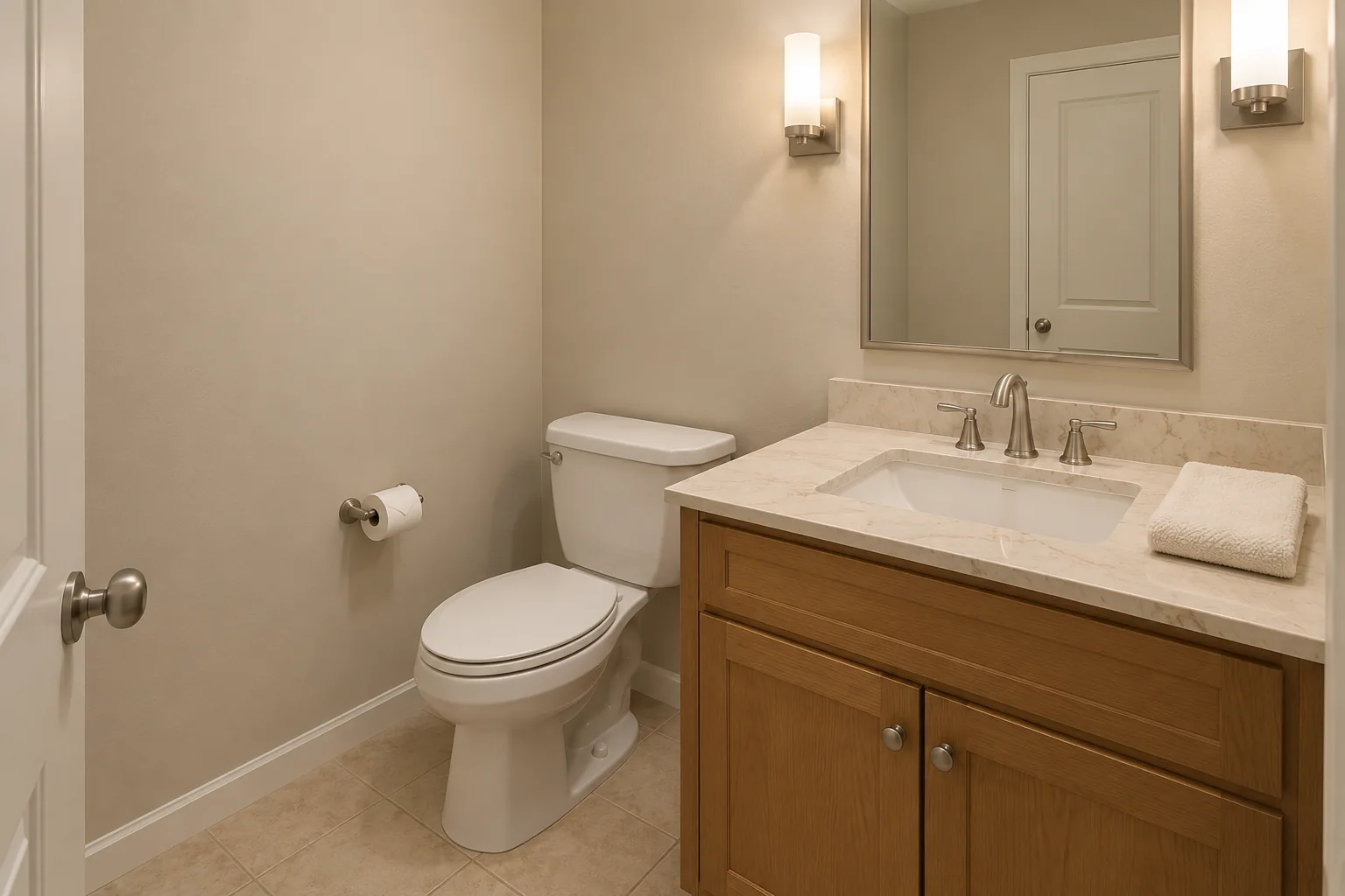
Beige and greige can work well in a windowless bathroom when white feels too stark or when the room already has warmer finishes.
They look great with beige floor tile, natural stone, wood vanities, cream countertops, or other finishes that may look disconnected beside a crisp white wall.
Greige adds gray to the warmth of beige, which can give a more neutral backdrop without making the room feel cold.
Benjamin Moore Pale Oak is a lighter option worth comparing, while Edgecomb Gray adds a little more depth. Sherwin-Williams Accessible Beige is warmer and can work particularly well if the bathroom includes wood or beige-toned finishes.
Some greiges can reveal pink, violet, green, or warmer undertones beside certain tiles and countertops, even when those undertones weren't obvious on the paint chip.
| Swatch | Color | Code | Brand |
|---|---|---|---|
Pale Oak Pale greige OC-20 | OC-20 | Benjamin Moore | |
Edgecomb Gray Warm greige HC-173 | HC-173 | Benjamin Moore | |
Accessible Beige Beige with gray SW 7036 | SW 7036 | Sherwin-Williams |
3. Green
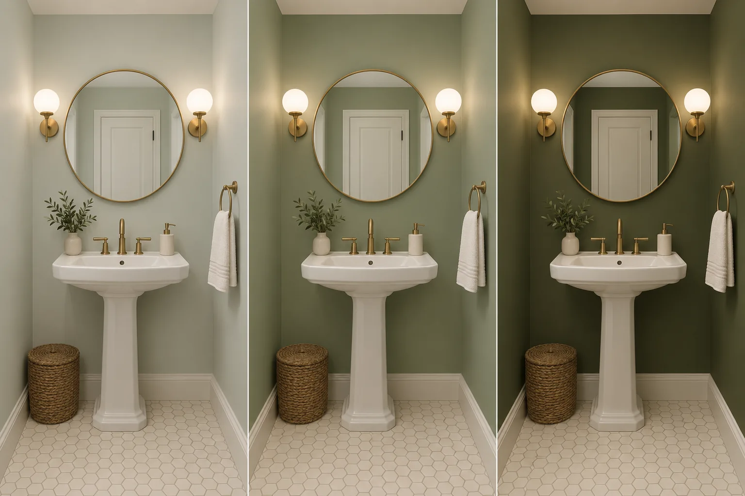
Green lets you add noticeable color without making a small bathroom feel heavy.
Lighter gray-greens and muted sages can work particularly well with white tile, wood vanities, cream surfaces, and natural materials. They bring more personality than a neutral while still giving you plenty of flexibility with the other finishes.
Sherwin-Williams Sea Salt is a pale green with gray and blue influences and works as a softer starting point. Benjamin Moore October Mist gives you a more obvious sage if you want the walls to have a little more presence.
You don't have to stay light, either. A deeper olive such as Sherwin-Williams Palm Leaf can create a moodier bathroom, especially in a powder room where you may want the small scale to feel intentional rather than trying to disguise it.
Keep in mind that deeper greens absorb more available light and may look substantially darker in corners or areas away from the vanity lights.
If the bathroom has paneling or another natural break in the wall, you could also use green on one portion and a softer white on the rest.
| Swatch | Color | Code | Brand |
|---|---|---|---|
Sea Salt Pale gray-green SW 6204 | SW 6204 | Sherwin-Williams | |
October Mist Muted sage 1495 | 1495 | Benjamin Moore | |
Palm Leaf Deep olive SW 7735 | SW 7735 | Sherwin-Williams |
4. Blue
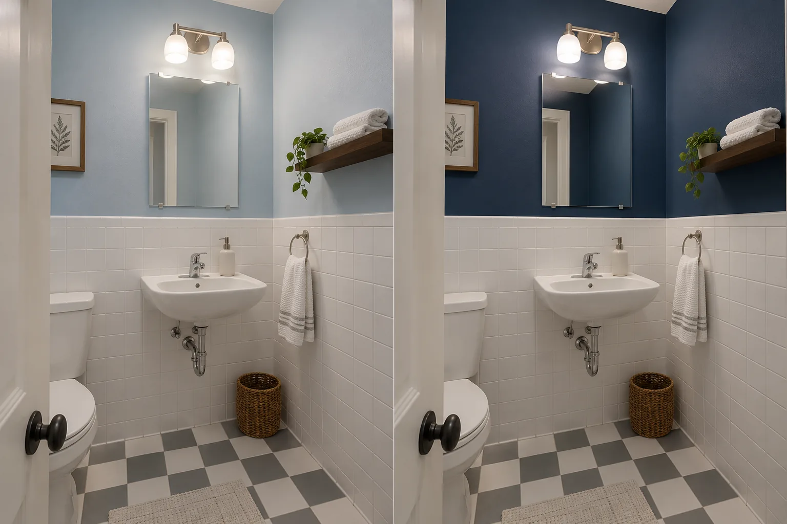
Blue can give a small bathroom a clean, relaxed look, particularly when the room already has white shower tile, a white sink, or chrome fixtures.
A pale blue keeps some color on the walls without creating the same contrast as a navy or another deep shade. Benjamin Moore Breath of Fresh Air gives you a clearer light blue, while Sherwin-Williams Misty has more gray and produces a softer, more muted result.
The difference between those directions becomes more noticeable in a bathroom without windows. Under cool bulbs, a gray-blue can feel considerably cooler, especially if the room also has gray floor tile, white fixtures, and chrome hardware.
If that combination starts to feel too cold, you can balance it with a wood vanity, warmer metals, woven accessories, or a less icy shade of blue.
Navy takes the room in a very different direction. Benjamin Moore Hale Navy can work particularly well in a powder room or above white tile or paneling, where the lighter surfaces provide contrast.
You could also keep the ceiling light and make sure there is adequate lighting around the mirror. Like deeper green, navy works best when you are comfortable leaning into a darker, more dramatic bathroom rather than trying to make the room look as bright as possible.
| Swatch | Color | Code | Brand |
|---|---|---|---|
Breath of Fresh Air Light blue 806 | 806 | Benjamin Moore | |
Misty Pale blue-gray SW 6232 | SW 6232 | Sherwin-Williams | |
Hale Navy Deep navy HC-154 | HC-154 | Benjamin Moore |
5. Blush Pink
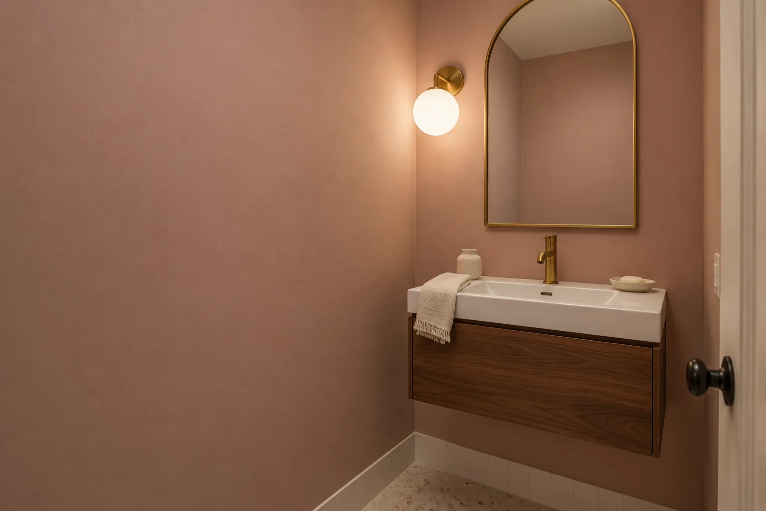
Blush pink can bring warmth into a windowless bathroom without making the walls feel as neutral as beige or white.
A pale, muted pink works particularly well with white fixtures, cream finishes, brass hardware, and lighter woods. The result can feel soft without the room necessarily reading as obviously pink.
Benjamin Moore First Light is a lighter place to start. Farrow & Ball Setting Plaster has more depth and an earthier, plaster-like quality if you want something warmer and more noticeable.
Pink needs a little extra attention if your bathroom already contains stone, beige tile, or countertops with peach or pink undertones. A wall color that is almost—but not quite—the same undertone can make those existing colors stand out much more than expected.
Compare your sample directly against the countertop, tile, and vanity rather than judging it on an empty section of wall. Artificial lighting can also push pale pink toward peach, beige, or a stronger rosy tone depending on the bulbs you use.
| Swatch | Color | Code | Brand |
|---|---|---|---|
First Light Pale pink 2102-70 | 2102-70 | Benjamin Moore | |
Setting Plaster Warm plaster pink No. 231 | No. 231 | Farrow & Ball |
6. Pale Yellow
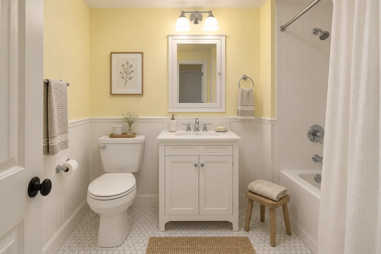
Pale yellow can make a windowless bathroom feel warmer, which helps when the space otherwise feels flat or cool under artificial lighting.
It pairs naturally with white fixtures and light wood and can also work with warm beige or cream finishes.
Benjamin Moore Windham Cream sits closer to a yellow-toned cream and gives you a more understated option. Sherwin-Williams Friendly Yellow brings more obvious color if you want the walls to feel cheerful rather than nearly neutral.
Yellow can become much stronger under warm bathroom bulbs, so test this group carefully.
The same applies if your bathroom already has beige flooring, cream counters, or wood with strong golden tones. Too many warm surfaces together can make the room feel more yellow than you intended.
If that happens, compare the yellow against a softer white or light greige before deciding. Sometimes a more restrained wall color lets the warmth already present in the bathroom do more of the work.
| Swatch | Color | Code | Brand |
|---|---|---|---|
Windham Cream Yellow-toned cream HC-6 | HC-6 | Benjamin Moore | |
Friendly Yellow Soft yellow SW 6680 | SW 6680 | Sherwin-Williams |
7. Charcoal
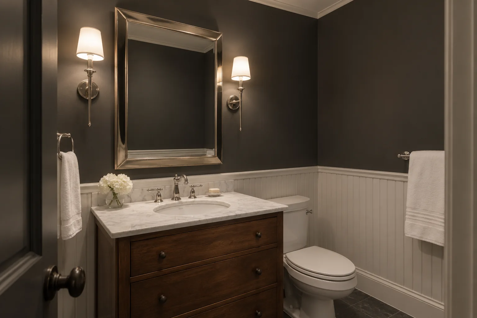
Charcoal can work particularly well in a powder room or another small bathroom where you would rather create a dramatic, enclosed atmosphere than try to make the room appear brighter.
Dark walls also create strong contrast with white sinks, toilets, shower tile, and trim. Wood vanities, brass hardware, and chrome can all stand out more clearly against a charcoal background.
Benjamin Moore Kendall Charcoal gives you a warmer gray, while Farrow & Ball Down Pipe has cooler blue influences.
You can also use charcoal above white wall tile or paneling instead of taking the dark color all the way to the floor. A light ceiling can provide another break if you want the darker walls without completely surrounding the room.
This is the darkest option in the list, so consider how much artificial light the bathroom actually has. If you already struggle to see clearly around the sink or shower, better lighting should come before relying on paint to solve the problem.
Charcoal reflects less available light than the lighter options above, but if you like a darker, moodier bathroom and have adequate lighting where you need it, the room's small size can help make that look feel deliberate.
| Swatch | Color | Code | Brand |
|---|---|---|---|
Kendall Charcoal Warm charcoal HC-166 | HC-166 | Benjamin Moore | |
Down Pipe Charcoal with blue undertones No. 26 | No. 26 | Farrow & Ball |
How to Choose Paint for a Small Bathroom With No Windows
In a windowless space, you cannot judge the paint based on natural daylight, so the artificial lighting, existing finishes, and even where the color sits in the room become more important.
Once you have a few colors in mind, the next step is figuring out which one actually works in your bathroom.
Start With the Bathroom Lighting
The same wall color can look noticeably different under warm, neutral, or cooler artificial light. If you plan to replace the bulbs or light fixtures, do that before making your final paint choice.
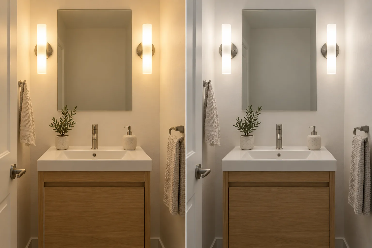
Warm bulbs can bring out cream, beige, yellow, and warmer undertones, while cooler lighting may make whites, blues, greens, and grays appear sharper or cooler.
Look at your samples with the lights you normally use, including both the vanity and ceiling fixtures. Also consider whether the bathroom simply needs more light.
Paint can change how the room feels, but it cannot compensate for poor lighting around the mirror, shower, or other areas where you need good visibility.
Compare the Paint With Your Tile, Vanity, and Countertop
Wall color doesn't stand alone, especially in a small bathroom where the floor, vanity, countertop, shower tile, and fixtures are all close together.
A white that looks clean on its own may appear yellow beside bright white tile. A greige may reveal pink or violet undertones next to the flooring, while a pale blue may feel much cooler when surrounded by gray tile and chrome fixtures.
Narrow your options down to a few colors and compare them against the finishes that will remain in the room.
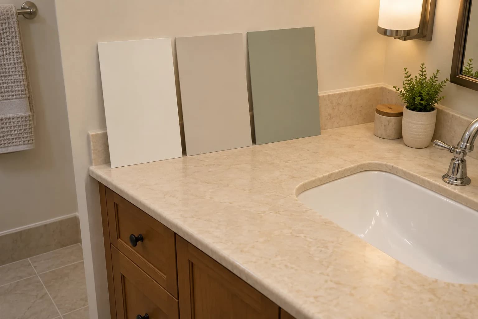
Pay particular attention to the flooring, countertop, vanity, shower surround, trim, and any existing white fixtures.
These larger fixed surfaces can influence how the wall color feels far more than a small paint chip suggests.
Preview the Colors in Your Bathroom
Once you have narrowed your options, use Paint Visualizer AI to see how each one looks across the entire bathroom before you commit.
Upload a photo of your bathroom and preview different paint colors while keeping the same vanity, floor, tile, fixtures, and other finishes in view. This makes it easier to compare how each option works with the bathroom you already have instead of trying to imagine the result from separate paint chips.
For example, you could compare a soft white against a light greige, muted green, or deeper charcoal on the same walls and see how each direction changes the overall feel of the room.
PaintVisualizer AI lets you preview real colors from Sherwin-Williams, Benjamin Moore, Behr, Farrow & Ball, PPG, and Valspar, plus custom colors.
Don’t Choose Based on LRV Alone
LRV tells you how much visible light a color reflects. A higher number generally indicates a lighter, more reflective color, while a lower number indicates a deeper color that reflects less light.
That can be useful when comparing two similar options, but a higher LRV does not automatically mean a color will work better in your bathroom.
A high-LRV creamy white could still feel too yellow beside your tile, while a slightly deeper greige or muted green may coordinate much better with the room.
Use LRV as one comparison point rather than a rule that says you must choose the lightest possible paint for a bathroom without windows.
Choose a Paint Finish Made for Bathroom Conditions
A bathroom with a shower or tub also exposes the walls to higher humidity and occasional splashes.
Choose a paint product that the manufacturer recommends for bathrooms or other humid areas.
Satin and similar washable finishes are common choices because they are easier to clean and generally handle moisture well, but you do not necessarily need a highly glossy wall.
Some manufacturers also offer lower-sheen paints specifically formulated for bathrooms. Benjamin Moore Aura Bath & Spa, for example, is designed for high-humidity environments while providing a matte finish.
Check the paint product's specifications instead of choosing based on sheen alone.
If the bathroom has an exhaust fan, make sure it works properly so moisture doesn't continually sit on the walls and ceiling.
Find the Right Paint for Your Small Bathroom
A small bathroom with no windows does not have to feel dark or closed in.
The right paint can help you work with the light you already have, coordinate the walls with the tile and fixtures, or create a more intentional cozy look if you prefer something deeper.
If you have a few colors in mind, upload a photo of your bathroom to Paint Visualizer AI and compare them on your actual walls.
You can preview different options with your existing finishes still in place, narrow down your favorites, and then confirm your final choice with a physical paint sample.
Try PaintVisualizer AI to virtually paint your bathroom before you buy the paint.