 Paint Visualizer AI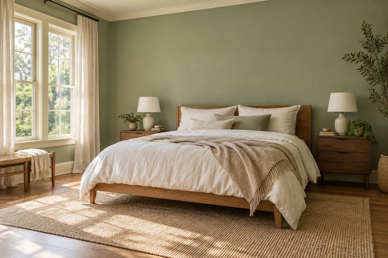
The colors in your bedroom affect how the whole room looks and feels, from how bright it appears during the day to how warm it feels at night.
But there’s no single paint color that works for every bedroom. A shade might look soft and inviting in one room but feel dull or much darker in another. Your bedroom’s natural light, its size, the colors already in the space, and the look you want to create all play a part in choosing the right color.
Below, we’ve picked some of the best bedroom paint colors and explained where each one works well, what to pair it with, and what to consider before painting your walls.
Best Paint Colors for Bedrooms
There are a range of colors that work really well for bedrooms, from light neutrals to deeper blues and greens, so you don’t have to stick to one type of palette.
The colors below work with different room sizes, lighting conditions, and styles, with options for both lighter, understated bedrooms and spaces where you want more color on the walls.
1. Sage Green
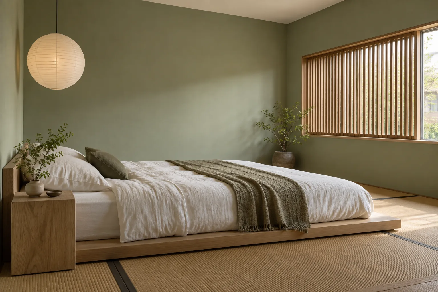
Sage green is a muted green with gray undertones, which makes it easier to use on bedroom walls than brighter or more saturated greens. It brings some color into the room without dominating everything around it.
It works particularly well with warm whites, beige, natural wood, linen, and other earthy tones. In a bedroom with plenty of natural light, sage can look soft and fresh.
With less light, the gray in the color becomes more noticeable, so test a few shades before deciding.
For a warmer bedroom, look for sage greens with slightly yellow or olive undertones. If you want crisp whites and cooler finishes, cooler grayer sages work really well.
2. Soft Blue
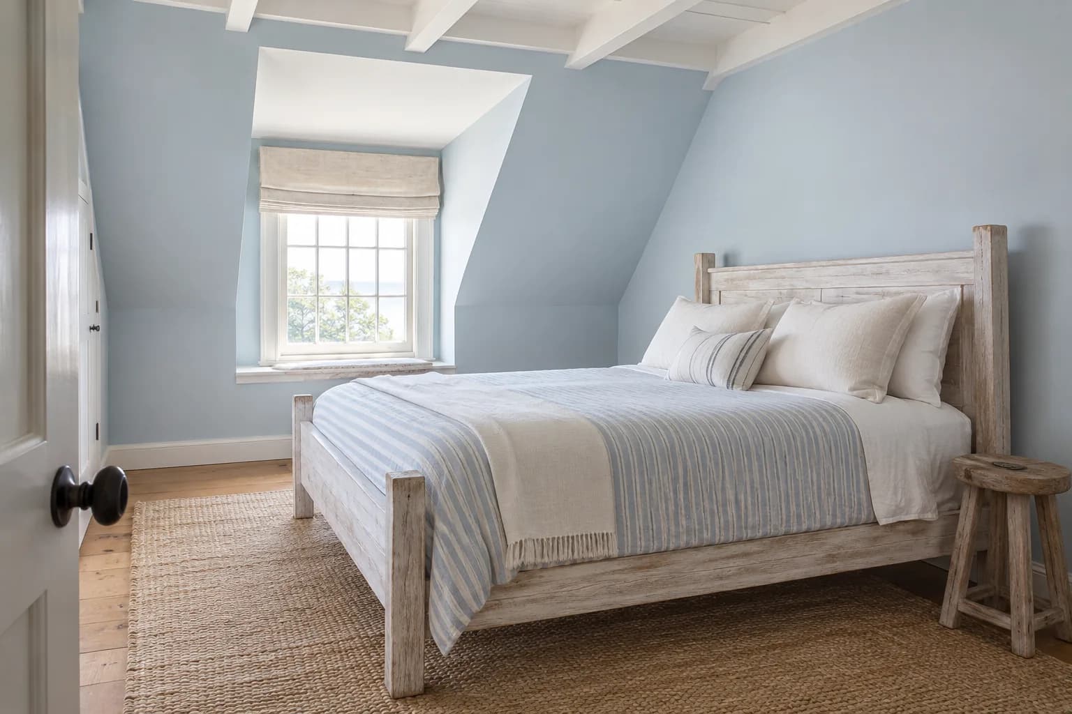
Blue can change quite a bit depending on the light.
Soft blue works well in a bedroom when you want some color on the walls without going too dark.
Lighter, muted blues can make the room feel fresh during the day while still giving the walls more depth than white or a light neutral.
In a bright, sunny bedroom, a pale blue will usually show more of its color, while in a room with less natural light, blue-gray shades can look noticeably grayer.
Soft blue pairs easily with white, cream, light wood, and warmer natural materials.
If the room already has a lot of cool gray or silver finishes, choose a blue with a slightly warmer undertone so the space doesn’t feel too cool.
3. Warm White
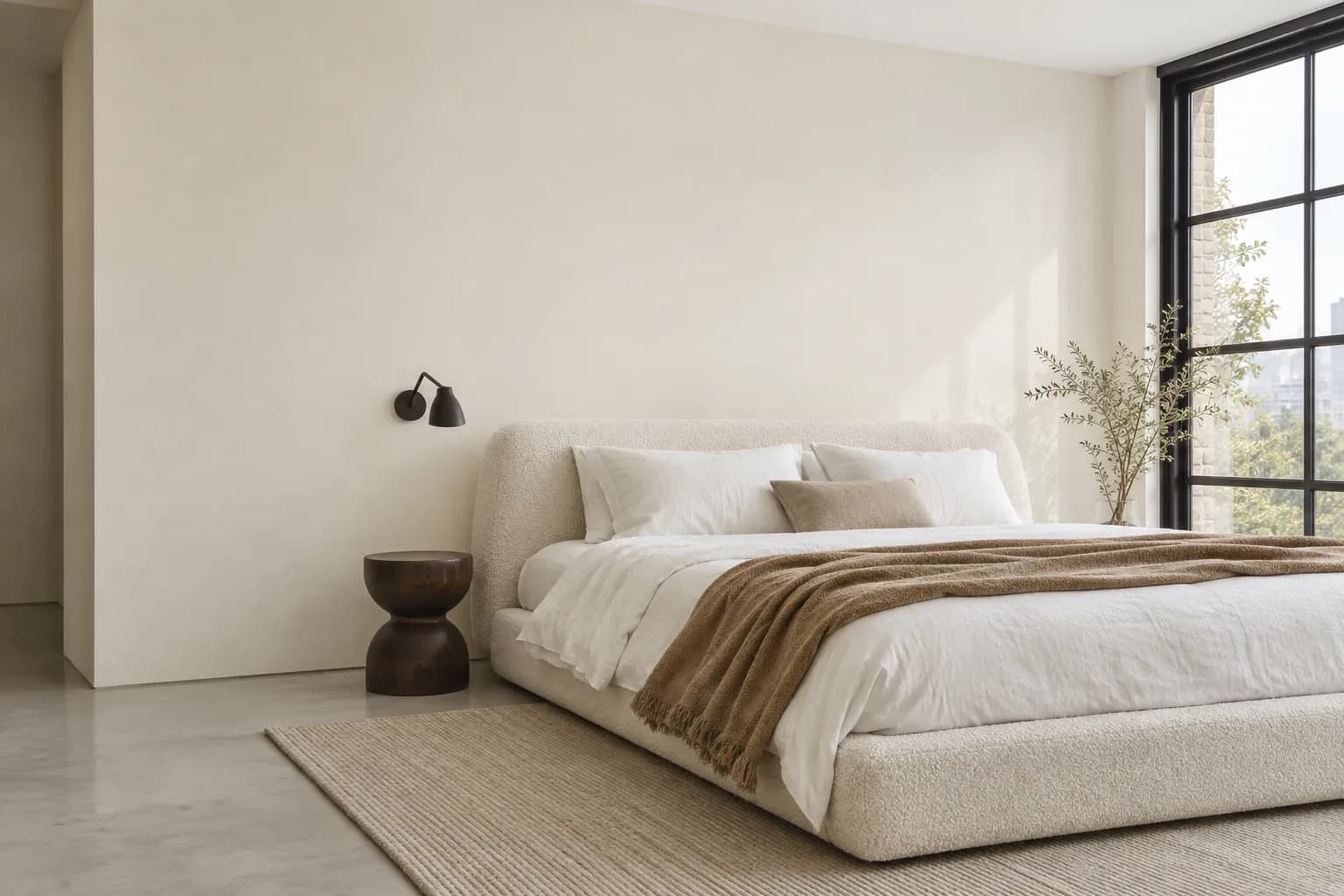
Warm white is a useful choice if you want a light bedroom without the stark look that some brighter whites can have. Its subtle cream, beige, or yellow undertones add warmth while still keeping the room light.
It can be particularly useful in bedrooms that don’t get much natural light. A very cool white can pick up gray or blue tones in these rooms, while a warmer white tends to look softer.
Some warm whites lean noticeably creamy, while others are only slightly warmer than a true white.
Compare your samples against the flooring, bedding, and trim in the room, especially if any of them are already cream or beige.
4. Greige
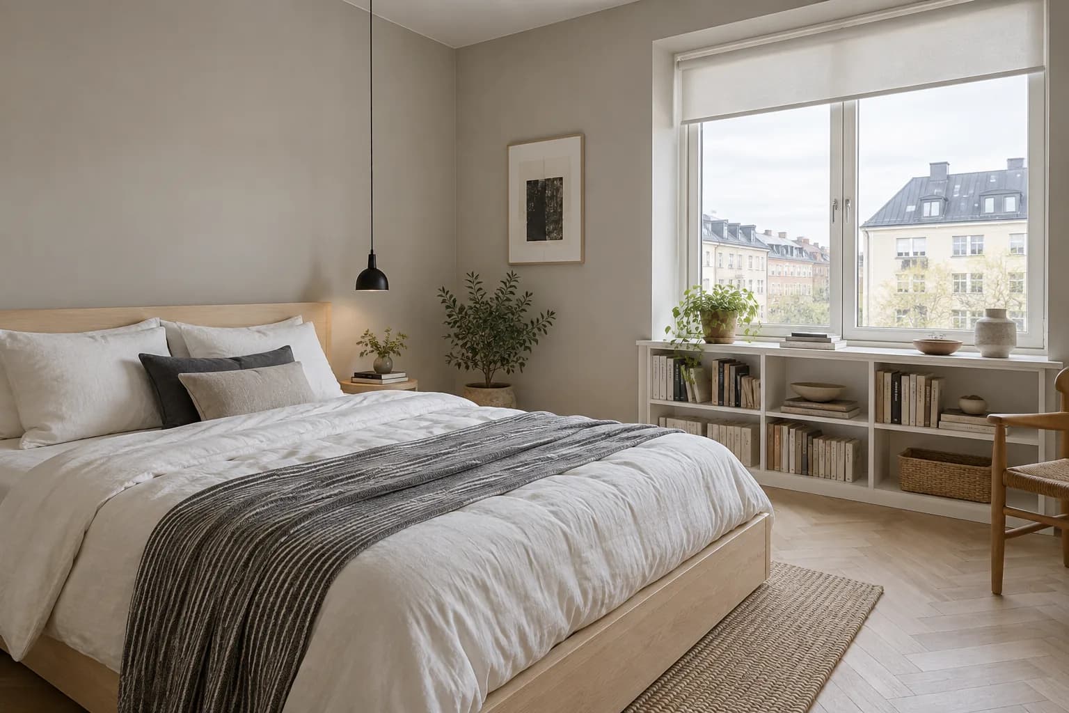
Greige sits somewhere between gray and beige, giving you a neutral that feels warmer than a typical gray without looking as creamy as beige.
The balance between gray and beige changes from shade to shade. In brighter rooms, some greiges can look lighter and more neutral, while lower or cooler light may bring out more of the gray.
Greige works well with white, black, natural wood, and other warm neutrals. If your bedroom has wood flooring or furniture, pay attention to its undertones when choosing a shade.
A warmer greige will generally sit more comfortably alongside warm oak and similar finishes.
5. Warm Beige
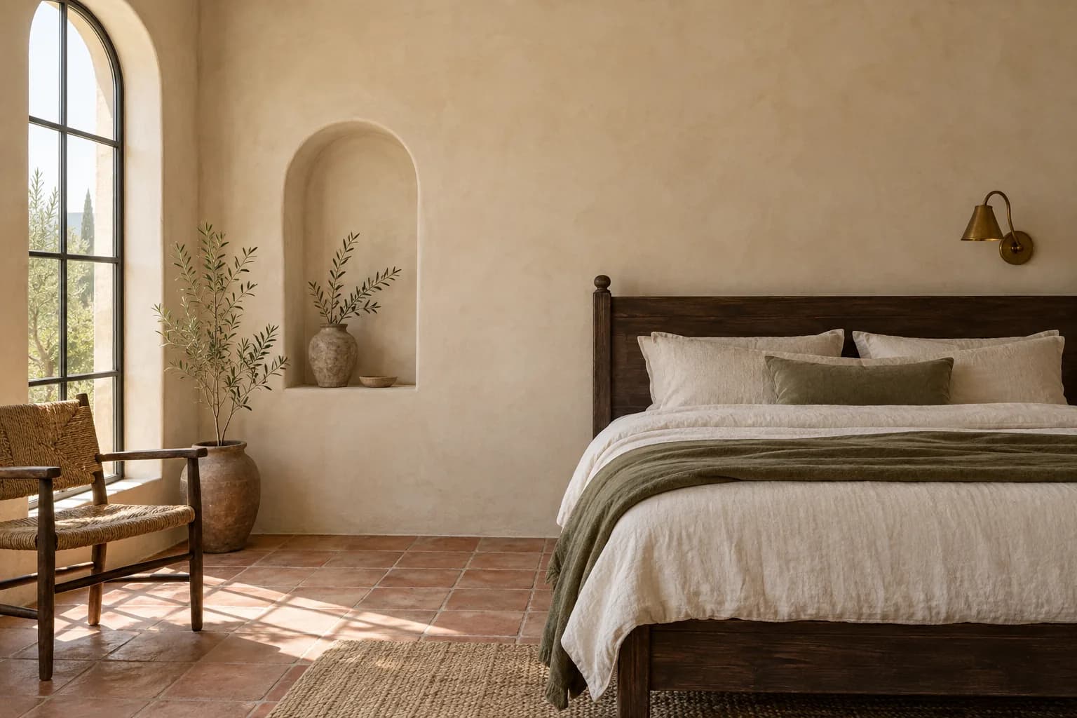
Warm beige gives a bedroom more color than white or greige while still keeping the walls neutral. Depending on the shade, it can range from a light sandy color to a deeper tan.
It works especially well with cream, brown, warm woods, and muted greens.
Beige can also be useful when the room already contains warmer materials, such as wood flooring, rattan, linen, or brass.
Be careful with very yellow beiges if the room already has a lot of warm light. In that setting, the color can appear more yellow than it does on the sample.
A more muted beige or one with a slight gray undertone can keep the warmth without pushing too far in that direction.
6. Navy Blue
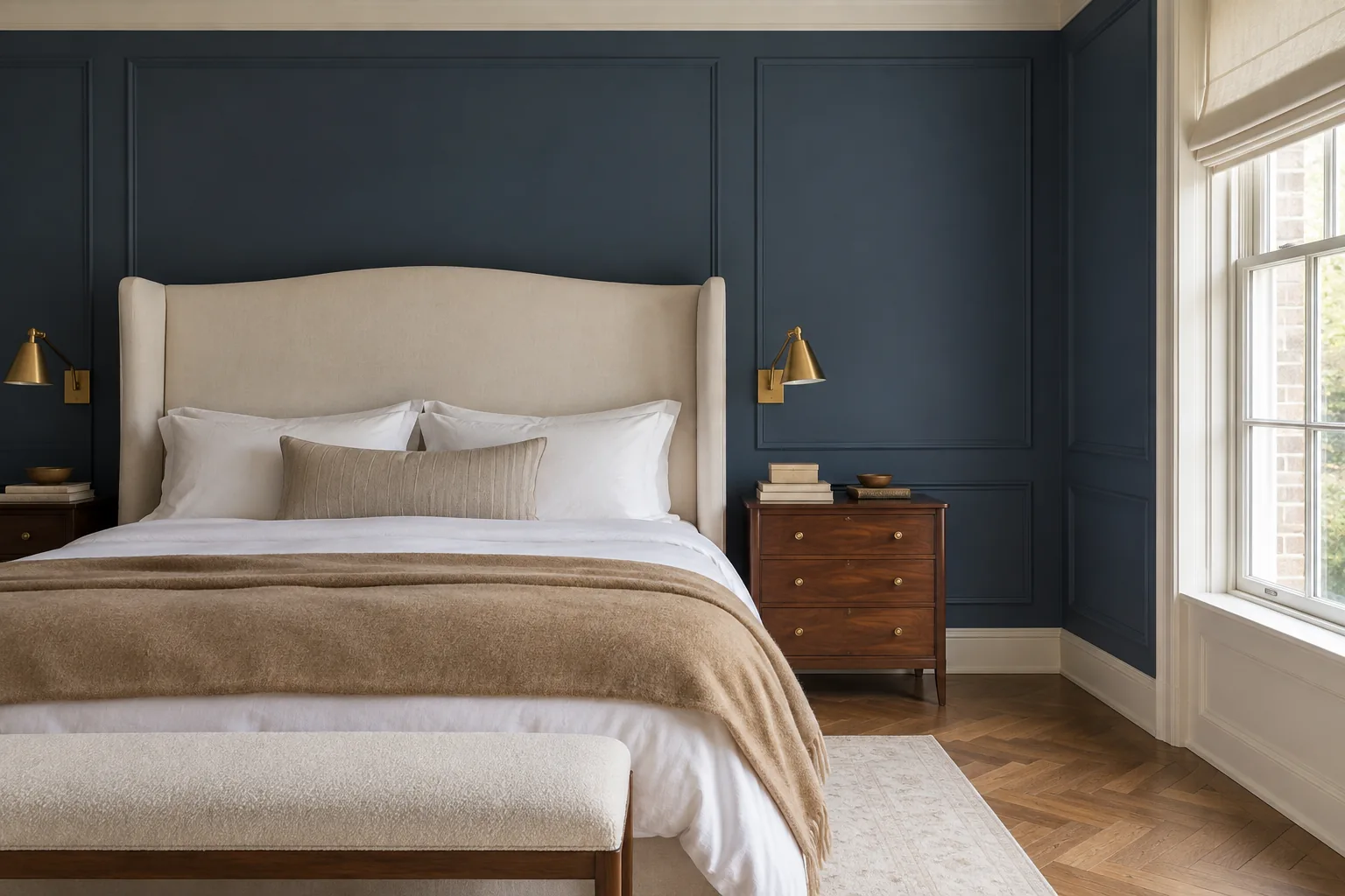
Navy is worth considering if you want darker bedroom walls without going all the way to black or charcoal. It gives the room much more depth than a pale blue and can make lighter bedding, trim, and furniture stand out against the walls.
The amount of natural light in the room makes a noticeable difference with navy.
In brighter bedrooms, you’ll see more of the blue during the day. In lower light, the same color can appear much deeper and may look close to black in some areas of the room.
White and cream provide an easy contrast, while walnut, oak, brass, and tan can bring some warmth into the color scheme.
If painting every wall navy feels like too much, it can also work on the wall behind the bed with a lighter color elsewhere.
7. Terracotta
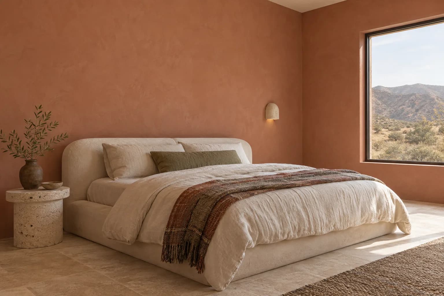
Terracotta brings warmer red, orange, and brown tones into a bedroom without the intensity of a bright red or orange.
Lighter, dustier versions tend to be easier to use across an entire room, while deeper terracotta shades create a stronger effect.
It pairs naturally with cream, beige, olive green, and wood. Those combinations work particularly well in bedrooms that already use earthy materials and warmer textiles.
Terracotta tends to become richer under warm artificial lighting, so check your sample both during the day and with your bedroom lights switched on.
If you want something more understated, look for a muted terracotta with more brown or pink in it rather than a strong orange undertone.
8. Taupe
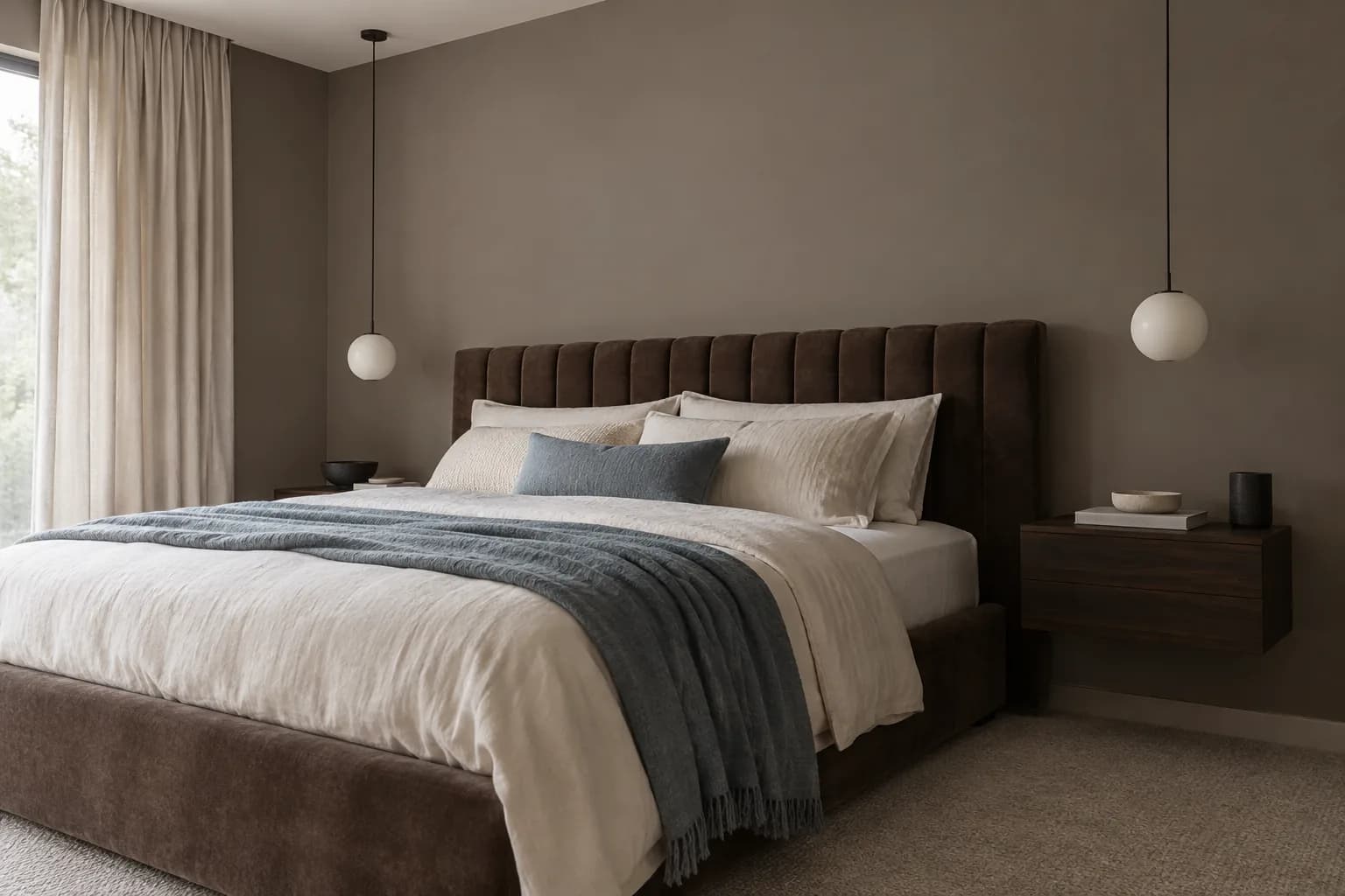
Taupe is a warm neutral that falls between brown and gray. It has more depth than beige but is still easy to use across all four walls, particularly if you want a neutral bedroom that doesn’t feel too light.
Taupe works well with cream, off-white, dark wood, and black accents. You can also pair it with muted greens or blues if you want to bring more color into the room through bedding, curtains, or furniture.
Some taupes lean more gray, while others have stronger brown or even slightly purple undertones. Look at samples next to your flooring and larger pieces of furniture, as these can make those undertones more noticeable.
9. Olive Green
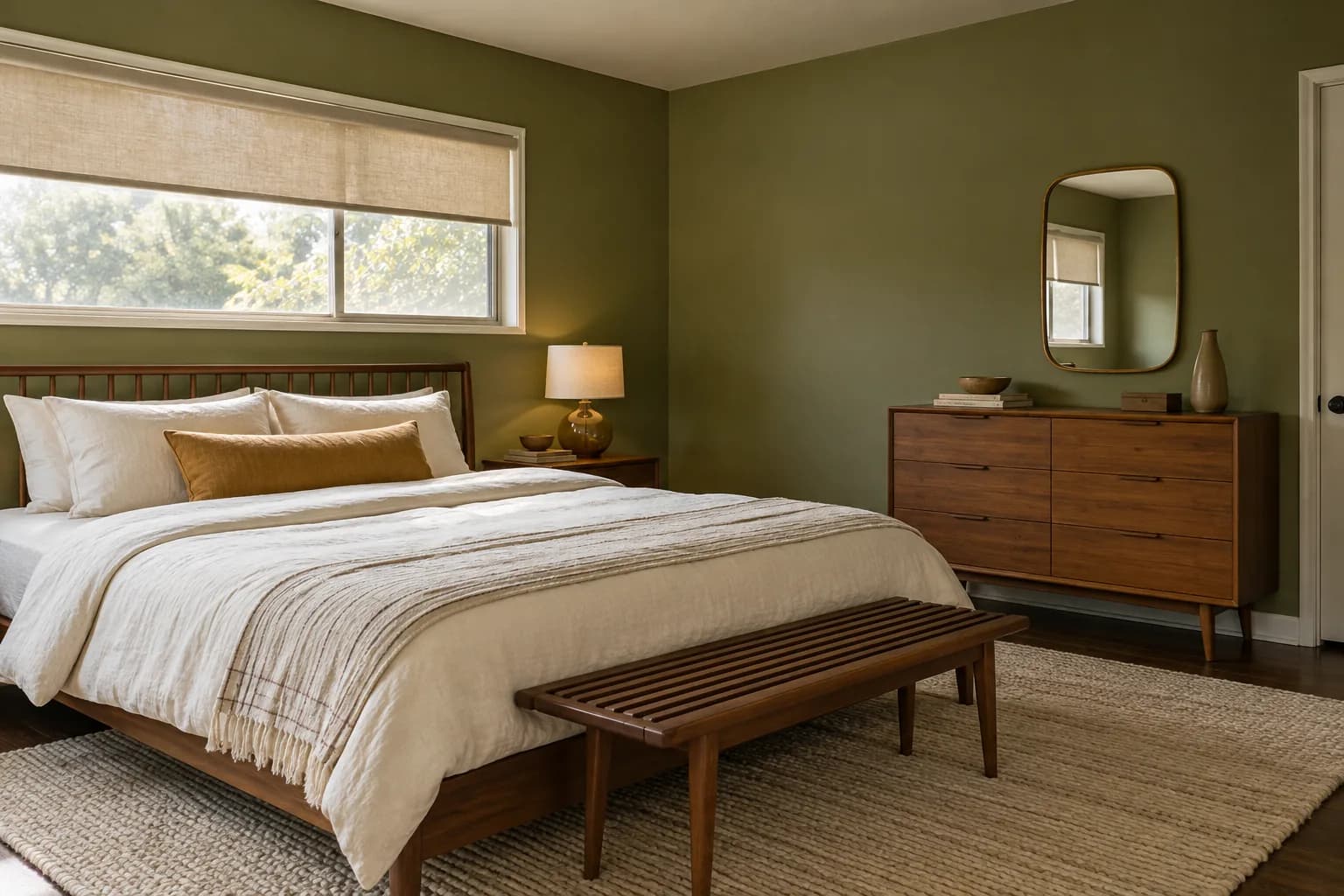
Olive is a deeper, warmer alternative to sage green. Its yellow and brown undertones give it an earthier appearance, making it a good fit for bedrooms with warm woods, cream fabrics, and other natural colors.
Because olive has more depth, it can look quite different as the light changes. A sunlit room may bring out more of the green, while at night or in a darker bedroom, the brown tones can become more prominent.
If you’re using a darker olive on all four walls, lighter bedding and curtains can help break up the color. Cream, tan, warm white, and natural wood all pair well without competing with the walls.
10. Dusty Blue
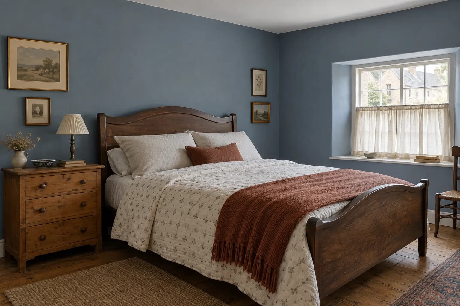
Dusty blue gives you the softness of a lighter blue, but with enough gray to keep the color muted. It’s a useful middle ground if pale blue feels too light but navy is darker than you want.
It pairs particularly well with warm white, cream, walnut, and medium or dark woods. Warmer materials can also balance the cooler quality that some dusty blues have.
Pay attention to how much gray is in the shade. In a room with limited natural light, an already gray-blue can look much grayer on the wall than it does on a paint card.
11. Dusty Pink
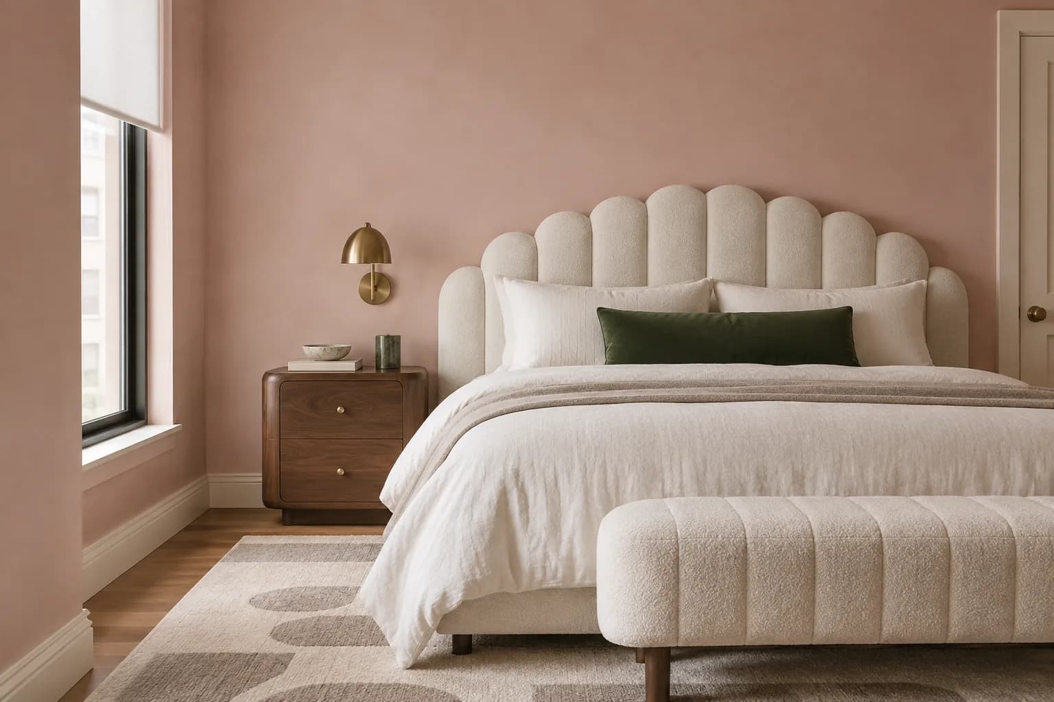
Dusty pink can add warmth to a bedroom without the brightness of a clearer or more saturated pink. Shades with muted brown, beige, or gray undertones are generally easier to pair with the rest of the room.
It works well with cream, warm white, taupe, natural wood, and deeper greens. You can also use black or darker wood accents for more contrast.
If you don’t want the room to look noticeably pink, look for shades closer to plaster, clay, or muted blush.
These have more neutral undertones and can change quite a bit depending on the surrounding colors.
12. Charcoal
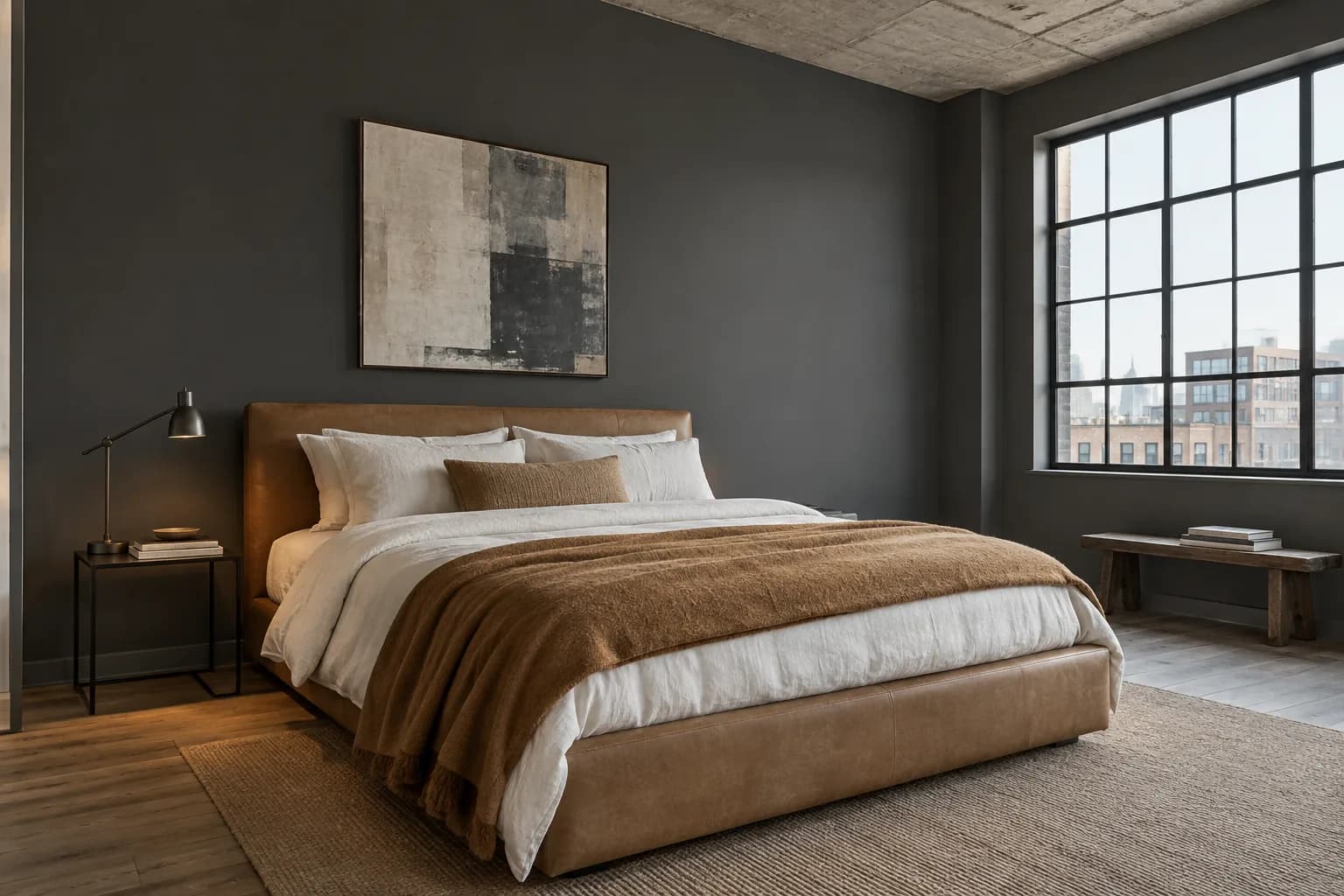
Charcoal works well when you want a dark bedroom but prefer something softer than black. Depending on its undertones, it can lean toward gray, blue, brown, or even green.
Lighter furniture, bedding, and trim create contrast against charcoal walls, while wood and warmer fabrics keep the overall color scheme from feeling too cool. It can work particularly well behind a light-colored upholstered or wooden bed.
Keep in mind that charcoal absorbs considerably more light than a pale neutral. In an already dark bedroom, painting every wall charcoal will make the room feel darker still.
If that isn’t the effect you want, use it on one or two walls or choose a lighter charcoal.
13. Muted Plum
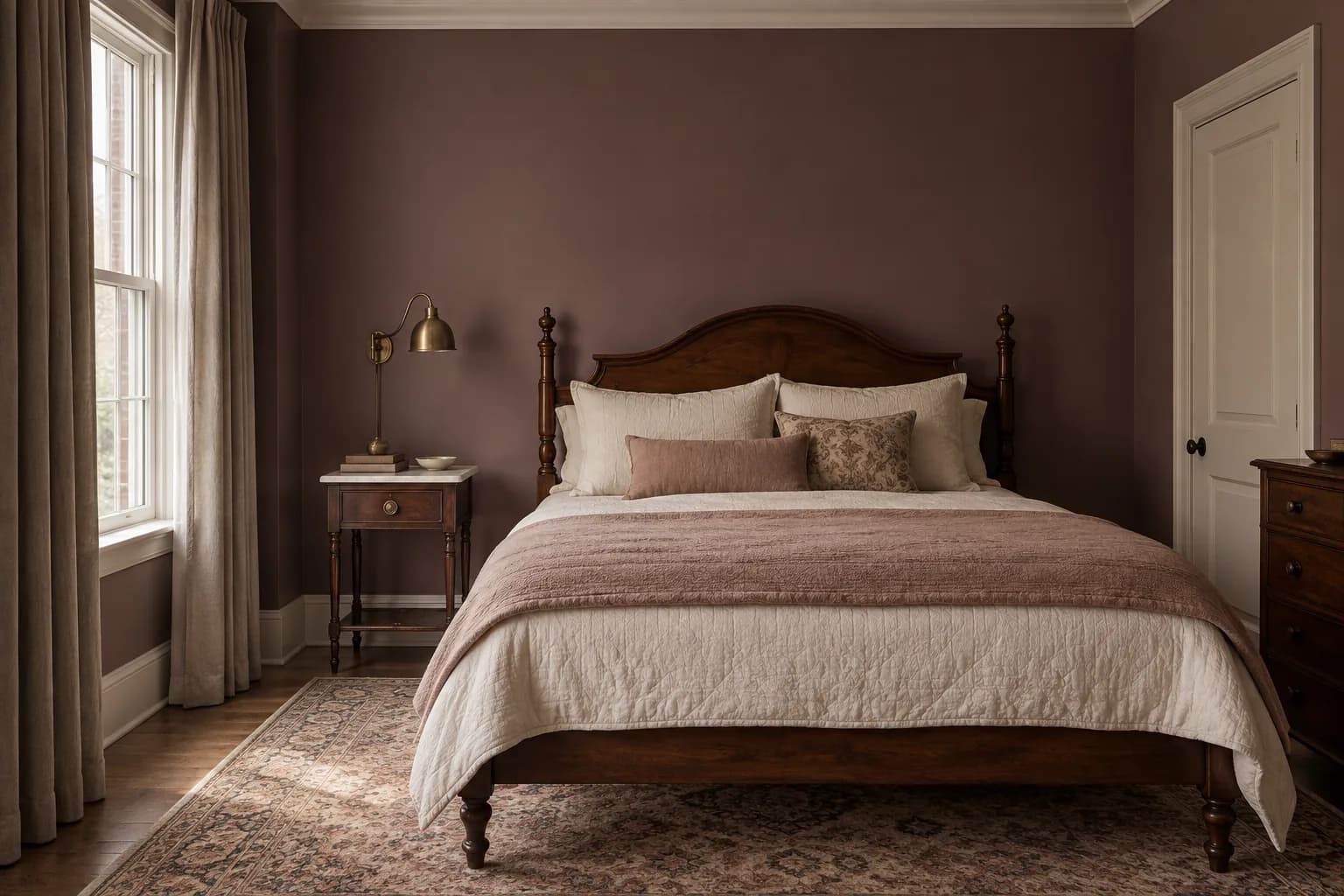
Muted plum is an option if you want a deeper bedroom color but don’t want to use blue, green, or gray.
Unlike brighter purples, muted plum contains more gray, brown, or red, which makes it easier to combine with neutral furniture and fabrics.
Cream, taupe, warm wood, and muted pink all work well alongside it. Darker plum can also look good with brass or other warm metal finishes.
Plum is particularly sensitive to undertones. Some shades look noticeably purple in daylight, while others move closer to brown or burgundy in lower light.
14. Soft Gray
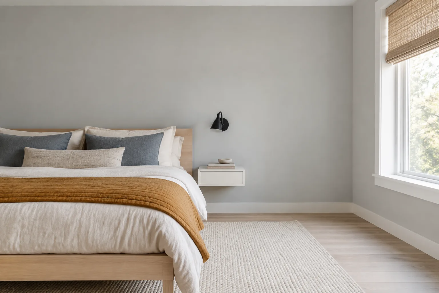
Soft gray works well if you want neutral walls with a little more depth than white. It can also be a useful backdrop if most of the color in your bedroom comes from the bedding, furniture, artwork, or other decor.
Cooler shades can pick up blue in certain light, while warmer grays may lean slightly beige or brown.
For bedrooms, a softer gray with some warmth often pairs more easily with wood and warmer fabrics.
If your bedroom gets limited natural light, be careful with grays that already look cool on the paint card, as they can appear darker and flatter once they’re on the walls.
15. Burgundy
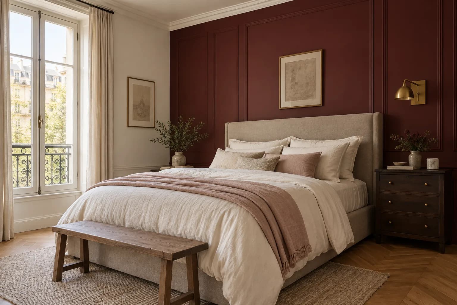
Burgundy gives you the depth of a dark paint color with more warmth than navy or charcoal. It can range from deep red to shades with noticeable brown or purple undertones, so there’s quite a bit of variation within the color.
It pairs well with cream, taupe, warm wood, and muted pinks. Lighter bedding and furniture can create contrast, while darker woods and warm metals make the overall palette richer.
Burgundy can become quite dark when there isn’t much natural light.
If you like the color but don’t want it throughout the entire bedroom, try it behind the bed and use a lighter neutral on the remaining walls.
How to Choose a Paint Color for Your Bedroom
The same paint can look noticeably different depending on your bedroom’s size, window direction, natural light, and the colors already in the room.
Here are a few things to consider before narrowing down your options:
Consider How Much Natural Light the Room Gets
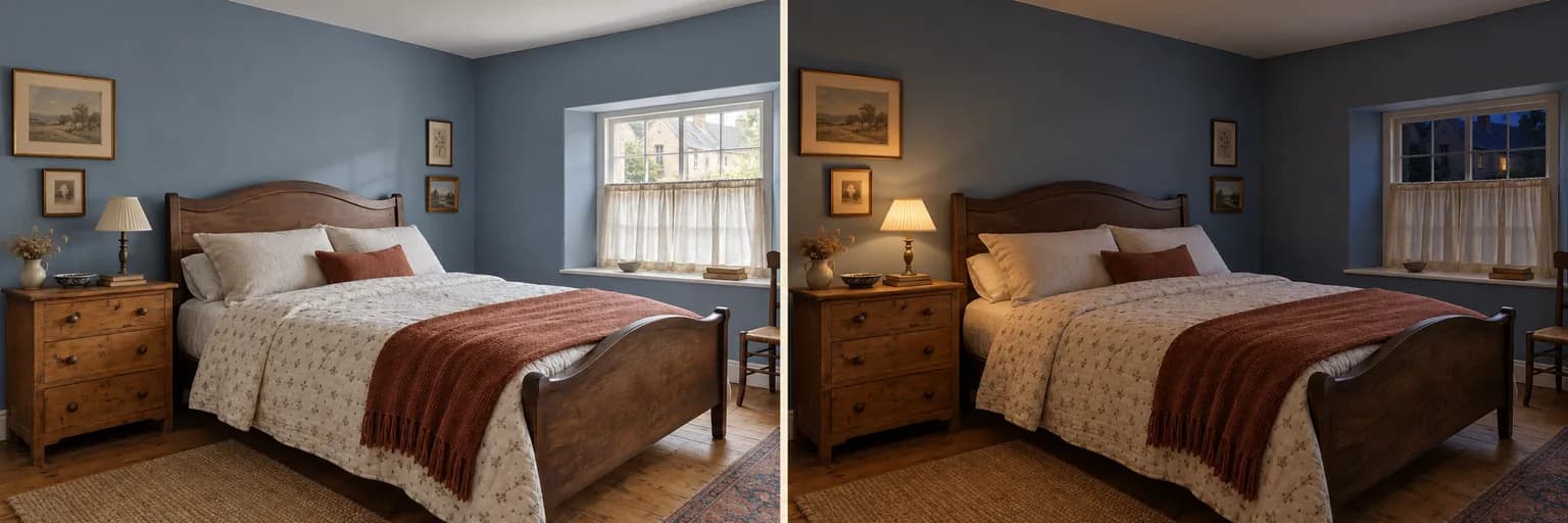
Natural light strongly affects how paint looks throughout the day. A color that appears light on a paint card may look considerably darker in a bedroom that gets little sunlight.
Rooms with plenty of daylight give you more flexibility with deeper colors such as navy, olive, or burgundy.
In darker bedrooms, lighter colors can help keep the walls from absorbing too much of the available light.
Don’t judge a color at just one time of day. Look at your samples in the morning, afternoon, and evening, as well as under the lights you normally use at night.
Pay Attention to the Direction of the Windows
North-facing rooms generally receive cooler, less direct light, which can make gray, blue, and green undertones more noticeable. Warmer whites, beige, taupe, and other warm shades can balance some of that coolness.
South-facing bedrooms usually receive stronger, warmer light for more of the day. This can bring out warm undertones and make colors appear brighter.
East- and west-facing rooms change more noticeably throughout the day, so it’s especially useful to check samples at different times.
Look at the Colors Already in the Bedroom
You probably aren’t starting with an empty room. Flooring, furniture, curtains, bedding, and even trim color can affect how a wall color looks.
Pay particular attention to items you aren’t planning to replace.
If you have warm wood floors, for example, compare your paint samples directly against them rather than choosing a color in isolation.
You don’t need everything to match, but avoid undertones that clash once the whole room is put together.
Think About How Dark You Want the Room to Feel
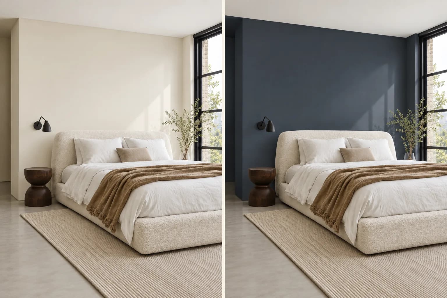
Small bedrooms don’t automatically need light walls, and large bedrooms don’t have to be dark. It comes down to the effect you want.
Light colors reflect more light and can make the room’s boundaries feel less pronounced. Darker colors absorb more light and create more contrast, which can make a bedroom feel more enclosed.
If you like a dark shade but aren’t sure about using it throughout the room, try it on the wall behind the bed first.
Test the Color Before Painting the Whole Room
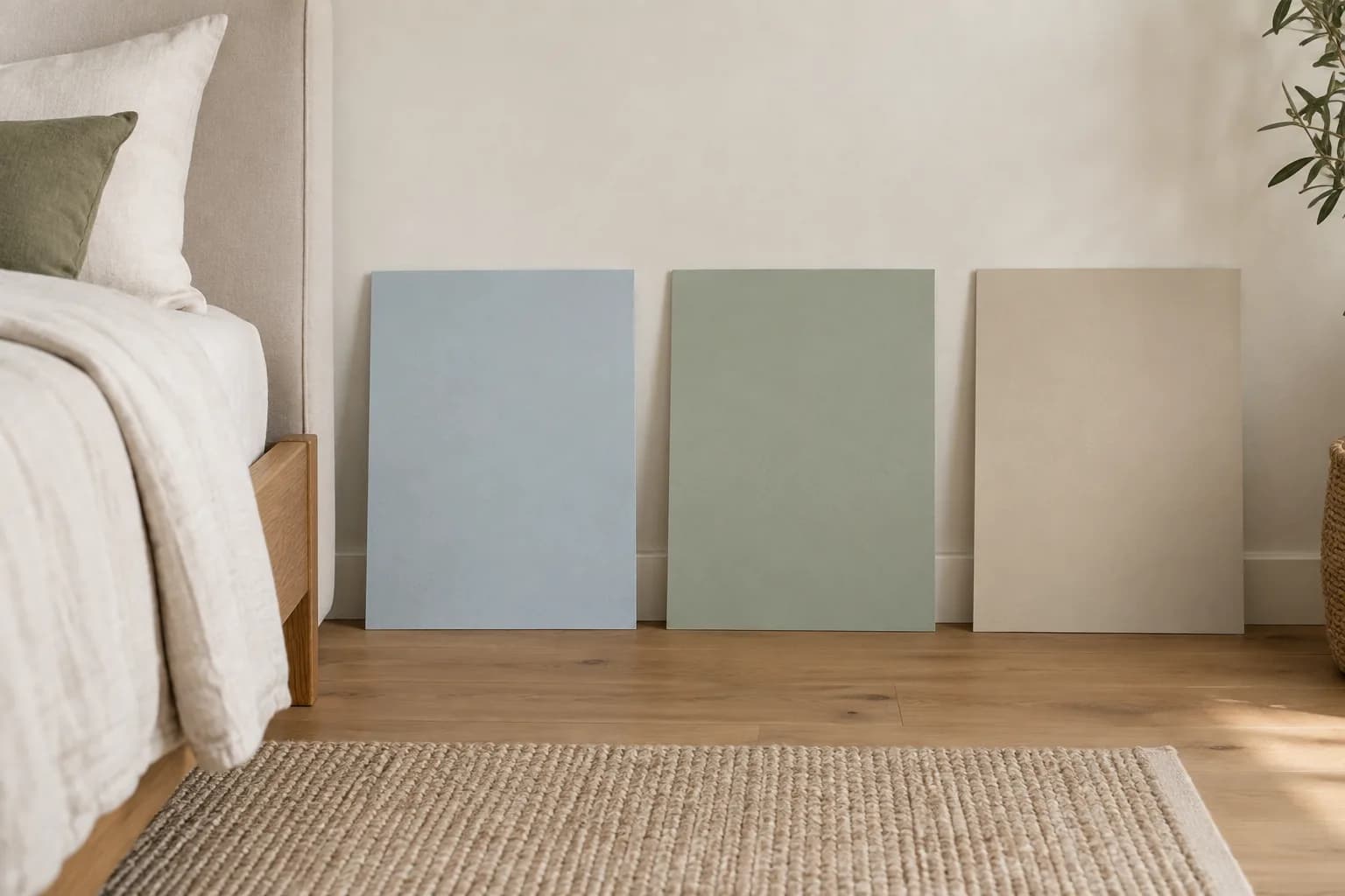
Once you’ve picked a few possibilities, compare them in the room itself.
With Paint Visualizer AI, you can upload a photo of your bedroom and try different paint colors directly on the walls.
This way, you can compare lighter and darker options, try colors you might not have considered, and see how a shade works with your existing flooring, furniture, bedding, and decor.
You can try as many colors as you like without painting a wall, then narrow your choices down to the ones that look best in your space.
Once you have a few favorites, test them with physical paint samples before buying enough paint for the whole room.
Find the Right Color for Your Bedroom
Your bedroom paint color should work with the light, furniture, and other colors already in your room.
Whether you prefer a light neutral, a muted green or blue, or something darker like navy or burgundy, seeing how the color looks in your space can help you decide easily.
With Paint Visualizer AI, you can upload a photo of your bedroom and try different wall colors in seconds.
Compare a few of your favorites, experiment with colors you might not normally consider, and see how they work with the rest of your room before you start painting.