
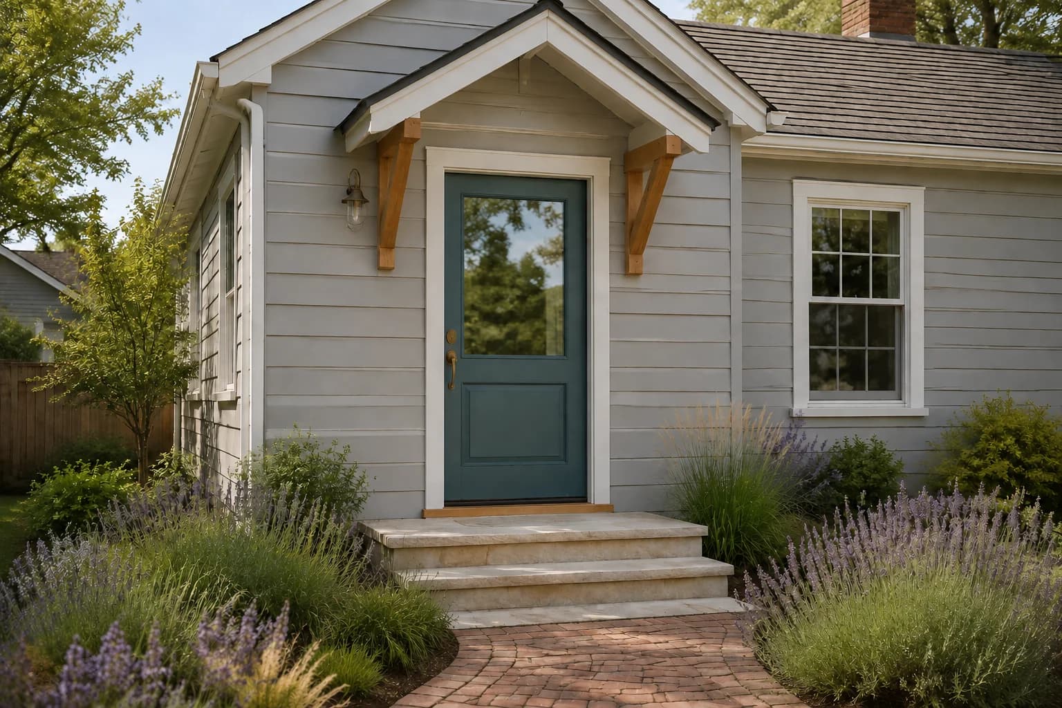
A fresh color on your front door can make the entrance more noticeable and give your gray house an updated look without repainting the entire exterior.
If you’re looking to repaint the front door of your gray house, you might want a color that stands out more or one that works better with your existing siding and trim.
We often find black, navy, and deep green are options most people consider, while yellow or red can give the entrance a brighter look.
Before choosing a paint color for your front door, compare the shade with any brick or stone around the door and check how it looks beneath your porch or behind a storm door.
In this guide, we’ll explore 12 front door colors for gray houses and also provide recommendations to help you choose a shade that works with your exterior and looks good from the street.
Best Front Door Colors for a Gray House
The colors below range from black and charcoal to brighter options like mustard yellow and terracotta. As you compare them, consider whether you want the door to stand out from the siding or blend more closely with the rest of the exterior.
Black
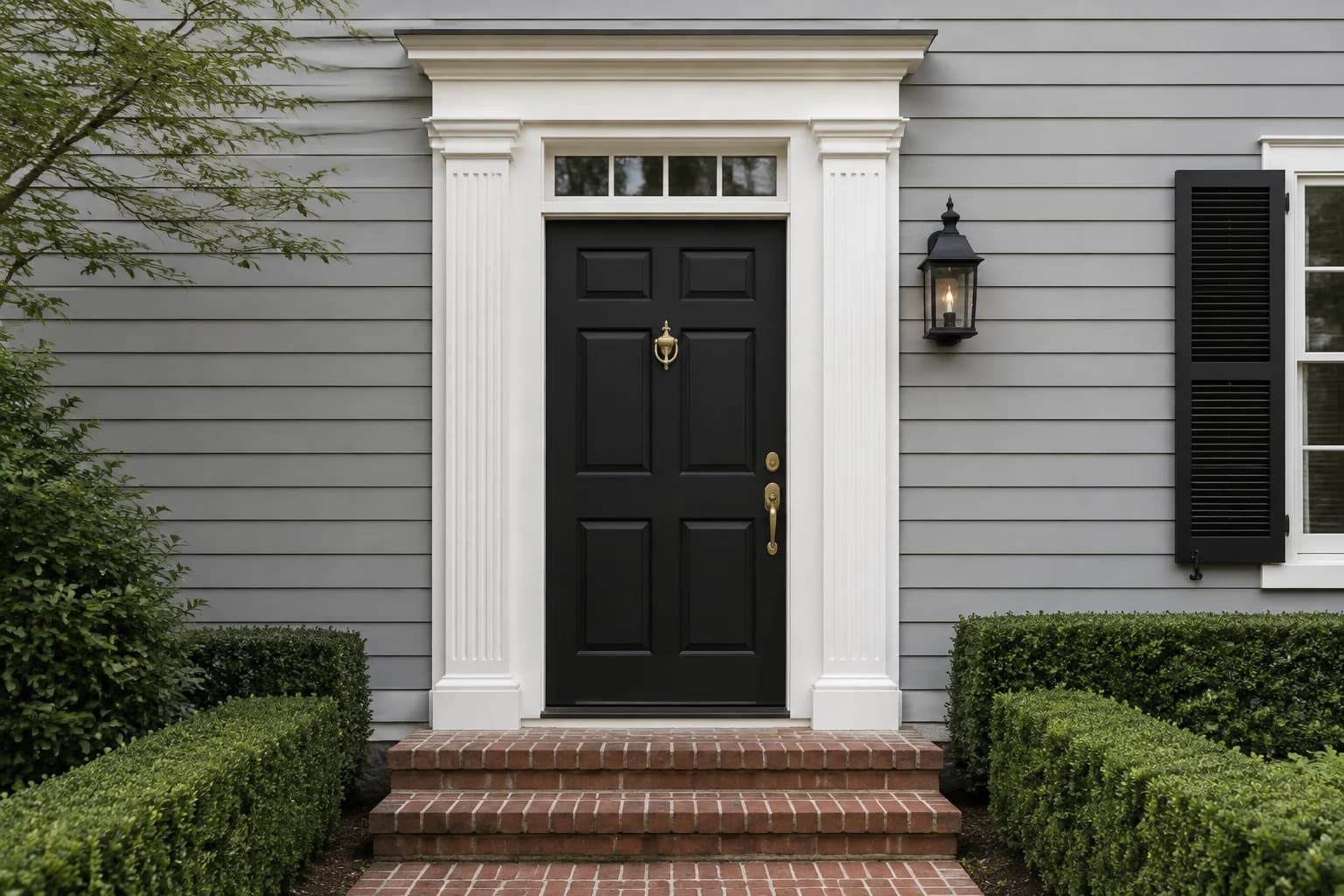
A black front door creates a noticeable contrast against light gray siding, especially when white trim frames the entrance. It can also work with existing black window frames, shutters, or porch lights, letting you repeat a color already on the house.
On a charcoal gray house, a black door will blend more closely with the siding. You might prefer that look, but check it from the driveway or sidewalk before painting. Under a deep porch, the door’s panels and details may be less visible.
Sherwin-Williams Tricorn Black SW 6258 is a neutral black to sample. Compare it at the entrance with the door closed so you can see it beside the framing and siding.
Charcoal Gray
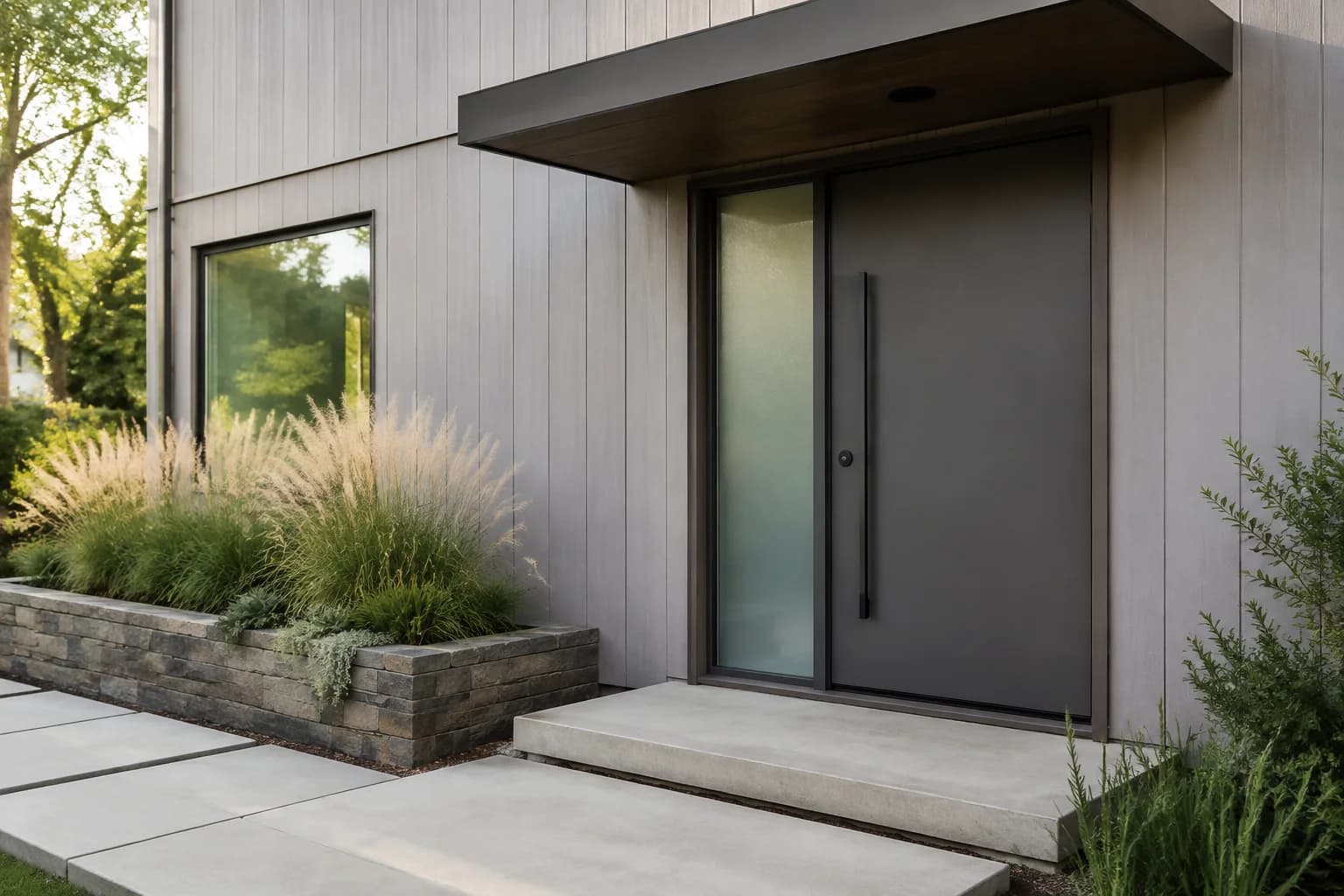
Charcoal is worth considering if you like a dark front door but find black too strong against your exterior. Against pale gray siding, it can provide contrast while keeping the door within the same general color family.
A charcoal that looks neutral on a paint card may appear warmer or cooler beside your siding. Include nearby stone in that comparison, particularly if it contains a mix of gray and brown.
Benjamin Moore Kendall Charcoal HC-166 is one option to sample. If your siding is already dark gray, check whether the difference is noticeable enough for the look you want.
Navy Blue
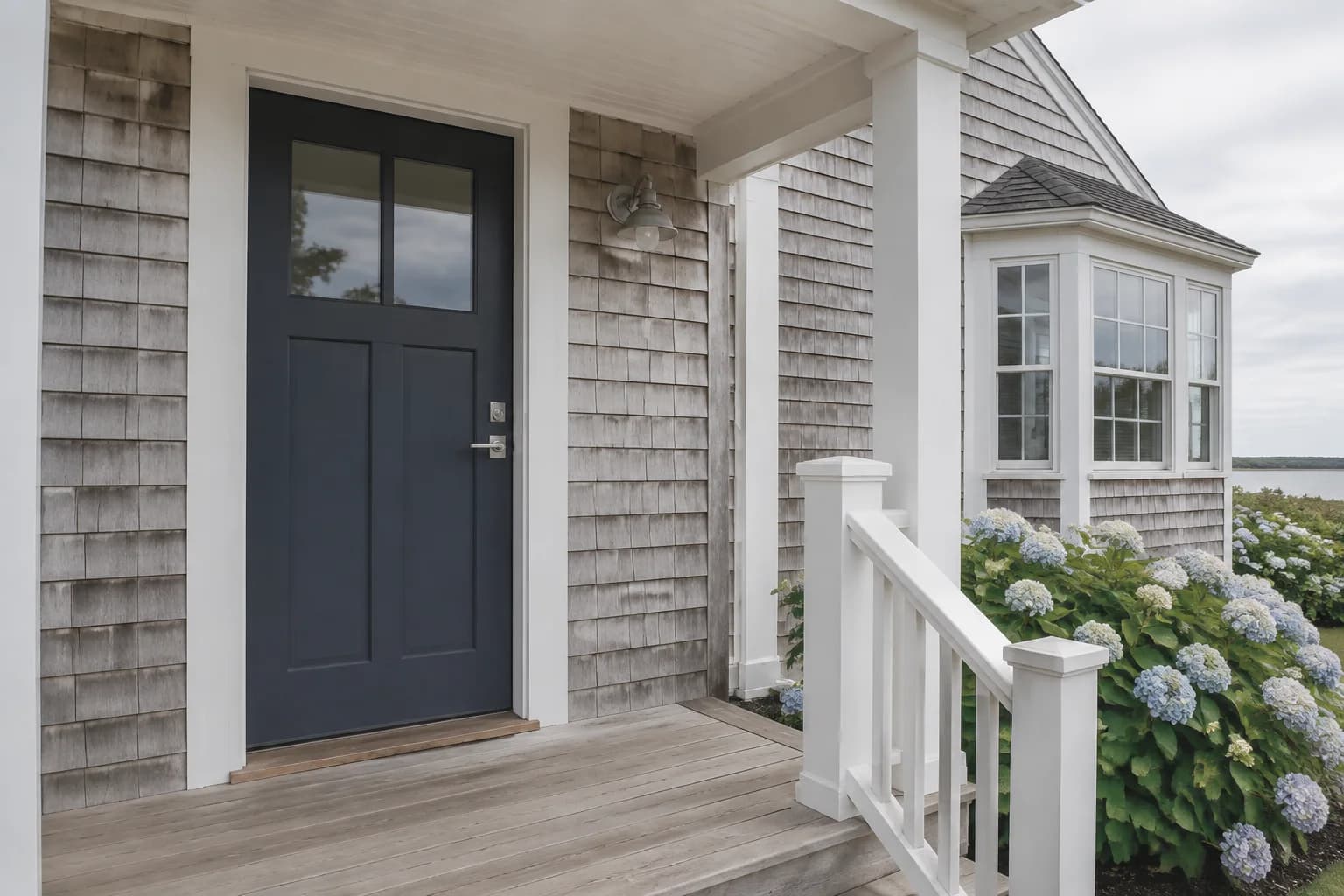
A navy blue front door adds color while keeping the entrance fairly understated. It is a good option to compare on a light gray house with white trim, particularly if you want a darker door without choosing black.
Pay attention to how much blue you can see in your entrance’s usual lighting. A deep navy may look clearly blue in sunlight and nearly black beneath a covered porch.
If you want the blue to remain noticeable, compare it with a lighter shade before deciding.
Benjamin Moore Hale Navy HC-154 is a starting point. View the sample beside both the siding and any brick or stone near the door, then step back to see how it looks across the whole entrance.
Slate Blue
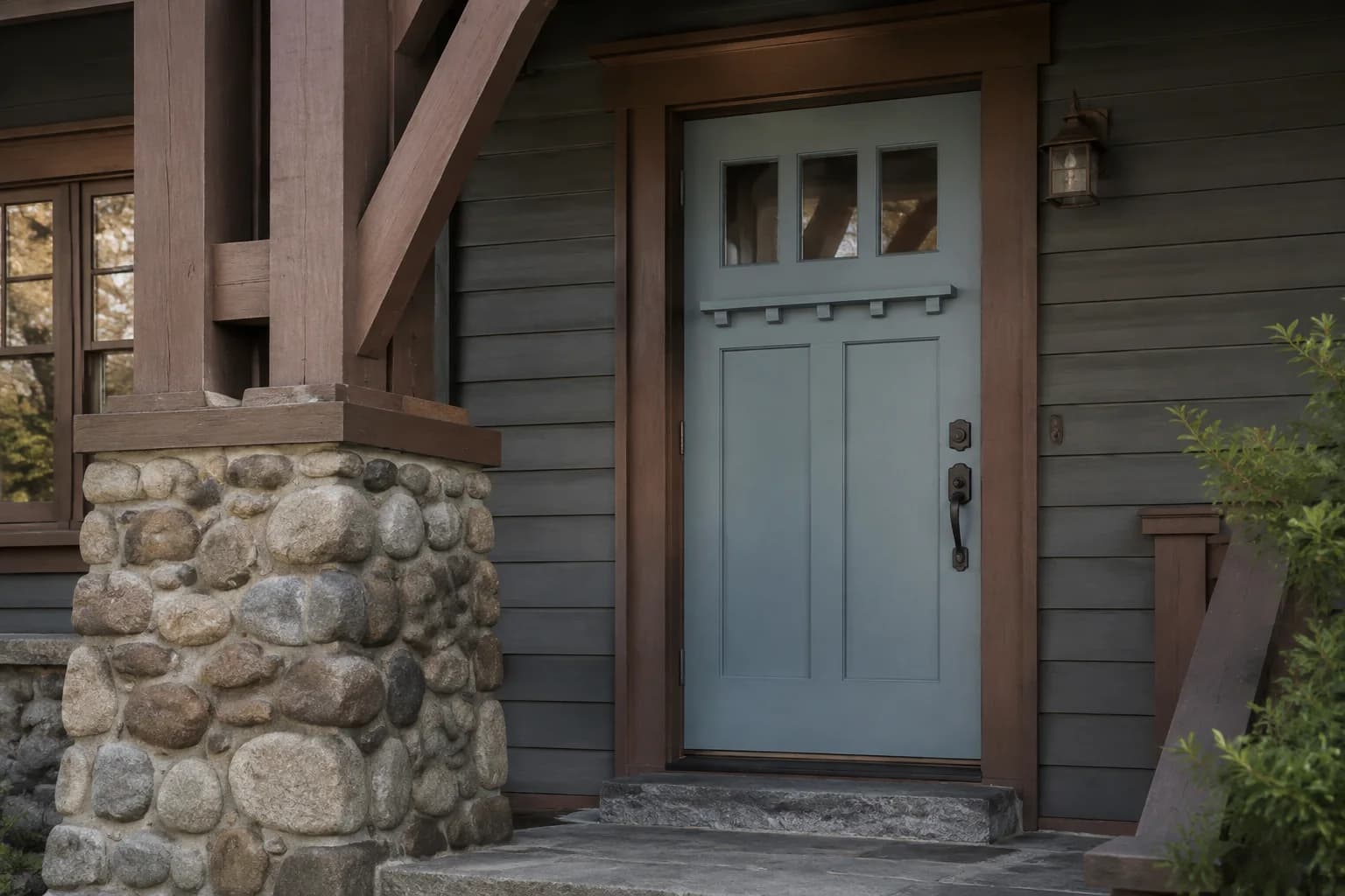
Slate blue gives you a more noticeable blue than navy while keeping some of the gray that connects it to the siding. Consider it if you want a blue door that still shows its color beneath a covered porch.
Against light gray siding, choose a slate blue with enough depth to distinguish the door from the walls.
On a darker gray house, a lighter version can make the entrance easier to see. Compare it beside your trim, too, since white framing will make the difference between the door and siding more apparent.
Benjamin Moore Blue Porcelain 1641 is one shade to sample for this look. Check it at the door when the porch is shaded to see whether it gives you the amount of blue you want.
Teal
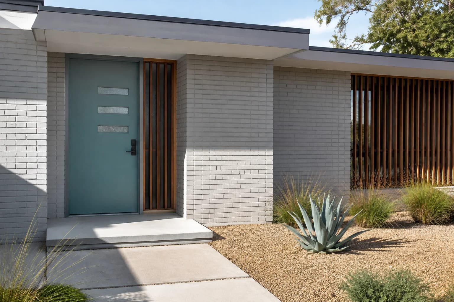
A teal front door introduces a mix of blue and green that can stand out against gray siding. You might prefer it if navy feels too dark or you want more color than a muted slate blue provides.
Teal shades can vary considerably. Some look distinctly blue, while others lean greener, so compare your options beside any brick, stone, or wood around the entrance.
A muted teal is a useful starting point if those materials already bring several colors into the exterior.
Benjamin Moore Aegean Teal 2136-40 is an option to sample. Look at it from the street as well as beside the door, particularly if a storm door covers much of the painted surface.
Sage Green
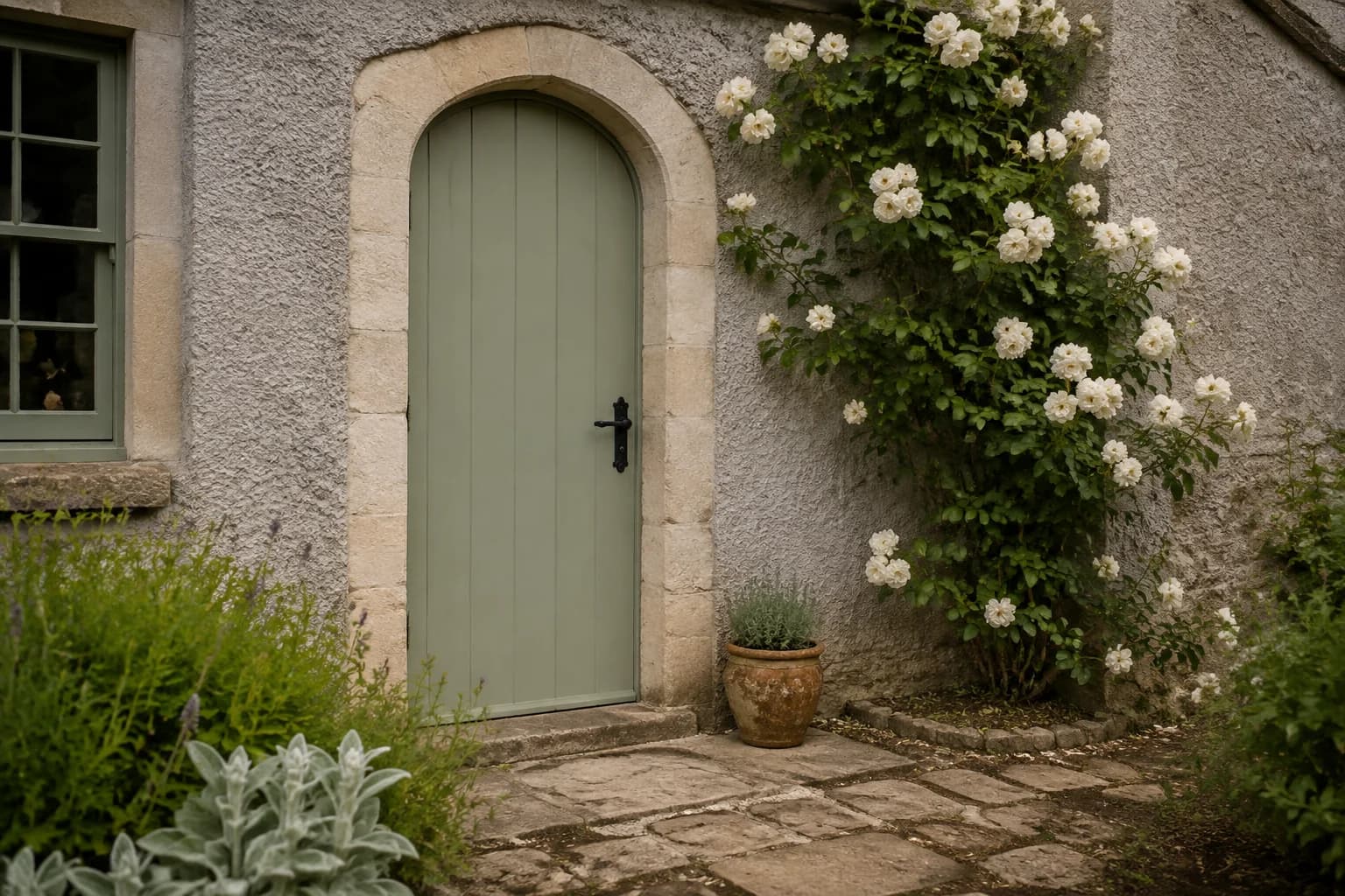
Sage green can give a gray house a softer-looking entrance without using white or another gray. Consider it alongside warm greige siding, natural wood, or stone with beige and brown tones.
On pale gray siding, a light sage may blend in more than you expect.
If you want the door to stand out, compare it with a slightly deeper green. Beside blue-gray siding, check whether you like the warmer appearance of the sage or would prefer a green with more blue.
Benjamin Moore Salisbury Green HC-139 is one muted green to try. Keep the surrounding trim visible when assessing the sample so you can judge the whole doorway together.
Forest Green
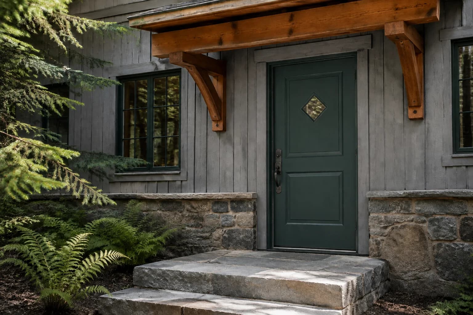
Forest green gives a light gray house a darker entrance with more visible color than black or charcoal. It can look good alongside wood accents and stone, especially if you prefer a deeper green to sage.
If your house has dark gray siding, check how clearly the green shows beneath the porch.
A very dark shade may blend into the surrounding shadows. Nearby shrubs can also affect how noticeable the door is from the street, so include the landscaping when comparing your options.
Benjamin Moore Tarrytown Green HC-134 is a deep green to sample. It has a blue-green appearance that is worth comparing directly with your siding and any warmer materials around the entrance.
Classic Red
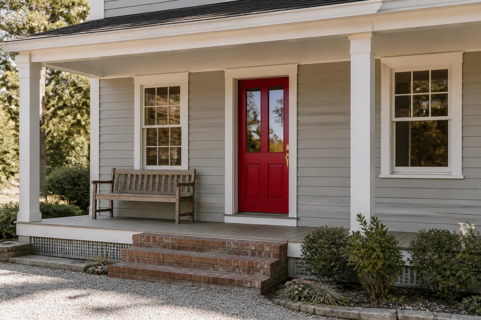
A classic red front door can make the entrance a focal point on a gray house. Against light gray siding and white trim, the red is likely to be one of the first colors you notice when approaching the home.
Choose the shade carefully if you have brick beside the door or along the steps. A clear red may look quite different next to brick with orange, pink, or brown tones. You don’t have to match the brick, but you should compare them together before painting.
Benjamin Moore Heritage Red HC-181 is an option for a traditional red-door look. Check a large sample from the driveway or sidewalk to decide whether you like that amount of color on the front of your house.
Burgundy
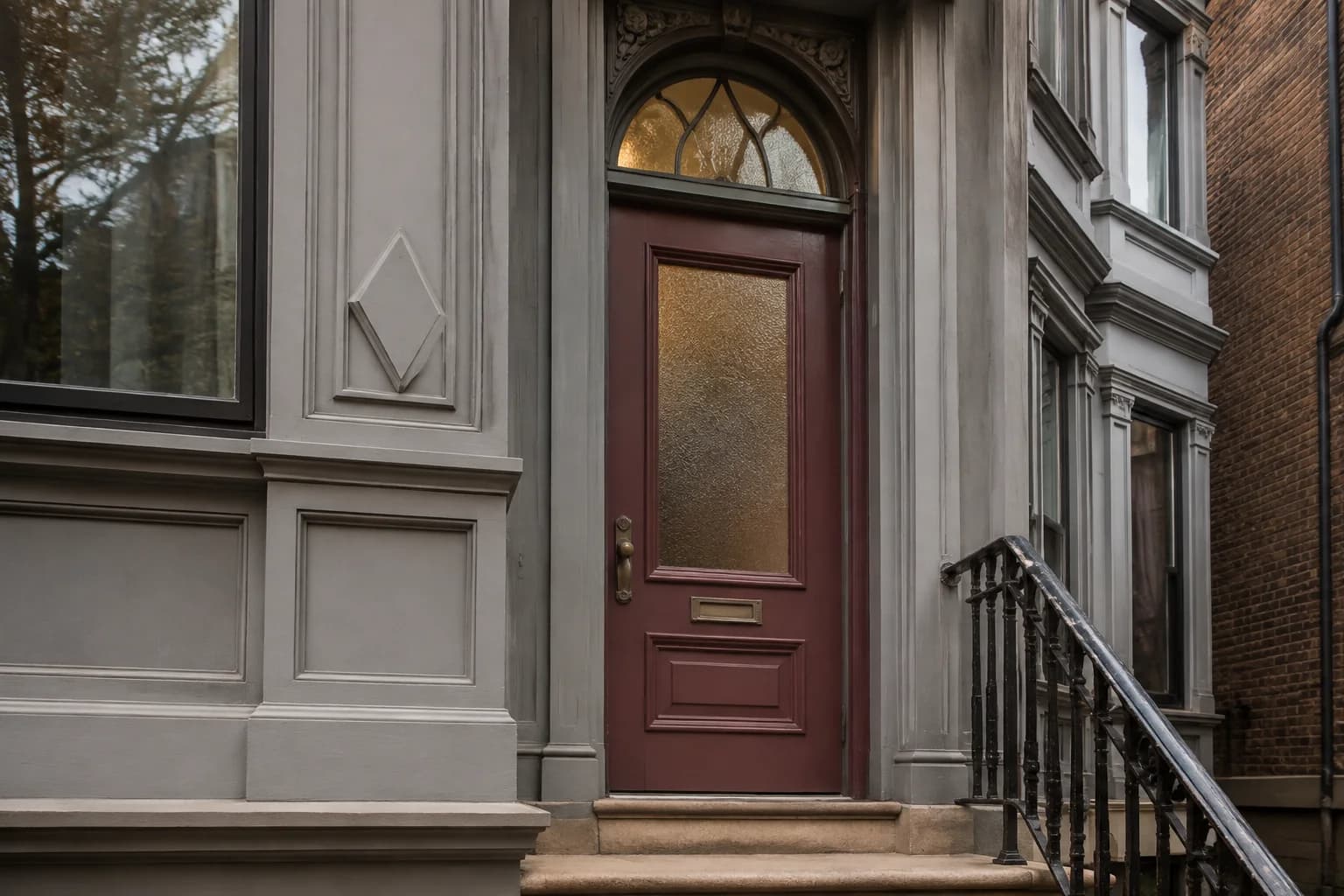
Burgundy offers a deeper, more muted alternative to a bright red door. You might prefer it on a gray house with warm stone or brown accents, where you want some red without making the entrance quite as bright.
Some burgundy shades lean purple, while others look browner. Those differences become easier to see beside your siding and masonry.
If you’re choosing burgundy to coordinate with red brick, check that you like the combination rather than relying on both being described as red.
Benjamin Moore New London Burgundy HC-61 is one shade to consider. Under a covered porch, check whether its red tones remain visible or whether it looks darker than you intended.
Mustard Yellow
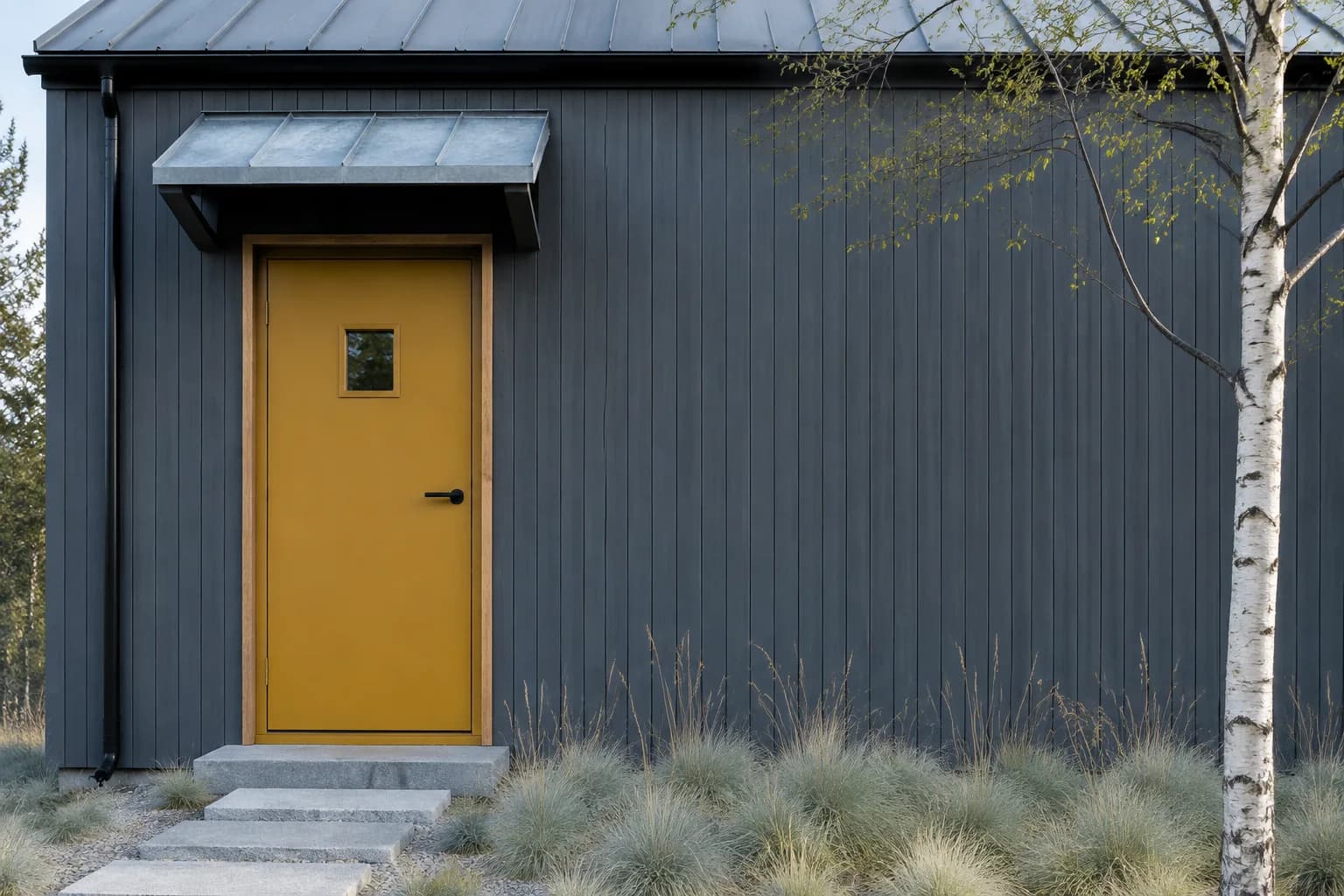
A mustard yellow front door adds a warm accent to gray siding without the brightness of a lemon yellow.
It can be a good choice if your current entrance feels dull or you want the door to stand out more from the street.
On a blue-gray house, the yellow creates a distinct warm contrast. Beside greige siding or warm stone, it may feel closer to the surrounding colors.
Compare a softer golden shade with a stronger mustard to see how much color you want, especially if the door receives direct sunlight.
Benjamin Moore Concord Ivory HC-12 is a softer yellow-gold to sample for this look. If you want a deeper mustard, use it as a starting point for comparing richer shades.
Terracotta
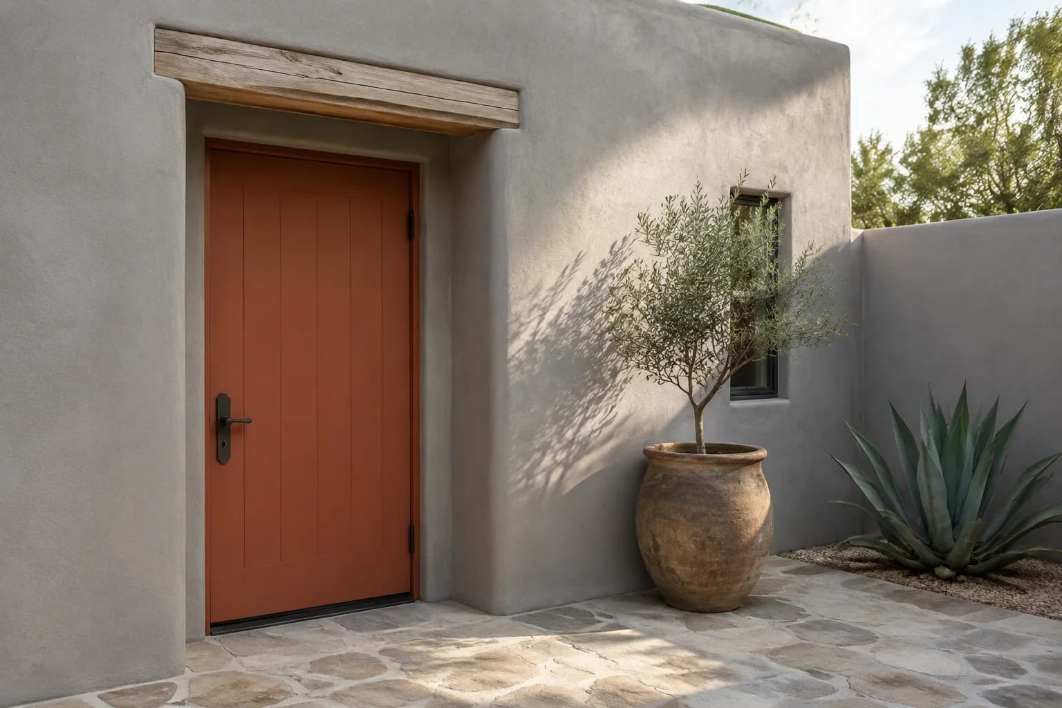
Terracotta brings an earthy orange-red color to a gray exterior. It’s worth considering if you like the warmth of a red or orange door but prefer a more muted shade.
Look at the brick, stone, and paving around your entrance before choosing. Terracotta may pick up warm tones already present in those materials, but an orange-heavy shade could look quite different beside pinkish brick or cooler gray stone.
Compare a muted clay shade with a deeper rusty red at the door. Against dark gray siding, check that the color remains visible beneath the porch.
On a pale gray house, consider whether you prefer the stronger contrast of terracotta or a softer, browner version.
Soft White
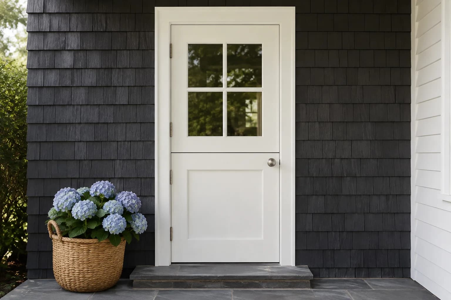
A soft white front door can make an entrance more noticeable against dark gray siding. Consider it if you want a lighter door but prefer to keep the exterior neutral.
If you already have white trim, compare the sample directly beside it. A creamy door may look yellow against a cooler white frame, while a brighter white door can make older trim appear dingy.
Benjamin Moore White Heron OC-57 is one white to sample.
On a light gray house, check the combination from the street—the difference between the door and siding may be subtle, particularly when white sidelights or a storm door surround the entrance.
How to Choose a Front Door Color for Your Gray House
Once you have a few colors in mind, compare them at your entrance with the surrounding surfaces visible. Keep any features you plan to retain in the comparison, including the storm door.
Then look at your options from the driveway or sidewalk to see how they work with the rest of the house.
Compare the color with your siding, stone, and brick
Start with the gray on your house. It may look slightly blue, green, or closer to beige, and those differences can become more noticeable when you put another color beside it.
Compare your door samples directly against the siding instead of choosing from a photo of a different gray house.
If brick or stone surrounds the entrance, position the samples beside those materials too.
For example, a red you like against the siding might look too orange beside your brick. A muted green might work with the stone but blend more closely with the siding than you intended.
Include the roof if it is prominent from the front of the house. You don’t need to repeat its color on the door, but you should like how the combination looks together.
Check how the door looks in sunlight and porch shade
Test colors where the door sits. A sample held against sunny siding won’t show you how the paint will look several feet back beneath a covered porch.
Look at your samples at different times of day, especially when you normally arrive home. With navy, forest green, and burgundy, check whether you can still see the color in shade. If they all look nearly black, compare a lighter version of the color you prefer.
For a door that receives direct sun, check whether a brighter shade looks stronger than you want across a larger area.
Keep the sample upright in the same position as the door so you’re comparing it under similar lighting.
Consider your trim, shutters, and storm door
Your front door can be a different color from your shutters. If you already have black shutters on a gray house, you can keep them and use blue, green, or another accent on the door.
Compare the combination across the front of the house before deciding that both need repainting.
Trim and sidelights frame the door, so leave them visible around your samples. This is particularly useful when choosing soft white, where a difference between the door and existing white trim may be noticeable.
If you have a storm door, assess the color with it closed. Its frame and screen may cover enough of the painted surface to change how the entrance looks.
Before repainting the storm-door frame or choosing a dark finish behind glass, check the manufacturer’s guidance for your particular doors.
Look at the color from the street
Step back to where you normally see the house when approaching it.
A shade that looks distinct beside the door may barely register from the sidewalk, particularly if your entrance is recessed or the house sits far back from the road.
Include the garage in this view. If it takes up much of the front of the house, decide whether you want the door to draw more attention or blend more with the surrounding colors.
A more noticeable door doesn’t necessarily need brighter paint; a lighter shade against dark siding may give you enough contrast.
Preview Your Options and Test Paint Samples
Use a photo of your house to compare a few door colors before buying samples.
Keep the siding, trim, and surrounding materials the same in each preview so you can judge the change to the door.
Once you have a shortlist, compare physical paint samples at the entrance. Use sample boards large enough to see from a distance, following the sample product’s instructions, and move them into place one at a time.
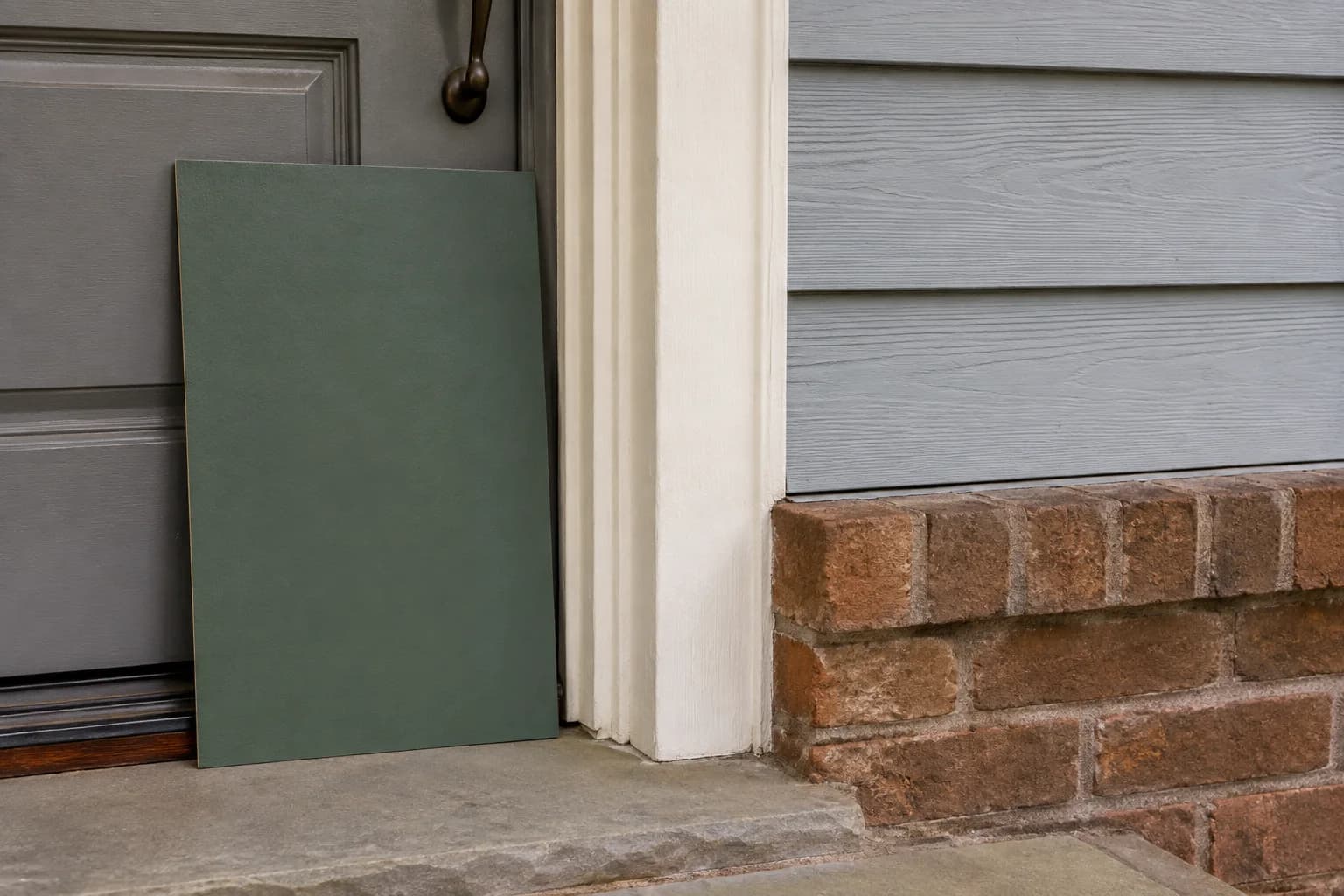
Digital previews can help you narrow the choices, but the paint sample lets you check the actual color in your entrance’s lighting before committing.
Find the Right Front Door Color for Your Gray House
If you’ve narrowed your choices to a few colors, try them on a photo of your house with Paint Visualizer AI.
You can compare how a black, green, or brighter door looks with your gray siding and the materials around your entrance.
Once you find a look you like, test a paint sample at the door to see how the color looks in your home’s lighting before painting.