
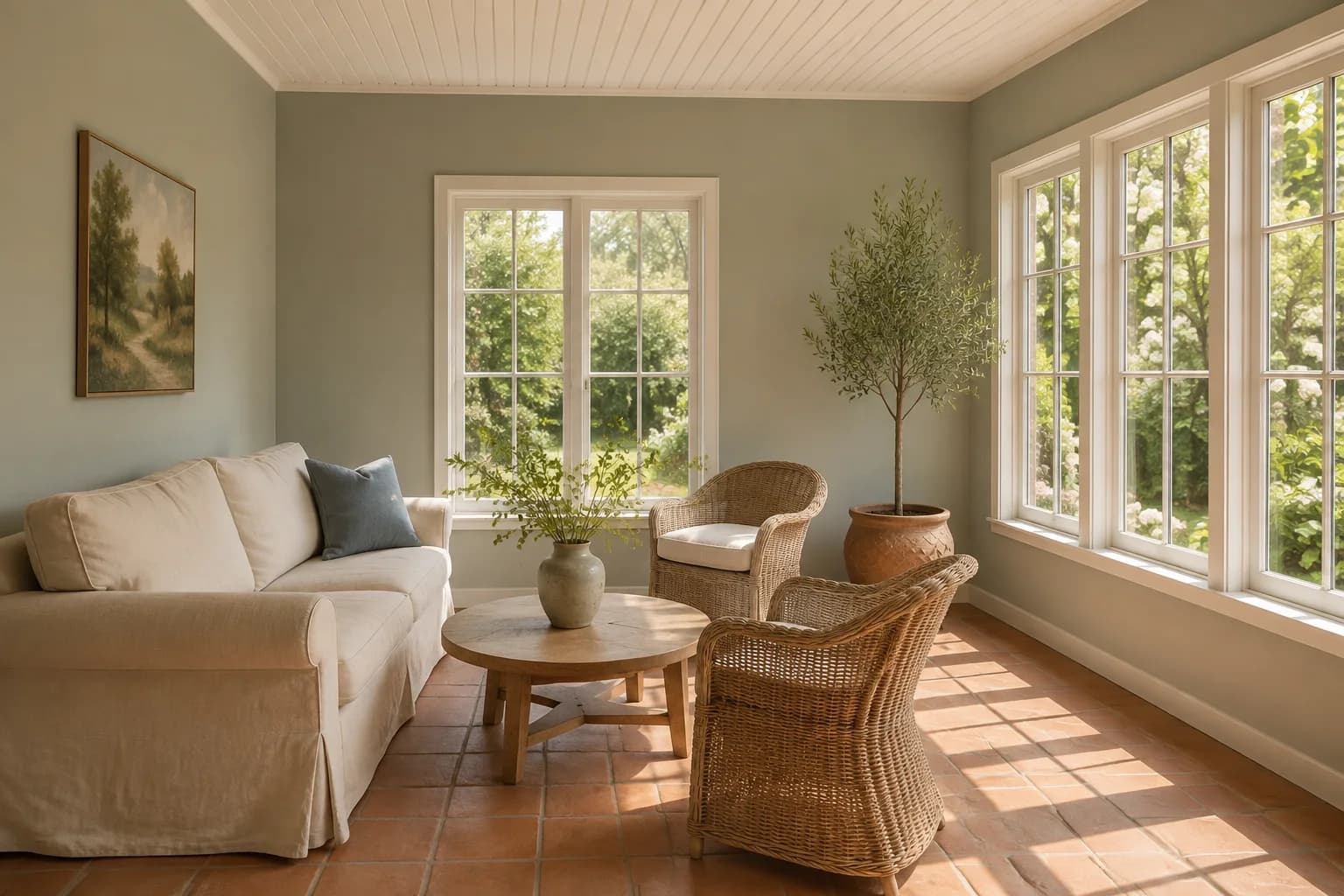
If you’re thinking about repainting your sunroom and wondering what color to choose, you may be considering a bright white to make it feel more open or a cheerful yellow to go with all that sunlight.
But a white that looks soft in a photo can feel too stark across your walls, and yellow may look stronger than you expected in direct sun.
We also find most people often find it easy to judge a sample at the brightest time of day and miss how it looks when the room is shaded. A color you like in the morning may look dull by the time you sit down there in the evening.
When choosing a paint color for your sunroom, start with the colors in your room and compare paint samples beside them as the light changes. For example, you might have wood trim that pairs well with a soft white, or terracotta floors that would look good with a muted green.
In this guide, we’ll look at some of the best paint colors for sunrooms and explain what to check before choosing a shade for your space.
The Best Paint Colors for Sunrooms
Soft whites and pale blue-greens are good starting points if you want your sunroom to feel light and open. You can also consider a deeper green or navy if you use the room for reading or relaxing in the evening and prefer a cozier feel.
Before choosing a paint color, compare a few shades with the finishes you plan to keep. This is because a color that looks good beside white window frames may look quite different against stained wood.
Below are specific paints to try for your sunroom, with suggestions for where each might work and what to check in your samples.
Benjamin Moore White Dove OC-17
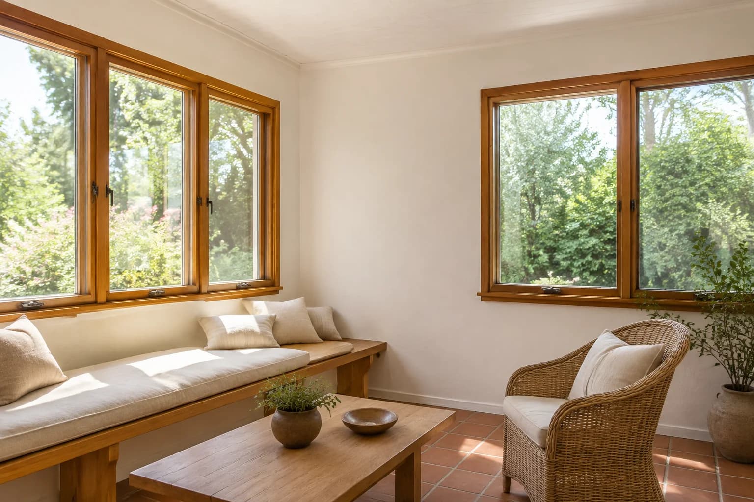
White Dove is a soft white worth trying if you want light walls without the stark appearance of a brighter white. It pairs well with natural wood and leaves you plenty of choice when selecting colors for your furniture or curtains.
In a sunroom with wood window trim, place a sample directly beside the wood. You can also compare it with terracotta floors if you want to keep the walls neutral and let the tile provide most of the room’s color.
Against bright white window frames or blinds, White Dove may look creamier than you expected.
Check that combination in direct sunlight and shade before deciding whether to use it across the room.
Sherwin-Williams Sea Salt SW 6204
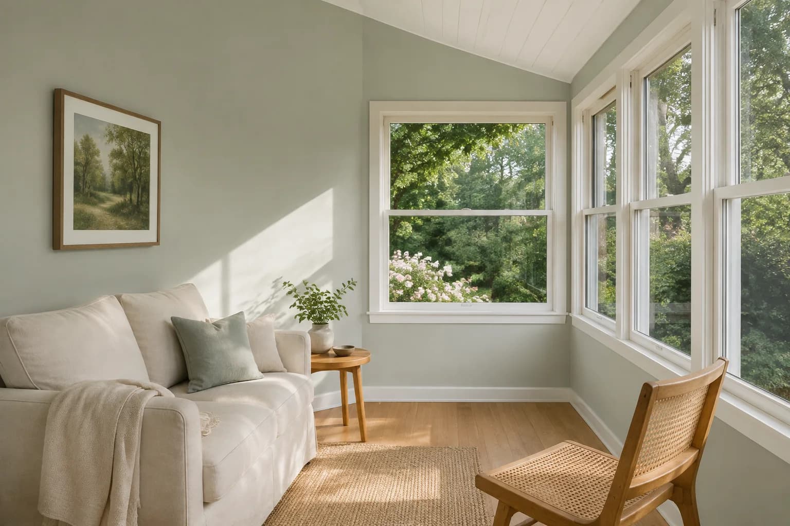
Sea Salt is a muted green with blue undertones. If white feels too plain but you want only a little color on the walls, it’s worth including in your samples.
Try it beside white trim and natural wood furniture. It can also work for a sunroom overlooking a garden, especially if you like softer greens but don’t want an obvious sage color.
Despite its placement in some lists of pale blue paints, Sea Salt is a green paint color. Its appearance can shift with the light and surrounding finishes, so check whether you like both the greener and bluer tones you see in your room.
On a wall that receives strong sunlight, it may look much paler than it does in a shaded corner.
Sherwin-Williams Clary Sage SW 6178
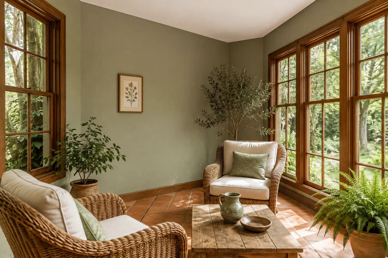
Clary Sage is worth trying if Sea Salt looks too pale or too blue for your sunroom. It gives the walls a more noticeable green color and is a useful option to compare beside stained wood or terracotta tile.
If your sunroom has an orange-toned floor, place a large sample near the tile before painting.
The green may create more contrast with the orange than a neutral wall color would. You may like that combination, but check it across a larger area if you want the floor to be less noticeable.
You can keep the ceiling and trim light if you want some contrast around the green walls.
If you already have stained wood trim, include it in your comparison before deciding whether anything besides the walls needs repainting.
Benjamin Moore Ocean Air 2123-50
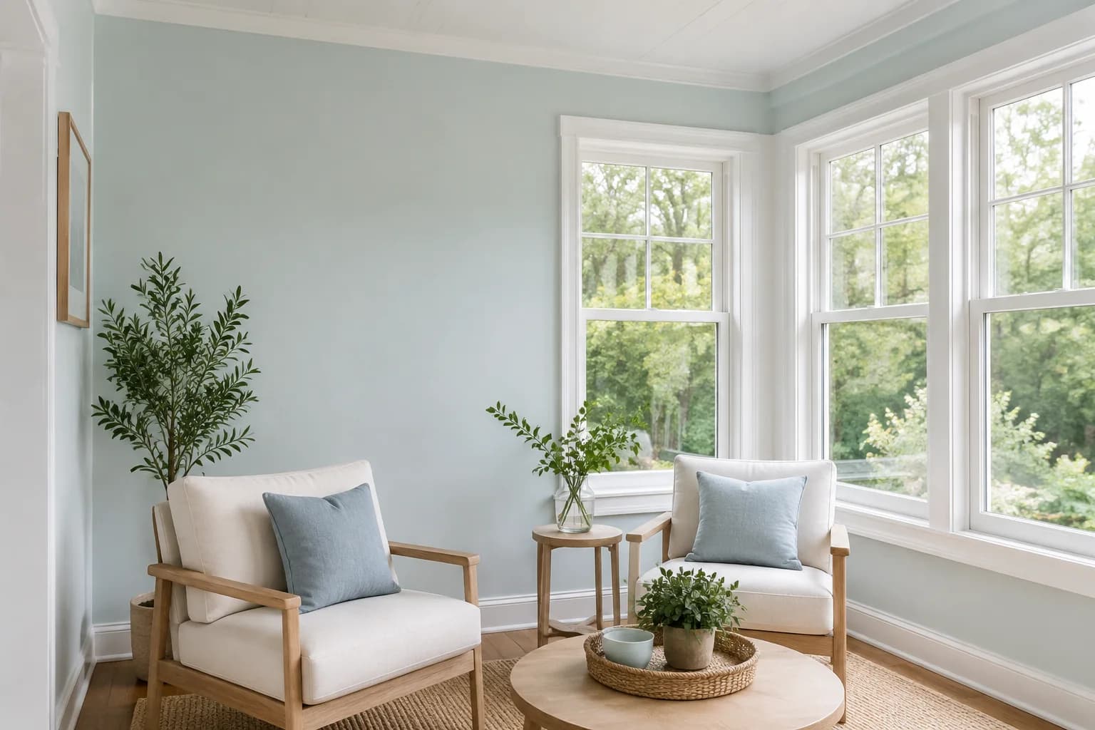
Ocean Air is a light blue-green that gives you another option if you’re drawn to the softer colors in this list.
Try it with white trim and pale wood furniture, or compare it with the blue fabrics you already have in the room.
In a sunroom with strong afternoon light, Ocean Air can give the walls a cooler appearance.
Check it when the room is shaded, too, especially if you want to avoid a blue that feels chilly on overcast days.
If you like the color but prefer neutral walls, consider it for the ceiling.
Paint a sample board and hold it overhead to see how it looks there; a sample viewed upright against the wall won’t give you the same impression.
Benjamin Moore White Sand OC-10
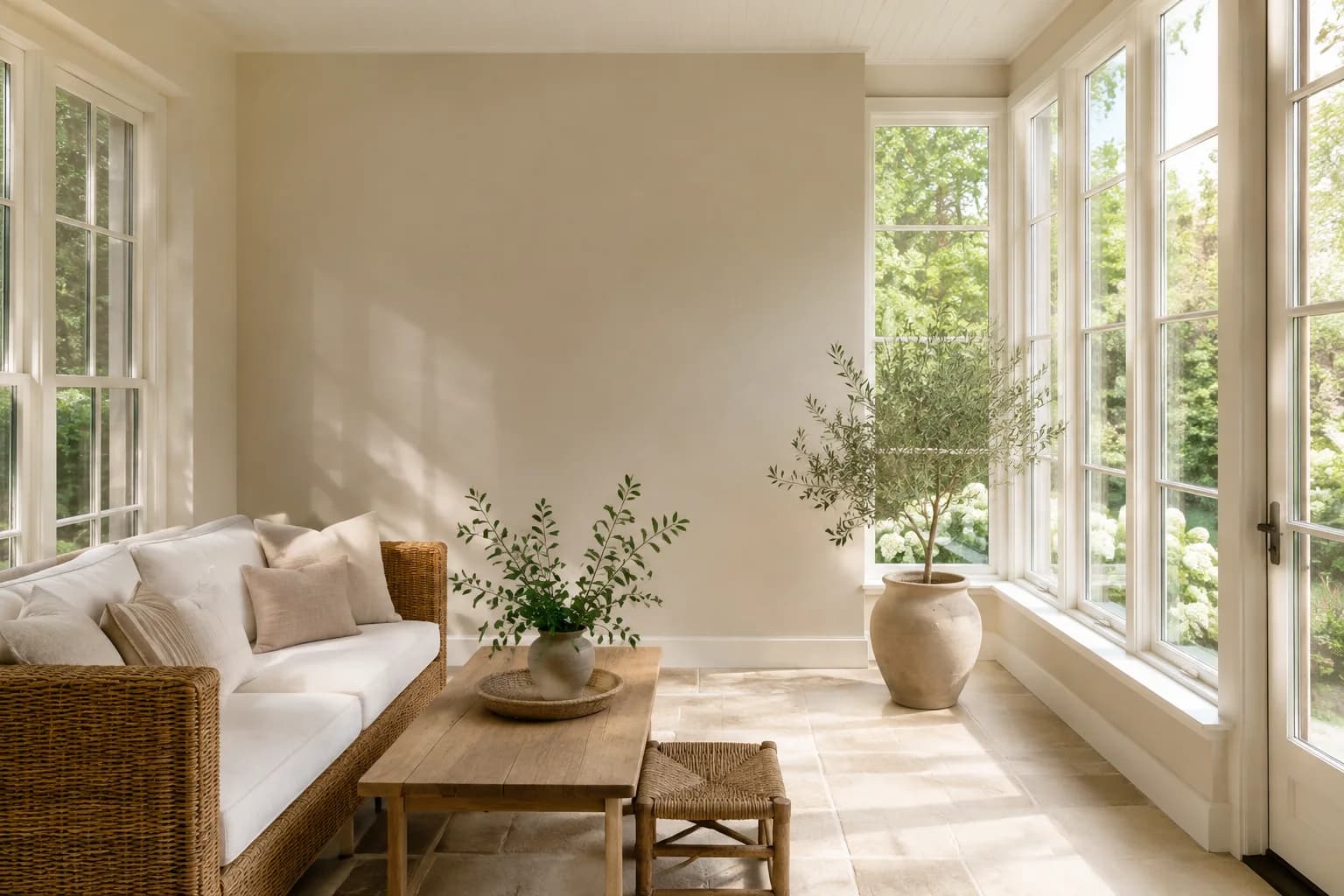
White Sand is a muted beige for anyone who wants a neutral sunroom with more color than white.
It’s worth comparing with cream upholstery or woven furniture, particularly if those pieces look too yellow against your current walls.
With beige tile floors, check the sample directly beside the tile and grout. Choose a combination you like rather than trying to match the floor from memory.
White Sand also gives you an option to consider if your sunroom opens onto a beige living room or kitchen.
View the sample from the adjoining room so you can judge both wall colors together.
Benjamin Moore Golden Straw 2152-50
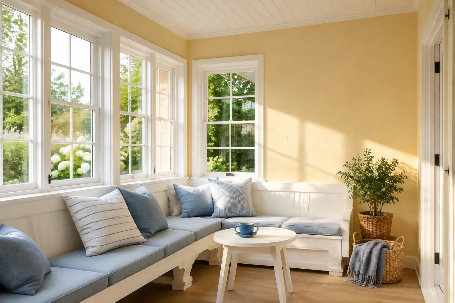
Golden Straw is a yellow-gold option if you want a visibly warm sunroom. You could try it with white-painted furniture or use blue cushions and curtains alongside it.
Check a large sample during the hours when direct sunlight reaches the walls. If you’ve chosen yellow because the room feels dull in the morning, you may find that the same shade looks stronger than you want later in the day.
Warm wood and terracotta floors will add more warm color to the room. If you’re keeping those finishes, compare Golden Straw beside them before committing.
A soft white may suit you better if you want the floor or woodwork to remain the main source of warmth.
Clare Daily Greens
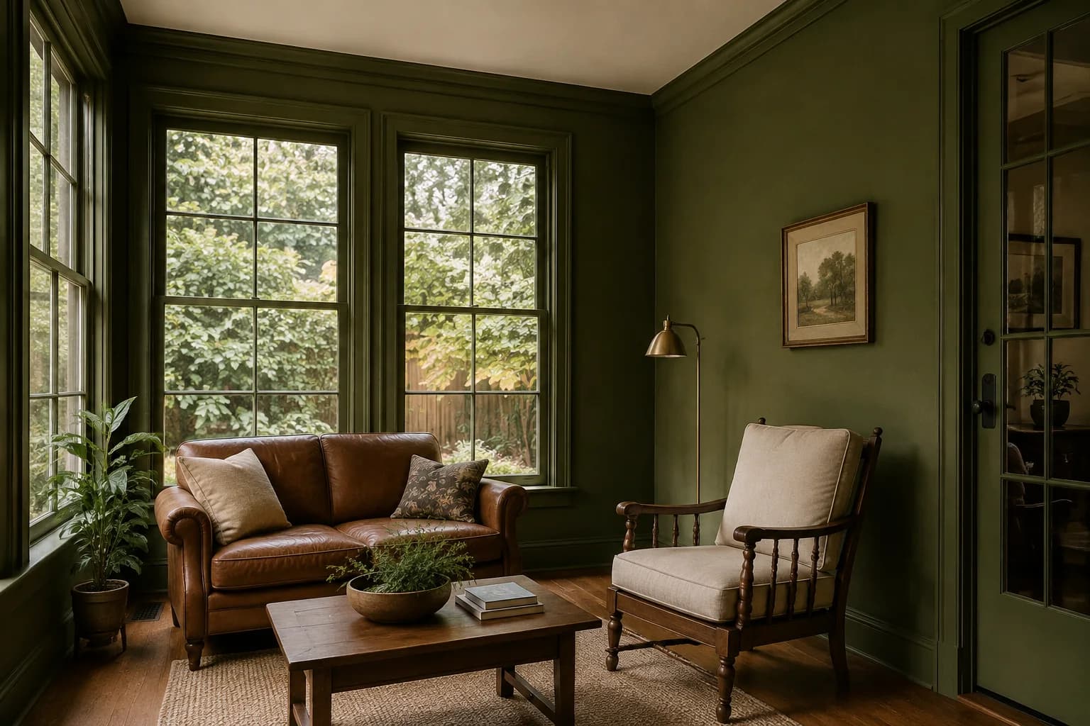
Daily Greens is a richer green to consider if you want a sunroom that feels cozy in the evening.
It gives the walls more depth than the pale greens in this list and works as a starting point for a room with vintage furniture or natural wood.
Clare features this color in a Victorian sunroom where the homeowner painted the ceiling and trim green as well. You could try that approach if you like an enveloping feel, or keep the ceiling light to break up the color.
Check how much painted surface surrounds your windows before deciding. Green on a narrow strip of wall will look different from the same shade covering a broad wall and ceiling.
Benjamin Moore Hale Navy HC-154
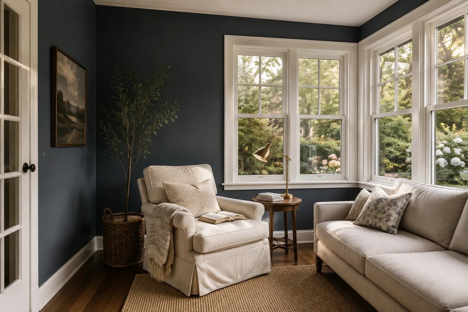
Hale Navy is a deep blue for a sunroom where you want darker walls. Consider it if you use the space for reading or evening conversation and like the contrast of dark paint against light upholstery.
If your room has lots of window divisions, decide whether you like that repeated contrast. You can preview painted trim in the wall color as another option, while leaving any window components you’re keeping unchanged.
Look at your sample under your usual evening lighting, especially beside dark flooring or furniture. A navy you like in daylight may feel too dark once the sun sets.
Try it on the largest wall you plan to paint so you can judge how much of the room will have that deeper color.
How to Choose a Paint Color for Your Sunroom
Once you have a few colors in mind, compare them in the areas you plan to paint.
Include a wall that gets direct sunlight and one that stays shaded, with your existing finishes visible beside the samples.
Start with the flooring and woodwork you plan to keep
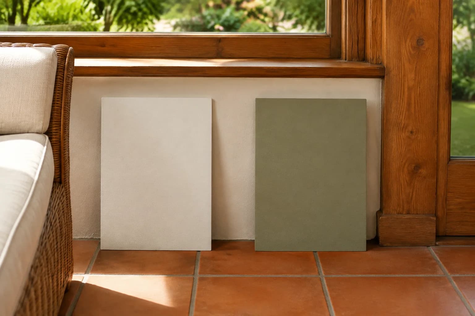
Place your samples close to the floor and against the window trim.
If you’re keeping stained wood, look at how each paint works with its color. A green you liked in a room with pale oak may look quite different beside reddish wood.
Check white paint against existing white window frames or blinds, too.
Differences that were barely noticeable on separate color chips can become obvious when the whites are next to each other.
Check the light when you actually use the room
If you spend mornings in your sunroom, look at the samples while you’re having breakfast.
If you usually sit there after work, check them in the late afternoon and with your evening lights on.
Window direction gives you a starting point, but a sunroom may receive light from several sides.
Trees and roof overhangs can also leave parts of it shaded.
Move your samples around so you can see how the color looks beyond the brightest wall.
Decide how much color you want around you
You may like a deep green on a sample but prefer a lighter color once you see it across the room.
A sunroom with broad walls gives paint more presence than one with windows extending almost to the floor.
Compare a light option with a deeper shade in a photo of your room.
Keep the furniture and flooring the same so you can judge the change in wall color.
Look at the sunroom from the adjoining room
If your sunroom opens onto the kitchen or living room, check the colors from both sides of the doorway. You may see the sunroom walls from your sofa or dining table every day.
You can give the sunroom its own color while repeating something from the adjoining space, such as the trim color or a shade in the upholstery.
Before buying paint, place your sample where both rooms’ wall colors are visible together.
Preview Your Sunroom Before You Paint
If you’re deciding between a soft white and a deeper green, seeing both across your walls can help you choose which to sample. A small paint chip leaves you to imagine how much color will surround the windows and how it will look beside your furniture.
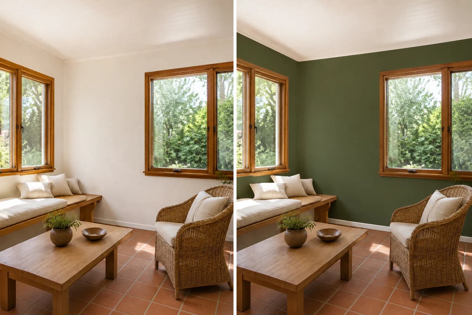
With Paint Visualizer AI, you can upload a photo of your sunroom and preview colors on the walls, ceiling, or trim. Use a photo that clearly shows the flooring and woodwork you plan to keep, then compare a few shades on that same view.
You can also try different combinations, such as green walls with a white ceiling or white walls with a pale blue ceiling. This can help you decide which surfaces to repaint before buying supplies.