
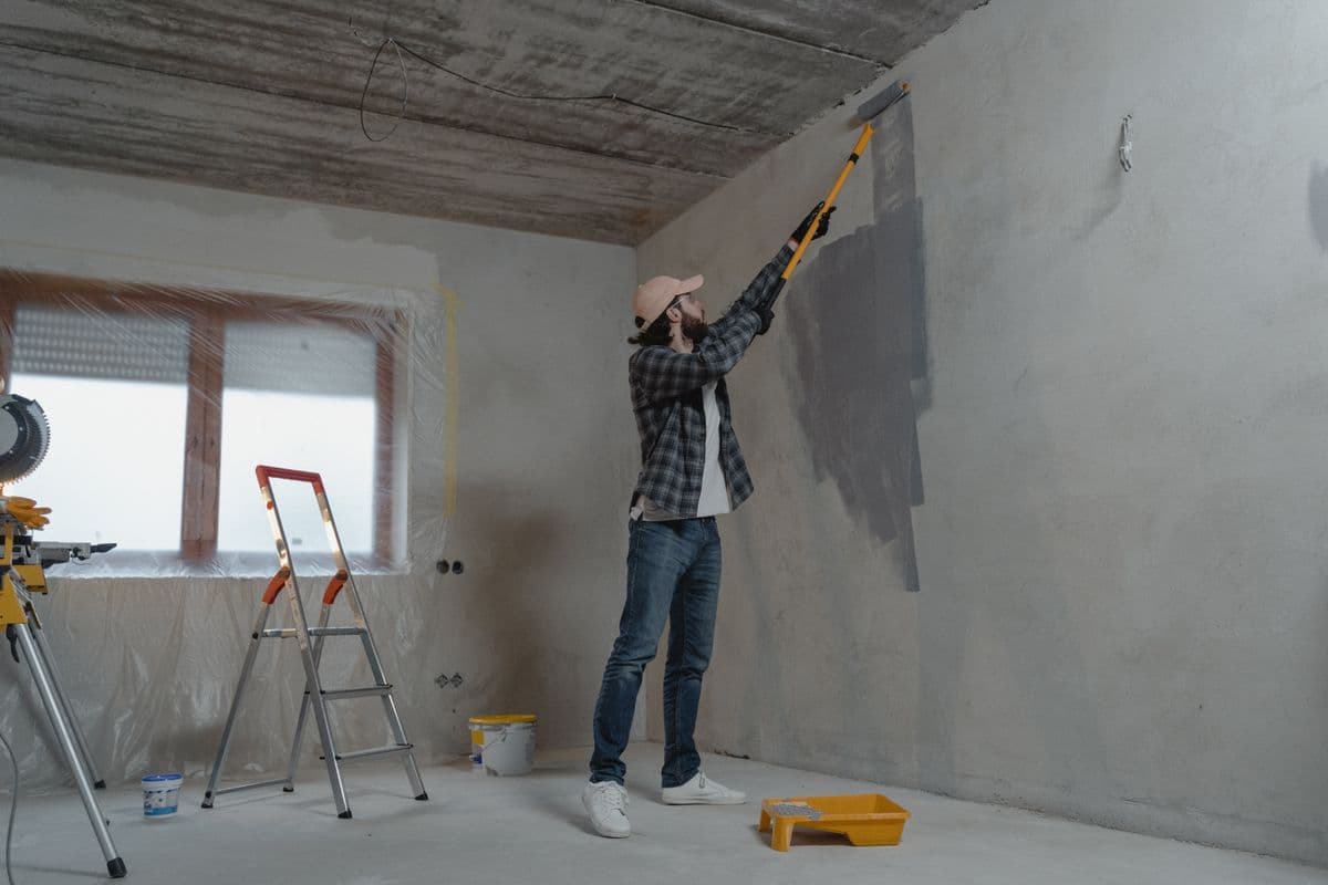
We often hear from people who spend hours comparing paint swatches and testing samples, only to find that the color looks different once they paint their whole room.
Several factors affect how you see paint in your room, including the natural light it receives, the bulbs you use, and the colors of your flooring, furniture, and trim.
We also find that people sometimes test one paint product and then buy another to finish the room, which affects how the color appears, and having another brand match the sample can introduce differences too.
In this guide, we’ll explain why paint can look different once it’s on the wall and what you can check before deciding whether to repaint. We’ll also cover how to get a better idea of the finished result before choosing your next color.
Why Your Paint Color Looks Different on the Wall
The conditions in your room, the surface you’re painting, or the paint itself can make the color appear different when you apply it to your wall.
Here are some of the most common causes we find:
The lighting in your room changes how the color looks
We often find that people choose a paint color under the bright lights of a store, then bring it into a room with very different lighting. A color that looked balanced in the store can appear warmer, cooler, or darker once it’s on their walls.
Natural light also changes throughout the day. In homes in the Northern Hemisphere, north-facing rooms generally receive cooler, indirect light, while south-facing rooms tend to receive more direct sunlight.
East-facing rooms get their strongest direct light in the morning, and west-facing rooms get it later in the day. Trees, neighboring buildings, and covered porches can reduce or change the light that reaches the walls.
Your bulbs and fixtures affect the color after sunset, too. If you use warm lighting, it can bring out more yellow in a cream or off-white, while a different bulb may make that same paint appear cooler.
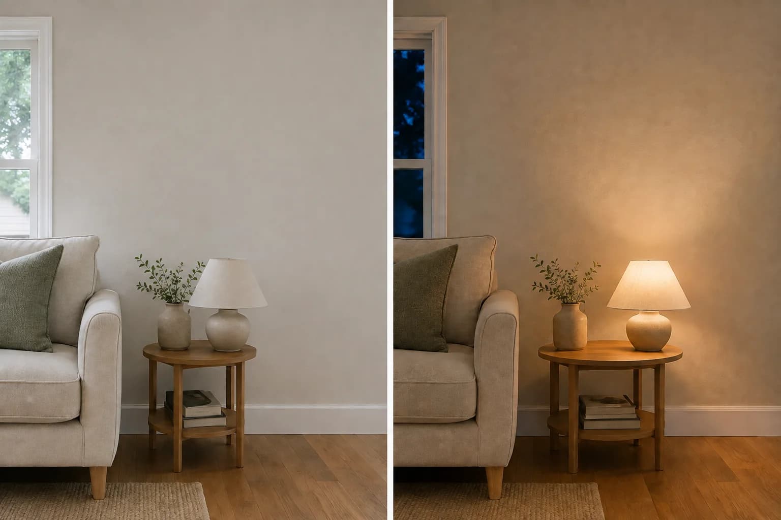
Look at the paint in the morning, afternoon, and under the lights you normally use in the evening. If you only dislike the color with a particular lamp or overhead fixture on, try a different bulb before deciding to repaint.
Choose lighting you enjoy living with, since no single bulb setting makes every paint color look right.
Your floors, trim, and furnishings affect its appearance
We also find that people test a sample on an open section of wall without comparing it beside their flooring, cabinets, or trim. Once they paint the whole room, they see the color against those finishes and notice differences they missed in the sample.
A warm white may look fairly neutral on its own but appear yellow beside a brighter white door. A gray may look more blue or purple next to warm wood flooring than it did in the store.
These subtle color leanings are commonly called undertones. You may notice them more when you place the paint beside another color, especially with whites, grays, and other neutrals.
Nearby surfaces can also reflect colored light onto your walls, and if you have strongly colored curtains or furnishings, they may contribute to a color cast that becomes more noticeable when sunlight enters the room.
Compare your paint beside the finishes you plan to keep, especially large surfaces such as flooring and cabinets. If you’re still testing samples, move them around so you can see how they look in different parts of the room.
If you’ve already painted, remove temporary items such as colored drop cloths before judging the result.
You may find that a nearby item contributes to the appearance, but if the paint consistently looks wrong beside your flooring or cabinets, another shade may work better.
A small sample cannot show the effect across the whole room
A small swatch leaves you to imagine how the color will look across every wall. You might like a bold color on a sample but find it too strong once it fills the room.
The existing wall color affects how you see a test patch, too. A light sample surrounded by dark paint may look brighter by comparison. Once you cover the rest of the wall, you lose that contrast and may see the new color differently.
We also see people paint several small samples close together when comparing shades. That can make the decision harder because each neighboring color affects how the others look.
Use larger samples and give each one enough space to judge it individually. Move them to different walls and step back so you can see them alongside your furniture and finishes.
A whole-room preview can help you compare the overall effect before painting. You can then use physical samples to check your preferred colors under the lighting in your room.
The paint finish and wall texture differ from the sample
Most people focus on the color name when buying paint and give less attention to the finish. If you test a color in a flat or eggshell sample but choose satin for the room, the finished walls may look different.
A higher-sheen paint can create bright highlights where light hits the wall, while the color may look deeper from another angle. The effect depends on the color and lighting, so a shinier finish does not always make paint look darker or lighter.
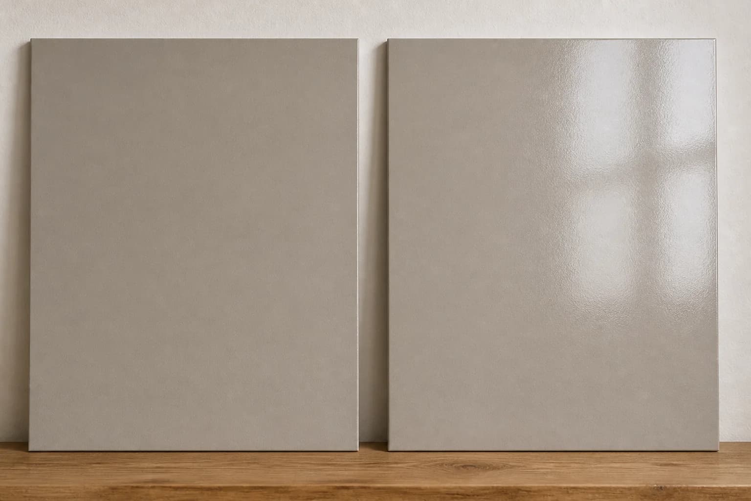
Your wall’s texture can also affect the comparison. A smooth sample card reflects light differently from a textured wall, where raised areas create small highlights and shadows.
If you’ve repaired parts of the wall, those areas may stand out because their texture differs from the surrounding surface. Uneven absorption can also leave differences in sheen.
Check which finish you sampled and which one you purchased. If the paint looks different as you move around the room, watch for reflections and whether certain patches stand out.
For a closer comparison before painting, test the intended product and finish on a surface with a texture similar to your walls.
The paint is still drying or has not fully covered the surface
Fresh paint can look uneven while it dries. You may see darker or shinier areas beside sections that have already dried, especially when you’re partway through painting the room.
Follow the drying instructions for your paint before judging the result. Cool temperatures, high humidity, or limited airflow can slow drying, so the wall may take longer than expected to develop an even appearance.
Paint continues to harden after it dries, but waiting through the full curing period is not a reliable way to fix an unwanted color cast. If the dry paint looks too pink or yellow in your room, don’t assume that it will eventually become the color you expected.
Incomplete coverage can also change what you see. If you spread the paint too thinly or it hasn’t fully covered the previous color, the old surface can show through. Porous areas, including some wall repairs, may absorb the coating differently.
Once the paint dries, look for show-through, uneven patches, or differences around repairs. Check the product’s coverage and recoating instructions before applying more paint, and ask the retailer whether the surface needs additional preparation or primer.
Another coat may help if coverage is incomplete. It will not necessarily fix a color you dislike under your lighting or next to your existing finishes.
The sample and purchased paint may not match
We also find that people sometimes test a sample from one brand and then ask another manufacturer to match it for the finished room. Others stay with the same brand but choose a different product line or finish without testing it again.
Some manufacturers make separate products for testing color and offer them in only one finish. These samples help you assess the shade, but they may not show exactly how your chosen coating will look.
If you have another brand match the color, its different base and colorants can introduce a variation. The match may look close under one light and show a difference under another.
If the purchased paint looks noticeably different from your sample, check it before continuing through more rooms.
Compare dry samples of both paints side by side under the same lighting. Use comparable surfaces and apply enough paint to cover the background so you can compare them usefully.
Check the brand, color code, product line, and finish on both containers. If the dry samples still differ, bring the labels and samples to the retailer and ask them to check the match.
How to Preview and Test Your Next Paint Color
Before you buy more paint, compare a few colors in the room you plan to paint.
Include your flooring, furniture, cabinets, and trim in the comparison so you can see how each option works with the finishes you already have.
With Paint Visualizer AI, you can upload a photo of your room and preview colors across the walls. You can compare a warm white with a cooler shade, try a deeper color, or see how different wall and trim combinations look together.
We built the tool to help you make these comparisons while keeping your existing room in view so you can see the color across the space and decide whether you like its overall effect before buying several samples.
Once you’ve narrowed down your choices, confirm the finalists with physical samples. Digital previews help you explore the possibilities, but your photo and screen can affect how the colors appear.
Use large, movable samples to compare different walls, and check them during the day and under your usual evening lighting.
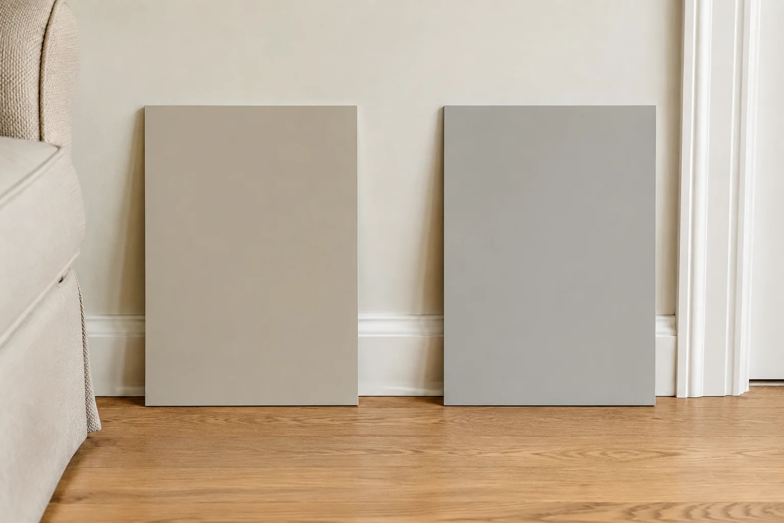
For the final check, use the paint product and finish you intend to buy on a representative section of the wall, following the preparation and application instructions.
If someone else will paint the room, give them the exact brand, color code, product, and finish you approved. Ask them to check with you before substituting another product or having the color matched in a different brand.
If you’re unsure about a color, preview it alongside a few alternatives before committing to the whole room. Paint Visualizer AI lets you compare your options in a photo of your own space, with the furniture and finishes you plan to keep.
Upload your room photo and explore the colors you’re considering.